Floating Visitor UI guide
Unblu provides a default interface for visitors called the Floating Visitor UI. This user guide focuses on the functionality that the Floating Visitor UI provides out of the box.
| Before version 7, the Floating Visitor UI was referred to as the Individual UI. |
The Floating Visitor UI guide is written from a visitor’s perspective. However, it should help agents and administrators to understand better what Unblu looks like to visitors. It should be useful if you need to assist visitors who have problems operating the Floating Visitor UI.
| Depending on the configuration your organization chose to implement, the look and feel of the interface may differ from the pictures in this guide. Additionally, some functions may not be available if they haven’t been licensed by your organization. However, you should have no difficulties applying the explanations in this guide to your particular circumstances. |
Launching the Floating Visitor UI
When you are on an Unblu-enabled website, all you see of Unblu to start with is the launcher button. On the web page pictured below, the launcher button is located in the lower right-hand corner of the screen:
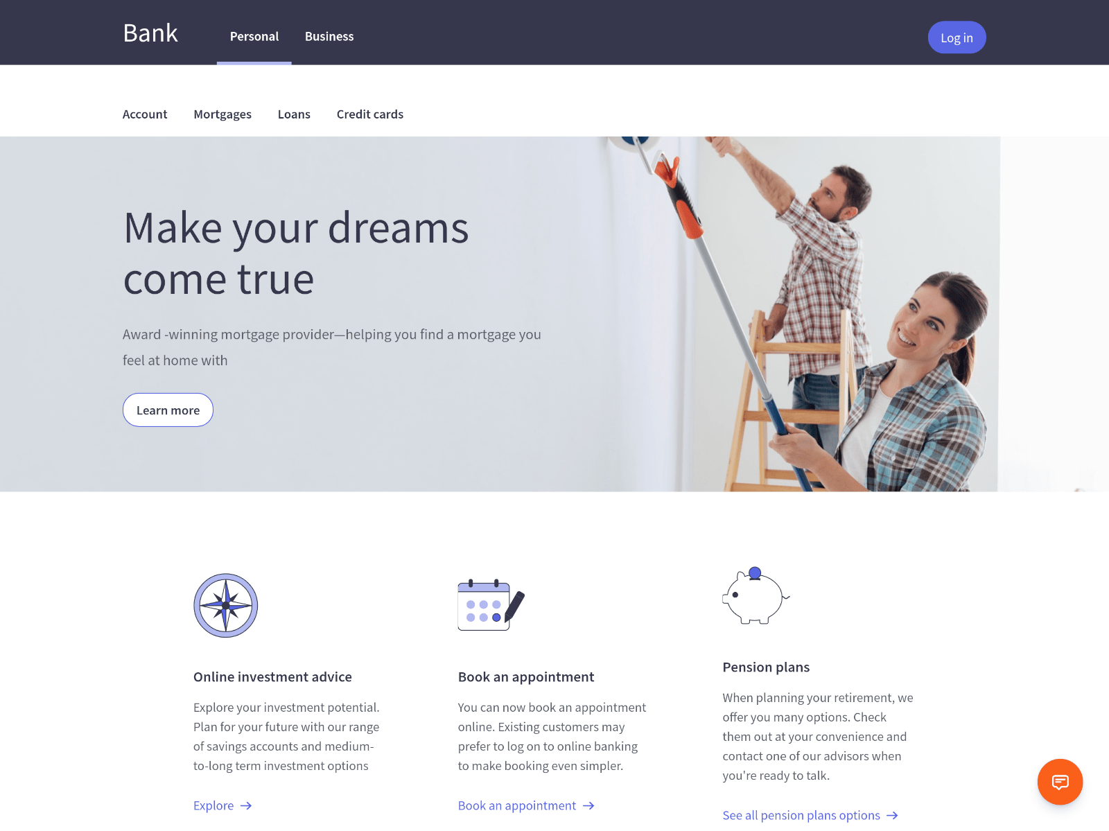
The launcher button can display an icon, text, or both. The icon and text vary depending on how Unblu is configured.
The icon on the launcher button depends on whether the Floating Visitor UI is open or not.
-
If the Floating Visitor UI is closed, the launcher button sports a chat request icon
.
-
If the Floating Visitor UI is open, the launcher button sports a collapse UI icon
.
Engagement UI
By default, clicking the launcher button opens the Floating Visitor UI conversation panel. The panel displays the engagement UI:
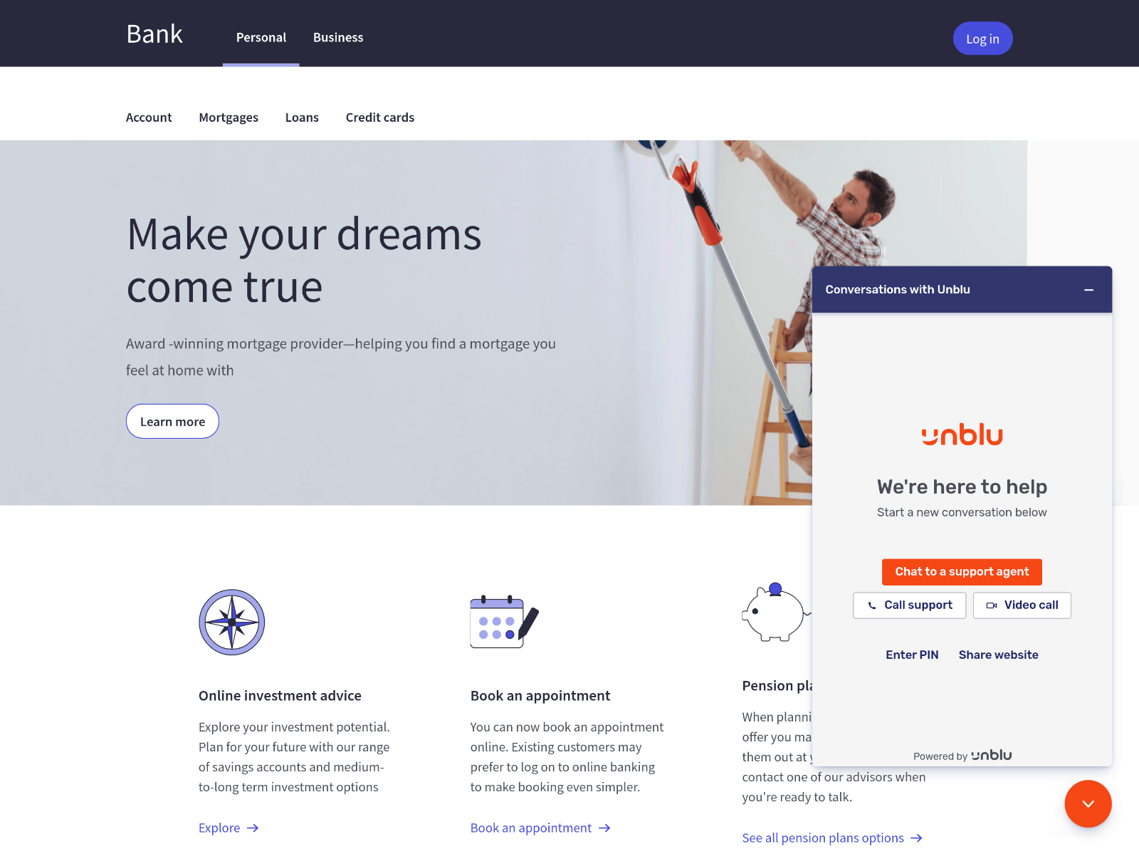
What exactly you see on the engagement UI depends on a number of factors, such as whether it’s your first time using Unblu, whether any agents are available to engage with you, and which features of Unblu are available on the page you are currently viewing.
The engagement UI in the picture above displays five different methods to get in touch with an agent (the actual texts used on your organization’s website may differ):
-
The Chat to a support agent button initiates a Live chat conversation.
-
The Call support button launches an Audio conversation.
-
The Video call button launches a Video conversation.
-
Enter PIN allows the visitor to join an embedded co-browsing, universal co-browsing, or document collaboration conversation initiated by an agent.
-
Share website starts a Live chat conversation with embedded co-browsing.
Chat to a support agent
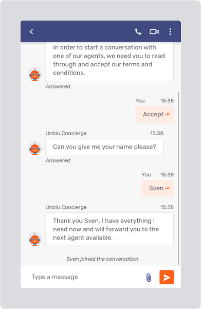
When you select Chat to a support agent, the conversation panel displays the chat panel. In the example below, the Unblu account has been configured in such a way that the concierge guides visitors through the onboarding process. If active, the concierge asks you some standard questions, such as what your name is, or which topic you need assistance with, before handing your chat request over to an actual agent. Unblu refers to this preparatory work to start a conversation as the onboarding process.
Queue status
Once you’ve completed the onboarding process, you can enter messages in the text field at the bottom of the chat panel and send them using the send message button 
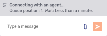
The messages you receive are shown in the same view, so you can review the entire conversation thread.
System messages
The conversation thread also contains system messages with information about what has happened during the conversation, for example when a participant joined or left the conversation, or when a participant launched a video call. In the picture of the onboarding process above, Sven joined the conversation is such a system message.
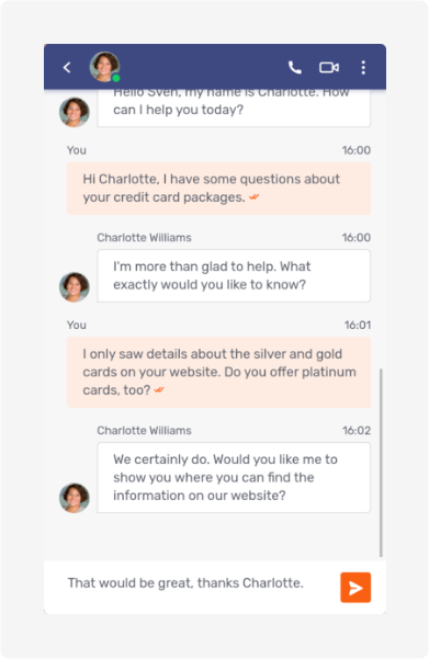
Blocked messages
If your message is blocked by a Message interceptor, the message is displayed with the notice Message blocked above it. The reason the message was blocked appears beneath the message text.
Blocked messages are always visible to the sender. Which other participants can see a rejected message depends on the rejection severity and the type of participant. For more information, refer to Rejection severity levels.
Copying a message
If you hover over a message, the copy icon 
Translating a message
If your counterpart in a conversation is writing in a different language, Unblu can be configured to translate their messages into the language of your locale. If Unblu does this automatically, you see the translated message straight away. The message has a label with a link to the original message and information about the language the original message is in:
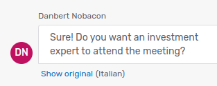
If messages aren’t translated automatically, hovering over a message that can be translated displays the translate icon 
Replying to a message
If it’s enabled for your user type, hovering over a message also displays the reply icon 
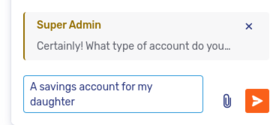
If you decide you don’t want to reply to an individual message after all, click the cross icon 
Once you send your reply, it appears in the conversation:
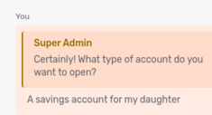
Above your reply, you can see the first sentence of the message you replied to. Clicking the sentence takes you to the original message so you can read it in its entirety.
| You can only reply to messages sent by participants in the conversation, including messages you sent yourself. You can’t reply to system messages. |
Deleting messages and files
If it’s enabled for your user type, hovering over a message or a file also displays the delete icon 
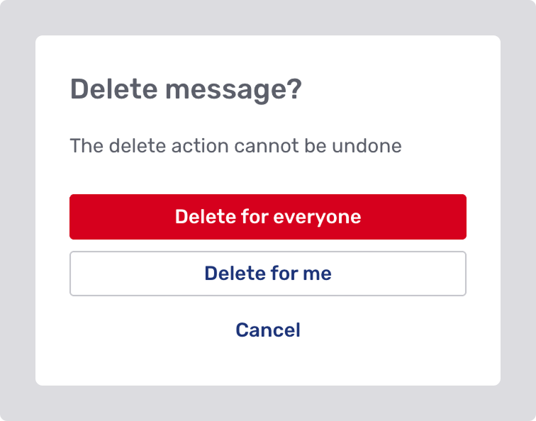
What you see in place of a deleted message depends on your permissions. It can be one of the following:
-
A collapsible section containing the deleted message’s content
This option always includes the placeholder text followed by a chevron
that can be clicked to reveal the content.
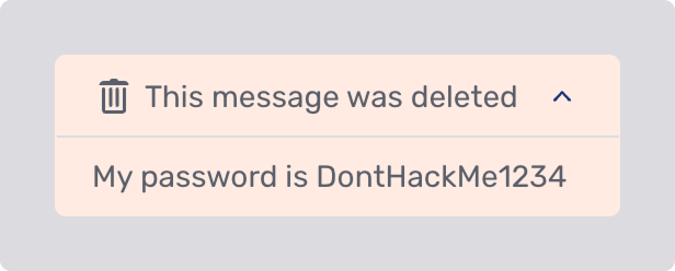 Figure 10. A deleted message placeholder with the deleted content displayed
 -
A placeholder only
 Figure 11. A deleted message placeholder
 -
A blank space, with no indication that a message existed. This happens when you don’t have permissions to see either the deleted content or the placeholder.
If you wish to delete all messages at once, this option may be available in Additional options menu.
Agent status
When you’re in a conversation with an agent who’s unavailable, you may see an information bar immediately above the message input field. The text in the bar tells you why the agent is unavailable.
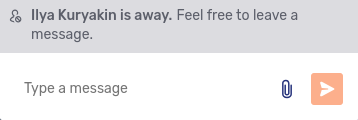
When there are multiple agents in the conversation and more than one of them is unavailable, the bar doesn’t state why they’re unavailable. Instead, it includes a link that opens a modal dialog where you can see why each agent is unavailable.
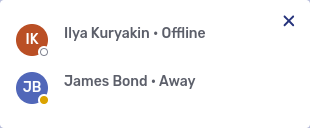
If you send a new message to a conversation with unavailable agents, the Unblu concierge may ask you whether you wish to invite the unavailable agent’s deputy to join the conversation. If you respond that you do, Unblu invites the unavailable agent’s deputies to join the conversation.
Additional Floating Visitor UI controls
Besides the controls necessary to read, write, and send messages, the messaging view has elements to access a number of other functions. Most of these controls are in the action bar above the message view.
| UI element | Function |
|---|---|
Return to the previous screen of the conversation panel. |
|
|
Show information on the other participants in the conversation. Only visible participants are shown. The badge in the lower right-hand corner of the avatar indicates that participant’s online status. Clicking a participant’s avatar displays more information about them. Depending on your permissions, it may also display actions you can execute, for example, removing the participant from the conversation. If there are more than five participants in a conversation, only the first four avatars are displayed. The fifth avatar sports a plus icon with the number of additional participants. Clicking it opens the list of additional participants.
|
Start an audio call in the conversation. |
|
Initiate a video call in the conversation. |
|
Display additional options (see below). |
One control is located in the message input area, between the text input field and the send message button.
| UI element | Function |
|---|---|
Send a file to share with the other participants in the conversation. The icon is only displayed if you haven’t entered any text in the text field. |
Return to previous screen
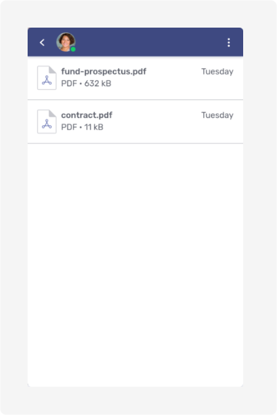
If you return to the engagement UI while you’re in a conversation, you see the current conversation listed at the top of the page:
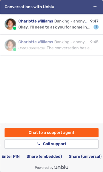
If active and archived conversations are shown in same list, then active conversations are shown in normal colors and conversations that have ended are grayed out. In the picture above, you can see one ended conversation and one active conversation.
If the overview displays active and archived conversations in separate lists, there will be two buttons above the list. The buttons allow you to switch between the lists of active conversations and conversations that have ended.
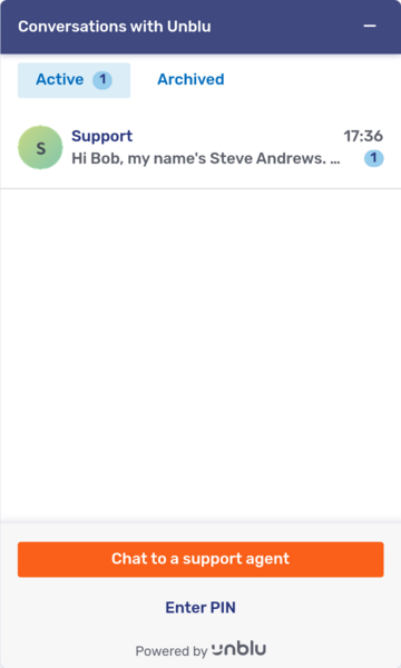
To return to an active conversation, simply click the conversation in the list. You can then continue the conversation.
If you click a conversation that has ended, you can review its contents and download any files that were shared in the conversation, but you can’t make any changes to the conversation.
Additional options menu
The additional options menu 
| Menu item | Function |
|---|---|
All shared files |
Opens the files view, which shows all the files shared in the course of the conversation.
This option isn’t available if you are already in the files view. |
Maximize UI |
Enlarge the conversation panel to fill the current browser tab. If the conversation panel is already maximized, this menu item is replaced by Minimize UI, which reverts the conversation panel to its default size and location in the browser tab. |
Collapse UI |
Hide the conversation panel completely, leaving only the launcher button visible. |
End conversation |
Start the offboarding process, which ultimately ends the conversation. Depending on how Unblu is configured, it may display a dialog asking you whether you really want to end the conversation. + By default, this option isn’t available to visitors. |
Delete all messages |
Delete all messages in a conversation, either for yourself only or for all participants. This also deletes system messages. |
| Which features are accessible in the additional options menu is configurable. You may have more or fewer options. |
Chat panel hints
The chat panel uses hints to point out things that might otherwise not be visible in the UI:
-
The Return to call hint is displayed when the visitor has returned to the conversation thread find a better term) while an audio or video call is in progress. Clicking the hint returns the visitor to the call view.
 Figure 16. Return to call hint
 -
When there are newer messages in the conversation thread that aren’t currently visible, Unblu shows the Jump to latest hint. Clicking the hint takes the visitor to the end of the conversation thread.
 Figure 17. Jump to latest hint
 -
When you aren’t at the end of the conversation thread and you receive a new message, Unblu displays the unread messages hint. The number of unread messages is displayed in the hint and as a badge on the launcher button.
 Figure 18. Unread messages hint
As with the jump to latest hint, clicking the hint takes the visitor to end of the conversation thread. Depending on how many unread messages there are, the visitor may not see the first unread message and may have to scroll up to read it.
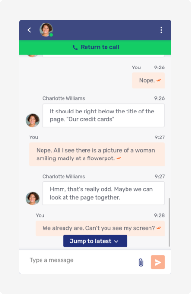
The picture below shows two of these hints in the chat panel at once. If there were unread messages, the chat panel would display the unread messages hint instead of the jump to latest hint.
Sharing files
The send file icon 
There are two other ways to upload a file to a conversation:
-
You can drag and drop it on the Floating Visitor UI
-
You can paste a file you’ve copied to your clipboard into the text input field of the Floating Visitor UI.
Once the file has been uploaded, it appears in the conversation thread.
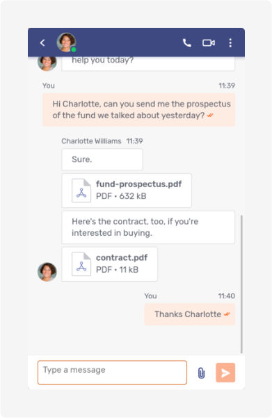
Hovering over a file displays a set of three icons:
| Icon | Function |
|---|---|
Open a document collaboration collaboration layer so the participants can view the file together. |
|
Download a copy of the file to your computer. |
|
Delete the file from the conversation. Any participant may delete any shared file, and doing so affects all the conversation’s participants. |
If the file is an image, Unblu displays a preview of the image (unless your administrator turned this feature off).
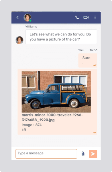
Transparent images are rendered with a white background.
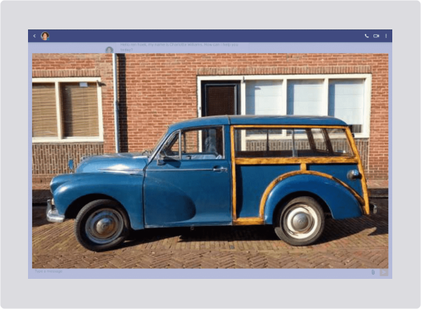
When you click the image, Unblu enlarges the image to fill the conversation UI.
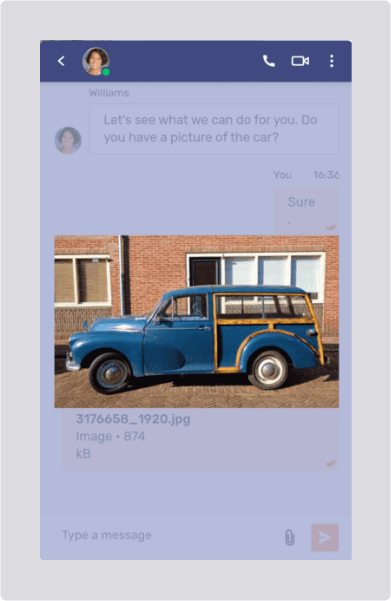
Of course, this is more useful if the conversation UI is maximized:
If the uploaded image is animated, the preview in the conversation sports a "play" button. Clicking the image enlarges it and plays the animation.
Hovering over the image displays the same icons as for other file types.
Call support and video call
Call support launches an audio call with your organization; Video call launches a video call. If the visitor has to go through an onboarding process—to ensure they’ve accepted the terms and conditions for the service, for example—the actual call starts once they’ve successfully completed the process.
Starting a call launches the call view. Since both audio and video calls use the call view, we discuss the two conversation types together, pointing out differences where they exist.
The picture below shows the call view of a call in progress.
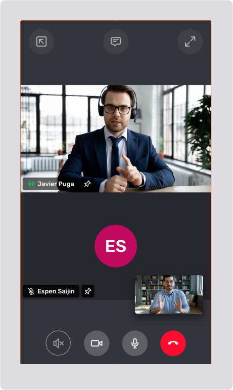
The main area of the call view is dedicated to the other people in the call. A video call may have up to six participants.
Video call participant information
In a video call, the main area displays the other participant’s video feeds, provided their camera is turned on. If their camera is turned off, or in an audio call, the main area displays the other participant’s avatar.
You can see the other participant’s view of yourself in a Picture-in-picture (PiP) window in the call view’s main area. By default, the PiP window is displayed in the lower right-hand corner, but you can move it elsewhere in the call view.
Each participant’s video stream or avatar sports a label that displays the participant’s name and a microphone icon 


The pin icon 
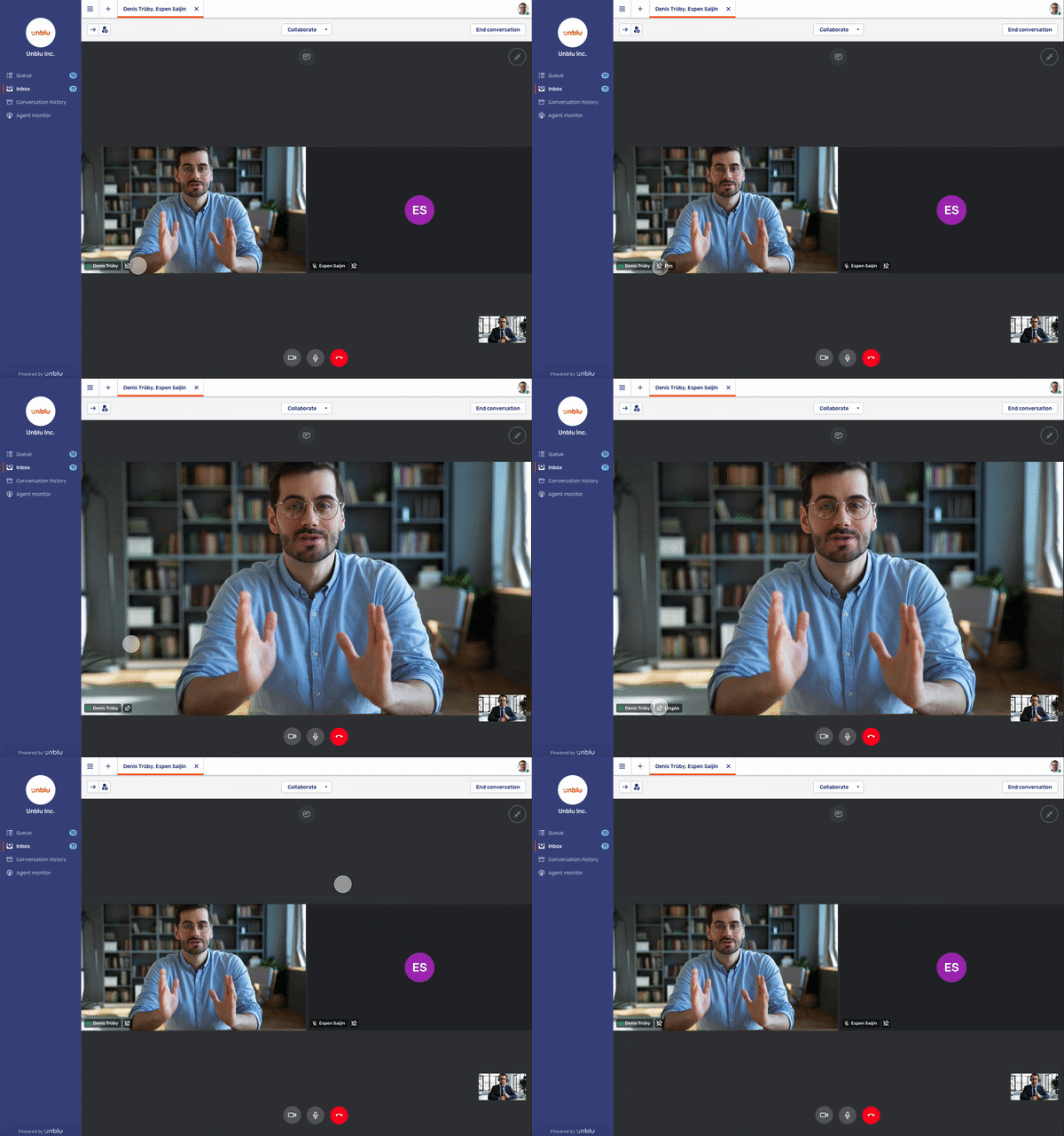
In a pinned video stream, the pin icon is replaced by the unpin icon 
Call view controls
The call view provides visitors with a number of new controls. These controls are distributed between two action bars above and below the main area of the call view. Depending on how Unblu is configured, some controls may be in the overflow menu 
| Control | Function |
|---|---|
Answer an incoming call. This control is no longer available once you have answered a call. |
|
Open the call view in a separate window. Once the call view has opened in a new window, the control is replaced by the close pop-out icon Closing the window doesn’t end the call or the conversation. When the call is open in a separate window, the launcher button displays the dock call to original window icon, too. If you accidentally close the new window, you can return to the call by clicking the launcher button on the original page. |
|
Open the messaging view. If you receive any messages during a call, the icon will have a badge displaying the number of unread messages in the conversation. Since opening the chat panel hides the call view, Unblu displays the Return to call hint (see above) to remind users that they’re still in a call. |
|
Displays the first tab of the media settings dialog, where you can choose which camera, microphone, and speakers to use for the call. On a second tab, you can configure the closed captions for the call. If Unblu doesn’t yet have access to one of the media devices, the dialog displays a button to grant Unblu access. If the closed caption controls are enabled, there’s a second settings icon labelled Caption settings in the main area of the call UI. Clicking it directly opens the media settings on the Closed captions (cc) tab. |
|
Maximize the call view so that it takes up the entire browser tab. This control isn’t available when the call view has been popped into a separate window, since in that case, the call view already takes up the entire window. When the call view is maximized, the control is replaced by the minimize icon |
|
Toggle the camera: if the camera is off, it turns it on. If the camera is on, it turns it off. When you start a video call, the camera is on by default. When you start an audio call, the camera is off by default. Visitors can, however, turn it on and convert the call to a video call. The icon to the left is shown when the camera is on. When the camera is off, the icon’s colors are slightly muted, and the icon is crossed out |
|
Toggle the microphone: if the microphone is off, it turns it on. If the microphone is on, it turns it off. The microphone is on by default when you start a call, be it an audio or a video call. The icon to the left is shown when the microphone is off. If the microphone is on, the colors of the icon are slightly brighter, and the icon isn’t crossed out |
|
Take a screenshot of the video stream. The snapshot is posted to the conversation’s chat. |
|
Cycle through the different cameras available on a system. The control is only displayed on mobile devices with more than one camera. |
|
Toggle background blurring: if background blurring is off, it turns it on. If background blurring is on, it turns it off. Whether background blurring is on or off by default depends on the configuration of Unblu. The icon to the left is displayed when background blurring is off. If background blurring is on, the icon includes a no symbol in the lower right-hand corner |
|
Leave the call. Depending on how Unblu is configured, you may be presented with a menu that lets you choose how leaving the call should affect the conversation. There can be up to four options: * Leave call: you leave the call, but the conversation continues. * Leave call and conversation: you leave the call and the conversation. You no longer have access to the call or the conversation. * Leave call and end conversation: you leave the call and end the conversation. You no longer have access to the call. The conversation ends for all participants. You have access to the ended conversation. * Leave call and close conversation: you leave the call and close the conversation. The visitor UI displays the conversation overview. You no longer have access to the call. You still have access to the conversation. |
| With the exception of the media settings, the controls are functional even before an agent answers the call. |
Allowing access to the microphone and camera
Once an agent answers your call, be it an audio or a video call, your browser usually asks for permission to access the camera and microphone on your computer. It does so by displaying a message similar to the one below:
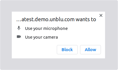
If you don’t grant the browser access to the camera and microphone, Unblu displays a modal dialog:
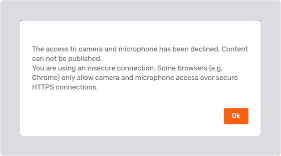
However, the call proceeds, and you will be able to hear the agent.
| If you accidentally deny access, many browsers provide a means of granting access after denying it. How to do so is beyond the scope of the Unblu documentation. |
Selecting specific media devices
If your computer has multiple media devices—cameras, microphones, or speakers—you can use the media settings dialog to specify which of them Unblu should use. Click the media settings icon 
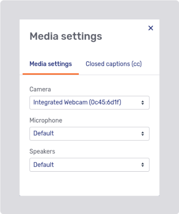
If Unblu doesn’t have access to a device, the media settings dialog provides a button for you to request access:
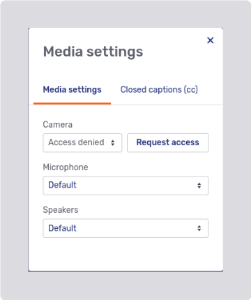
If you blocked access to a device on the page you launched the call from, clicking the Request access button displays a message asking you to grant access to the device in your browser permissions.
For information on granting access to a device after blocking it, refer to the documentation for your browser:
The dialog only displays device types that are allowed in the type of call you’re in. If you can’t turn your camera on in an audio call, for example, the dialog doesn’t list the camera.
Closed captions
The media settings dialog also has a tab to configure closed captions:
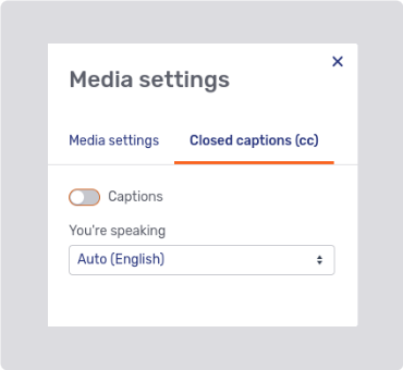
When a visitor enables closed captions, they must specify the language they’re speaking in. If they select the wrong language, Unblu isn’t able to interpret what they’re saying and can’t display captions.
Enabling captions also displays the Translate toggle.
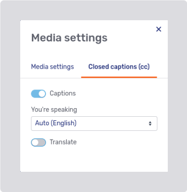
Activating it lets the visitor choose the language they want to see captions in.
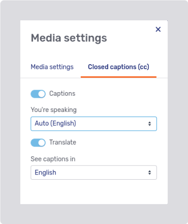
The visitor’s selection is applied to both their own statements and those of the other participants.
When captions are translated, the original language they’re translated from is shown above the caption.
Call connection status
If there are connection issues with the call you’re in, Unblu automatically tries to reconnect you to the call. In the case of a temporary connection issue, Unblu displays a label with the disconnected icon 
If Unblu is unable to reestablish a connection, the disconnected icon is displayed in the center of the call UI, along with a message that the connection to the call was lost. In the background, Unblu attempts to create a new connection to the call.
Enter PIN
Enter PIN allows you to join a conversation initiated by an agent.
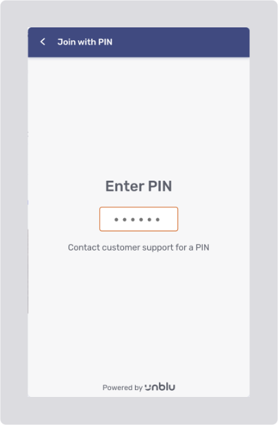
The agent provides you with a PIN, for example on the phone, and you enter the PIN in the Floating Visitor UI. The PIN is validated once you enter the last digit.
If you enter an invalid PIN, an error message appears beneath the field:
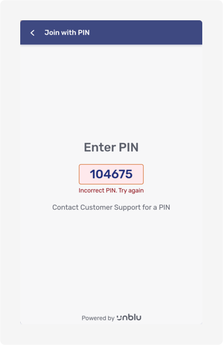
If, on the other hand, you enter the correct PIN before it expires, collaboration starts immediately.
The kind of collaboration that starts is determined by the type of invitation the agent created with the Plus icon menu in the Agent Desk. In the picture below, the agent invited the visitor to join an embedded co-browsing session. Note the green frame around the tab being shared.
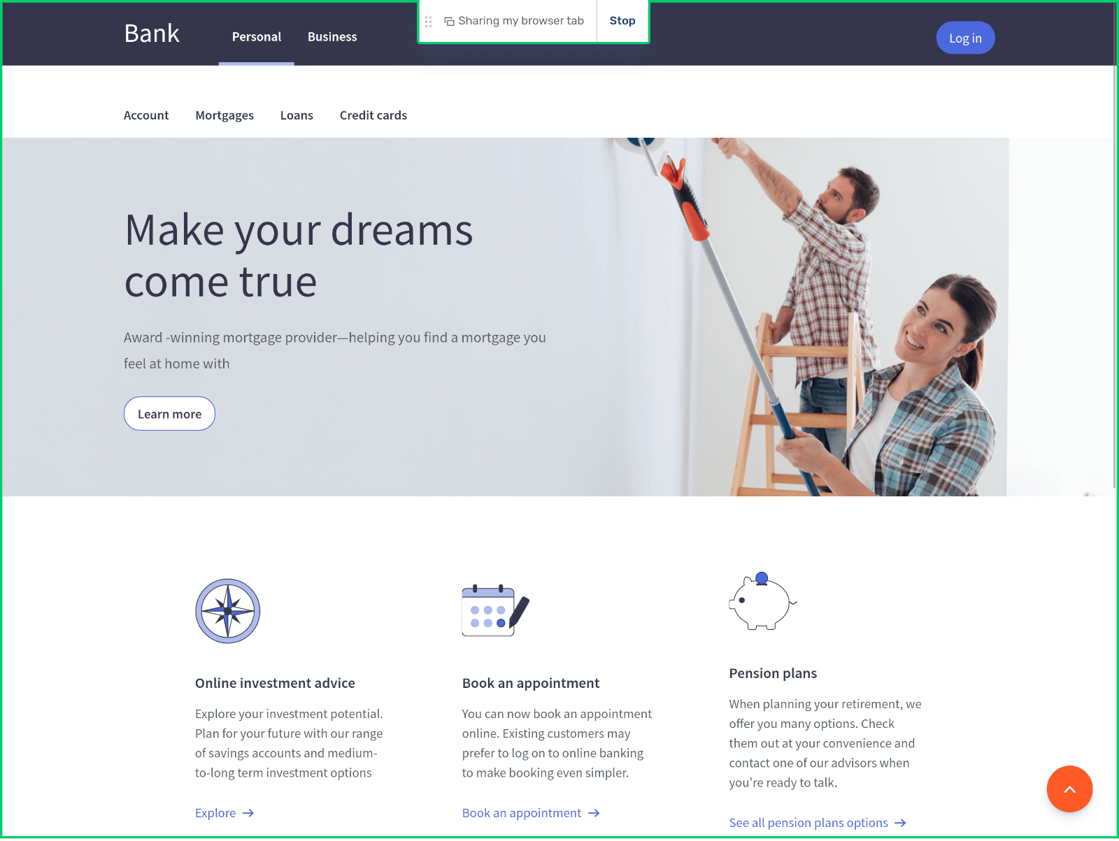
At the top of the screen, the collaboration control states what’s being shared and who is sharing it. If you are the one sharing content, the control element provides a button to stop sharing.
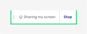
The nubs on the left of the collaboration controls allow you to move the controls if they’re in the way. Simply grab them with the cursor and move the controls to the left or right. Release them once you happy with the new location of the controls.
If you are collaborating on an embedded co-browsing session, the Floating Visitor UI is collapsed, but you can open it and send messages. What’s more, the Floating Visitor UI doesn’t appear on the agent’s view of the website you are co-browsing, so they can still see the whole of the page you are on, even if you are typing them a message.
| If you stop collaborating, the conversation continues. Only the collaboration layer is shut. |
Multiple collaboration layers
It’s possible to collaborate in different ways at the same time. For example, you could share your browser tab with an agent while they share their screen with you. You can only ever see one of the collaboration layers at any one time. However, running more than one collaboration layer simultaneously makes it easier to switch between them.
When there are multiple collaboration layers active in a conversation, you see a dropdown menu with the active collaboration layers in the collaboration control. The collaboration layer currently in view is the shown in the collaboration control:
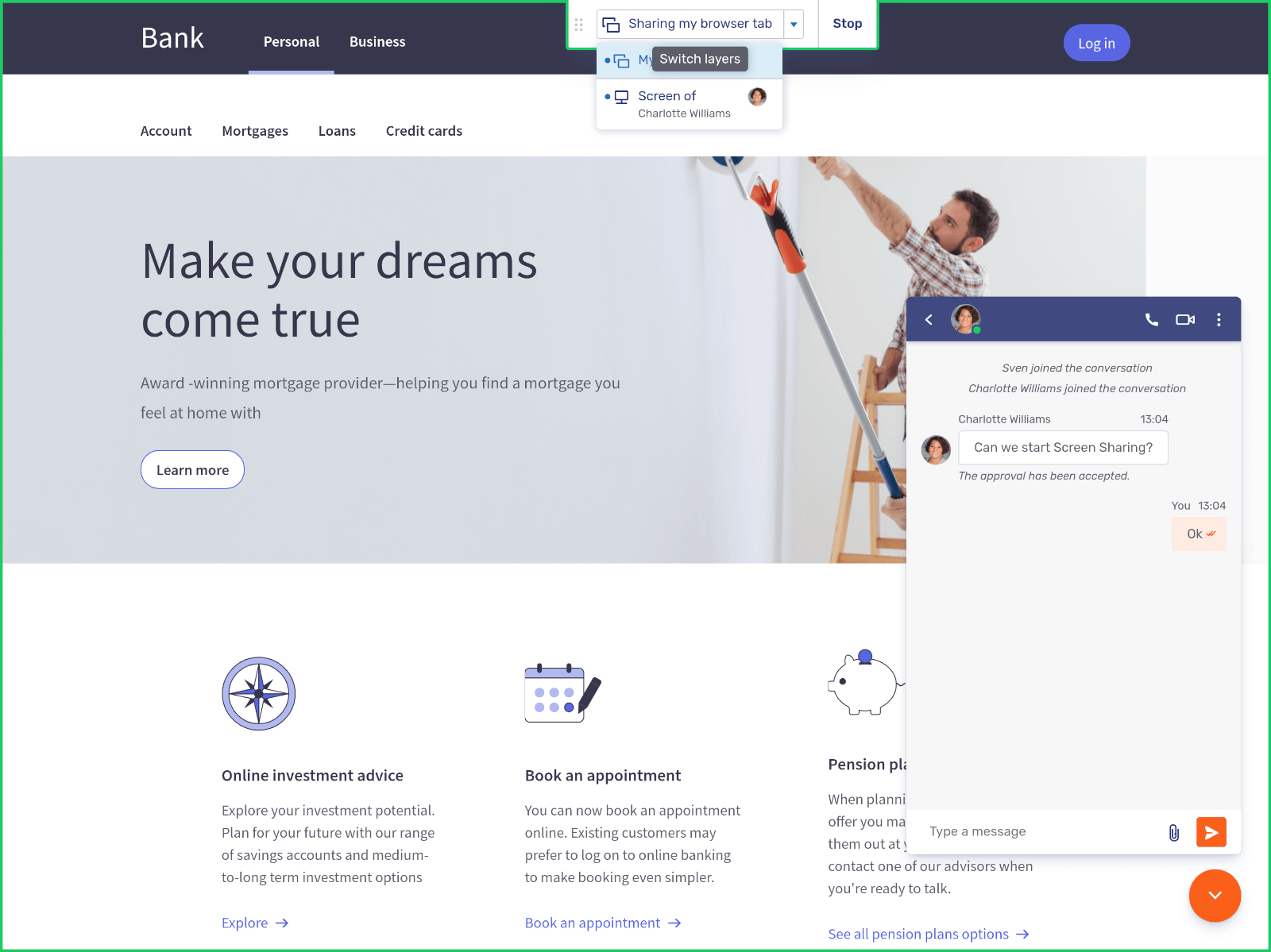
In the example above, there are two collaboration layers, an embedded co-browsing layer and a screen-sharing layer. The embedded co-browsing layer is the one currently visible in the collaboration space: its menu entry is highlighted with a shade of blue.


