Agent Desk guide
The Agent Desk is the principle interface for your organization’s agents to engage with visitors using Unblu. It also provides features for Supervisors to monitor and organize agents and teams.
This guide aims to give you a good working knowledge of the Agent Desk’s features. Once you’ve read through this guide, you can focus on engaging with visitors, instead of trying to work out how to do so.
| Depending on the configuration your organization chose to implement, the look and feel of the interface may differ from the pictures in this guide. Additionally, some functions may not be available if your organization hasn’t licensed them. However, you should have no difficulties applying the explanations in this guide to your particular circumstances. |
Login
To access the Agent Desk, agents must be authenticated. Unblu offers a variety of ways to authenticate users. One way is a traditional login form that asks for your username and password, but your organization may have opted for a different authentication method.
For more information on the various authentication methods available, refer to Authentication and single sign-on (SSO) in self-hosted and on-premises installations.
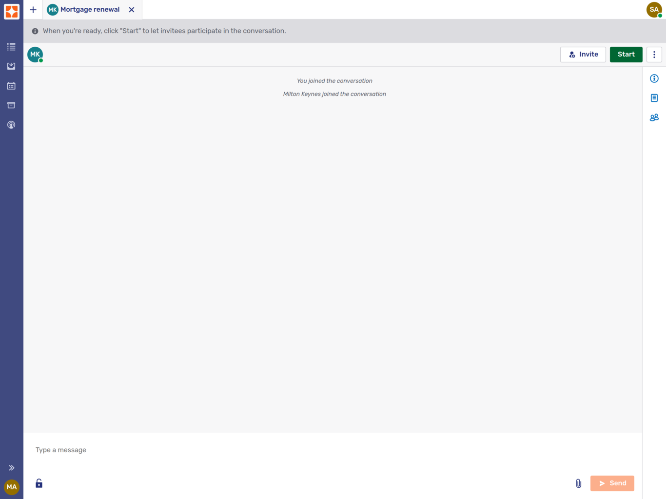
Agent Desk layout
The Agent Desk is made up of three areas:
-
The top bar holds the tabs of all the conversations you’re currently participating in as well as the Plus icon menu and the Agent Desk user menu.
-
The sidebar provides access to the queue, the inbox, your scheduled conversations, the conversation history, and (for supervisors and administrators) the agent monitor. If enabled by your organization, you can also access the customer view.
-
The main content area is where conversations, collaboration layers, calls, and other content are displayed.
Top bar
The top bar provides a number of useful features.

-
The plus icon menu
 can be used to start various types of conversation. The contents of the menu depends on how Unblu is configured.
 -
If your organization has enabled full-text search, the search icon
 opens a tab where you can search for messages in conversations that are accessible to you:
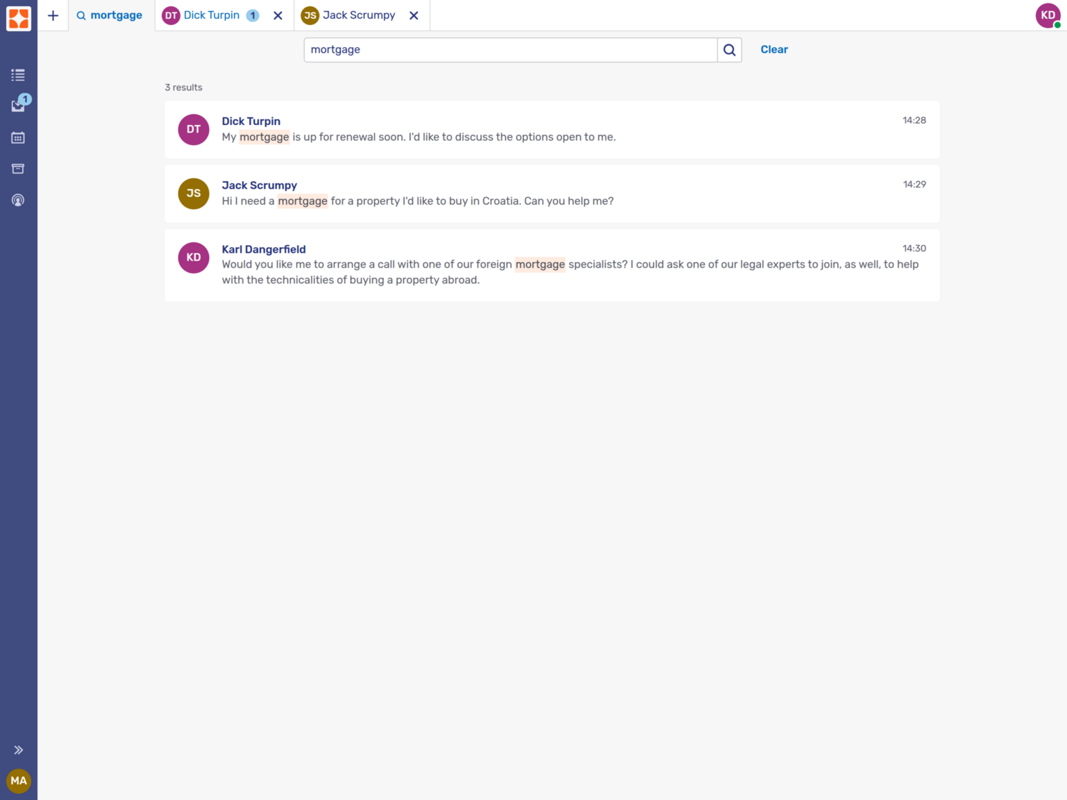 Figure 2. Search tab with search results
The search only takes into account the text used in messages. You can’t use full-text search to search for participants or conversation topics.
-
Next to the search icon (or the plus icon) is a tabbed list of your open conversations. The tab of the active conversation is a darker shade of grey than the other tabs. The tabs of conversations with unread chat messages sport a badge with the number of unread messages.
Each tab has a Close button
 . Clicking it closes the conversation tab but it doesn’t end the conversation. The conversation continues and is accessible from the appropriate navigation sidebar entry.
 -
With automatic request dispatching enabled, the top bar contains a switch that allows agents to signal when they’re available to accept incoming conversations.
-
Finally, your avatar displays your current online status and provides access to the Agent Desk user menu.
Your avatar may sport a badge indicating whether you’re online. To disable these badges, refer to Disabling availability badges.
Plus icon menu
The plus icon in the top bar allows you to start various types of conversation. Which types of conversation you can start depends on your organization’s use of Unblu Spark.
Join embedded co-browsing, Join screen sharing, and Join mobile co-browsing all open a modal dialog showing a PIN that you can share with a visitor to launch a conversation in Unblu:
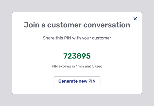
PINs can only be redeemed for a certain period. The dialog includes a countdown showing how much time remains to redeem the PIN.
If the PIN isn’t redeemed it expires. When this occurs, the dialog below appears:
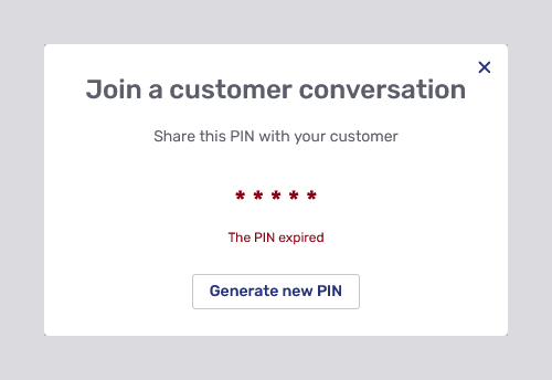
It’s always possible to generate a new PIN by clicking Generate new PIN. Generating a new PIN automatically invalidates the previous PIN.
Show universal co-browsing invite and Show screen both open a conversation panel with a new conversation. In both cases, you must invite users to join the conversation. Do so with the Invite button in the control bar beneath the top bar.
The type of conversation that’s created when a user enters the PIN depends on which option you selected in the plus icon menu:
-
Join embedded co-browsing launches a conversation with embedded co-browsing.
-
Join screen sharing launches a conversation with screen-sharing on the user’s side. The user must choose whether they want to share a particular application window or their entire screen with you.
If they choose not to share anything with you, the conversation continues as a live chat.
-
Join mobile co-browsing launches a conversation with mobile co-apping.
-
Show universal co-browsing invite launches a conversation with universal co-browsing on the agent’s side. Just like other users, you can choose what to share in the co-browsing session.
-
Show screen launches a conversation with screen-sharing on the agent’s side.
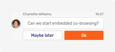
Embedded co-browsing invite and Mobile co-browsing invite are initiated by an agent for an authenticated visitor. The conversation window opens automatically on the visitor’s device. Once the visitor accepts the request, an embedded or mobile co-apping session begins.
This feature removes the need to share or enter a PIN, simplifying the process for both agents and visitors to start collaborating seamlessly. As a result, agents no longer need to guide the visitors to the PIN entry field, which was often time-consuming.
| The choice you make in the plus icon menu isn’t final. You can switch between types of conversation after the initial selection. For example, you might select Join embedded co-browsing to see a visitor’s view of your organization’s website, but later need to launch document collaboration to review a file together. |
Starting outbound conversations
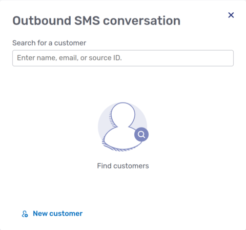
To start an outbound conversation, select the appropriate conversation template from the plus icon menu. When you do, Unblu opens a modal dialog where you can search for the visitor you want to start a conversation with:
By default, you can search for customers by the following criteria:
-
First name
-
Last name
-
Nickname
-
Username
-
Email address
-
Source ID
Unblu only displays customers that meet the following criteria:
-
You’re allowed to see them according to their labels and the visibility rules in place.
-
If you want to start an outbound conversation that uses an external messenger such as WhatsApp, the visitor must have a contact registered for that messenger. For example, if you want to start an outbound conversation using SMS text messaging, the visitor must have a phone number registered to be used with that external messenger.
If your search comes up empty, you can still start an outbound conversation by clicking the New customer action at the bottom of the modal dialog. This opens the New customer modal dialog for the Anonymous customer type:
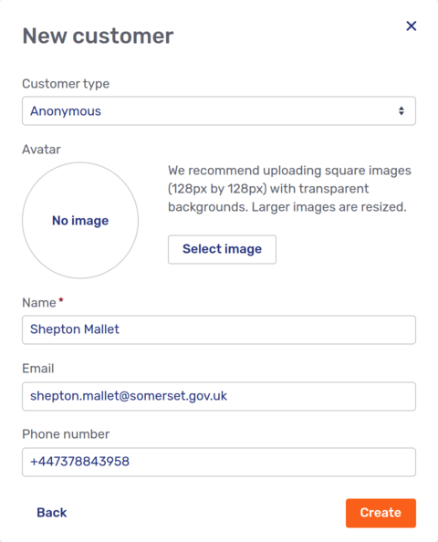
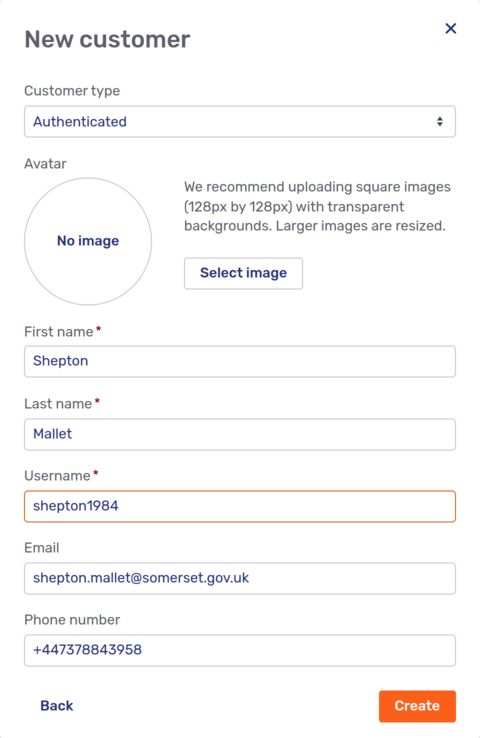
If you want to start a conversation with an authenticated customer, switch the Customer type from Anonymous to Authenticated. The modal dialog then looks like this:
What happens next depends on the channel that’s linked to the template you selected.
-
If the conversation uses the Unblu chat feature, you’re taken to the Start conversation modal dialog:
 Figure 6. Modal dialog to start an outbound conversation
The dialog lets you customize the conversation further. You can:
-
Enter a topic for the conversation.
-
Specify the conversation’s language.
-
Add agents to the conversation. These agents can be visible to the customer or hidden from them.
Agents you add here aren’t invited to the conversation. Instead, they join the conversation as soon as you click Start conversation.
These customization fields may be mandatory, optional, or hidden, depending on how the conversation is configured. The default values for the fields are:
-
The topic is empty
-
The conversation language is the agent’s language in Unblu
-
No additional agents join the conversation automatically when it starts
These values are applied if the fields are optional and left unchanged, and if they’re hidden. The topic and language can be modified during the conversation, and additional agents can be invited at any time.
-
-
If the conversation uses an external messenger, the next step depends on whether the customer you selected already has a connection with the external messenger used by the template you selected.
-
If the customer doesn’t have a connection yet, Unblu takes you to the Add connection modal dialog. The fields of the dialog depend on the information required by the external messenger you’re connecting the customer to. The screenshot below shows the Add connection dialog for an SMS external messenger:
 Figure 7. Modal dialog to create a new connected messenger
 -
If the customer already has a connection, Unblu displays the Connected messengers modal dialog:
 Figure 8. Modal dialog to select a connected messenger
The dialog lists all the connections the customer has to the external messenger used by the template you selected. To create a conversation using a particular connection, click its New button. (If the external messenger only allows one connection per customer—this is the case for SMS text messages and WhatsApp, for example—and there’s already an ongoing conversation using that external messenger, you see a link to the current conversation instead of the New button.)
The connection’s kebab menu
 lets you remove the connection or link it to another person.
Once you’ve selected the connection you want to use for the conversation, Unblu displays the Start conversation dialog discussed above.
-
Queue
The queue displays all conversations that you could join as the assigned agent. Each item in the queue contains useful information about the conversation:
-
The visitor’s name
-
The last message entered in the conversation
-
Where the visitor started the conversation, for example, the URL of the page they were on
-
How long the visitor has been waiting
-
The visitor’s approximate location
-
The conversation source: Browser, Unblu Branch, External messenger, or Mobile SDK
-
The operating system and browser the visitor is using
Above the queue, you can see how many conversations are waiting in the queue, and the average time visitors' conversations have been waiting in the queue.
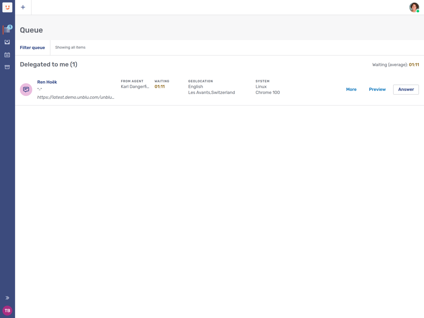
The picture below shows a queue with just one waiting conversation. The toast in the lower left-hand corner of the Agent Desk appears when a request is added to your queue.
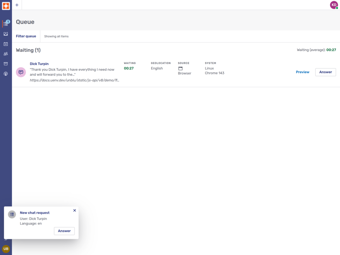
The icon to the left of the visitor’s name indicates the type of conversation request.
| Icon | Request type |
|---|---|
|
Chat request |
|
Audio call request |
|
Video call request |
|
Co-browsing request |
|
Screen sharing request |
|
Whiteboard request |


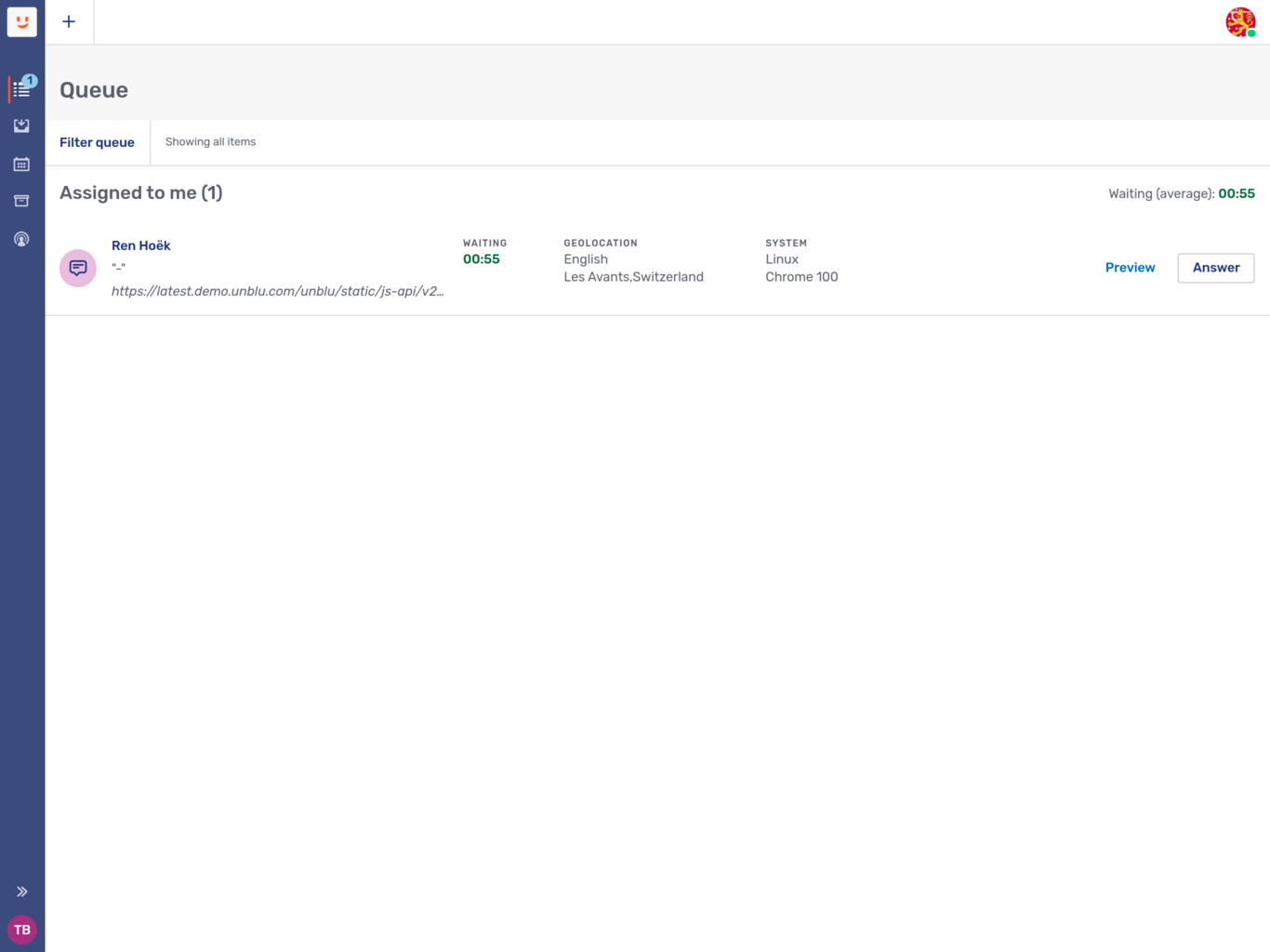
Conversation requests addressed to you personally are listed under the heading Assigned to me:
If you’re another agent’s deputy and they didn’t respond to a personal conversation request, the delegated conversation is listed under the heading Delegated to me:
Queue filters
The queue provides filters for named areas and languages. You can select multiple named areas and languages by which to filter your queue.
To filter the queue, click Filter queue, which is located above the queue. This opens a modal dialog where you can select the filters to apply to the queue. To confirm your selection click Apply, then click OK to apply the filter to the queue.
Manual request dispatching
If your organization uses manual request dispatching, each conversation in your queue has an Answer button and a Preview button.
When you click the Answer button, you join the conversation.
-
If there’s no other agent in the conversation, you join as the assigned agent.
-
If you were invited to join the conversation by another agent, you join as a secondary agent.
In this case, the queue item also has a Decline button. Clicking it declines the invitation.
The Preview button lets you see what’s happened so far in a conversation without actually joining it. The picture below shows what a conversation preview might look like. Note the blue banner beneath the top bar stating You are previewing this conversation.
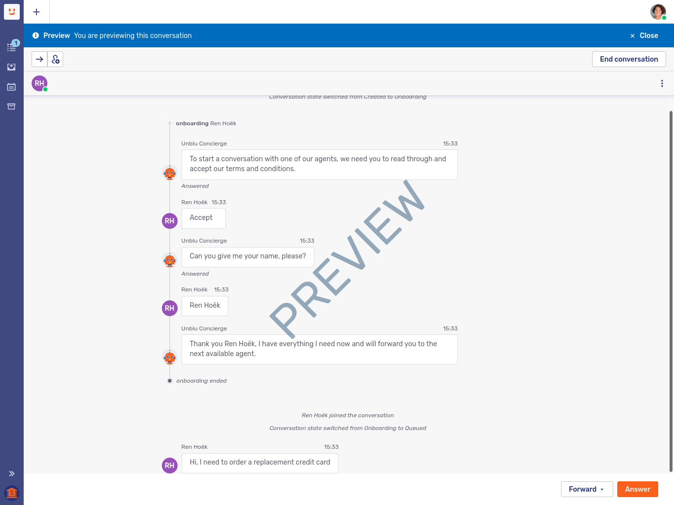
There are two buttons at the bottom of the preview:
-
The Answer button lets you join the previewed conversation without returning to the queue. It has the same effect as clicking the Answer button on the conversation item in the queue.
-
The Forward menu lets you forward the conversation to an agent, team, or named area without joining the conversation.
To close the preview, click Close in the banner above the conversation.
| In the preview, the buttons in the control bar are disabled. |
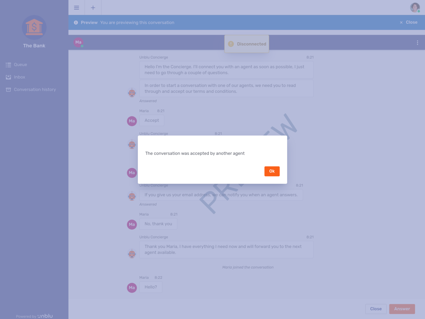
If another agent answers a conversation while you’re previewing it, Unblu informs you in a modal dialog and disconnects you from the conversation:
For more information on the options available once you answer a conversation, refer to Conversation panel below.
Automatic request dispatching
Automatic request dispatching is a way for your organization to automate the conversation assignment process. Rather than choosing which conversation requests to answer, Unblu reserves conversation requests for you.
This is what the queue looks like in the Agent Desk when automatic request dispatching is active:
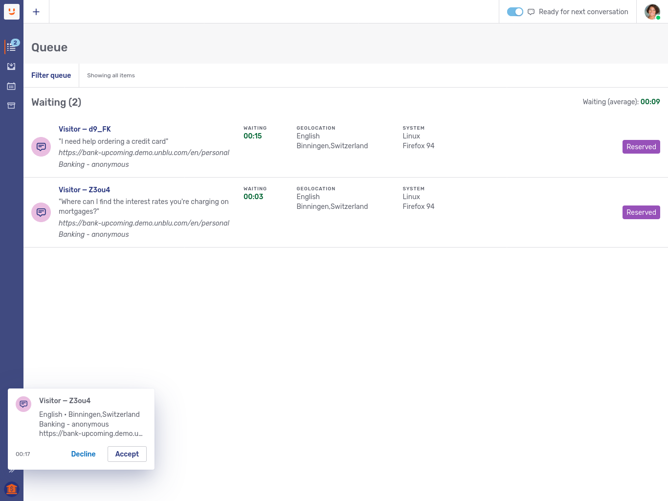
-
To the left of your avatar in the conversation bar, you see a switch labeled Ready for next conversation. By activating the switch, you inform the dispatch mechanism that it may reserve conversation requests for you.
-
In the queue, the conversations sport a Reserved label. (This label is applied to all reserved conversation requests, not just requests reserved for you.)
-
There are no buttons to Accept or Decline the conversation from the queue. There is also no way of previewing the conversation.
If you’re available for conversations, the dispatcher assigns you and your coworkers conversations in turn, up to your maximum number of active conversations. When it reserves a conversation for you, a toast appears in the lower left-hand corner of the Agent Desk. The toast includes buttons for you to accept or decline the conversation and a countdown showing how much time remains for you to do so.
If you decline a conversation request, your status is set to unavailable. You have to flip the Ready for next conversation switch for Unblu to assign you requests again.
If the reservation timed out, Unblu shows a modal dialog explaining that it’s set your status to unavailable. If you click OK, your status remains unavailable. Alternatively, you can set your status to available again by clicking Take next.
Inbox
Once you’ve been authenticated, the Agent Desk opens in the inbox view.
The inbox provides access to all the conversations you’re currently participating in. Depending on your organization’s Unblu configuration, it may also give you access to conversations you or your team have been invited to, and to conversations forwarded to you or your team. By default, your conversations are grouped on three tabs, My Conversations, Secondary Conversations, and Forwarded.
-
My Conversations lists conversations where you are the assigned agent. It may also list conversations forwarded or delegated to you or your team.
-
Secondary Conversations lists conversations where you are a secondary agent. It may also list conversations you or your team have been invited to join as secondary agents.
-
Forwarded lists conversations that you have forwarded but that haven’t been accepted by another agent yet. Once the forwarding is redeemed by another agent, the forwarded conversations no longer appear here since you are no longer a participant.
The Forwarded tab never lists conversations forwarded to you.
Each conversation listing provides several useful pieces of information about the conversation:
-
The names of the other participants in the conversation
-
The status of the conversation’s other participants, that is, whether they’re online or not
-
The last message of the conversation
-
The time the last message was transmitted
-
The number of messages you haven’t read yet, if there are any
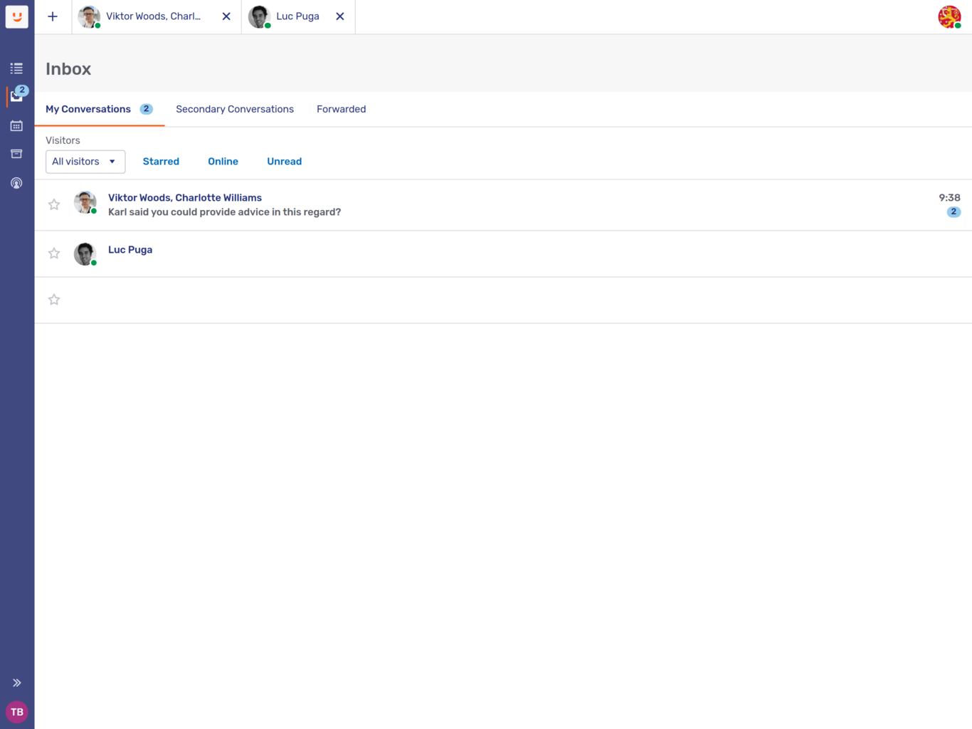
In the picture above, the agent is the assigned agent in two conversations, one with Viktor, one with Luc. The green badge on each visitor’s avatar shows that they’re online. The badge on the My Conversations tab indicates that the Agent has two unread messages. They’re both in the conversation with Viktor and Charlotte.
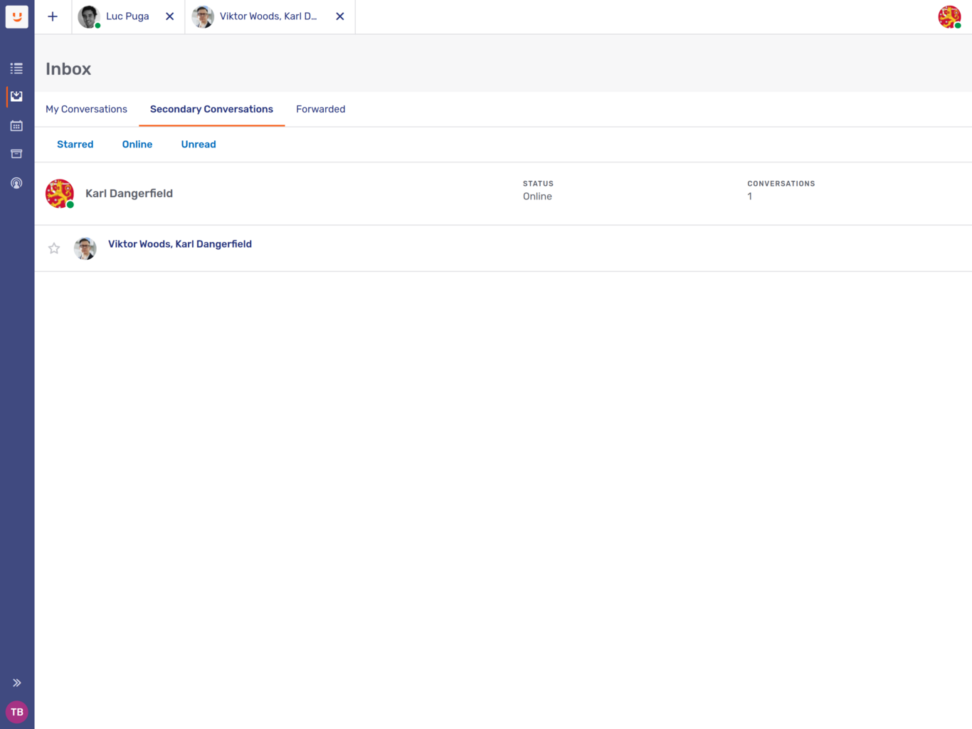
In the picture of the Secondary Conversations tab below, the Agent Karl has invited the Agent to join a conversation with the client Viktor Woods. Karl is online (as indicated by the green badge), but Viktor isn’t. In the top bar of the Agent Desk, you can also see two open conversations, one with Luc, one with Viktor and Karl.
To reopen a conversation, click its listing in the inbox.
For more information on the options available once you answer a conversation, see the section Conversation panel below.
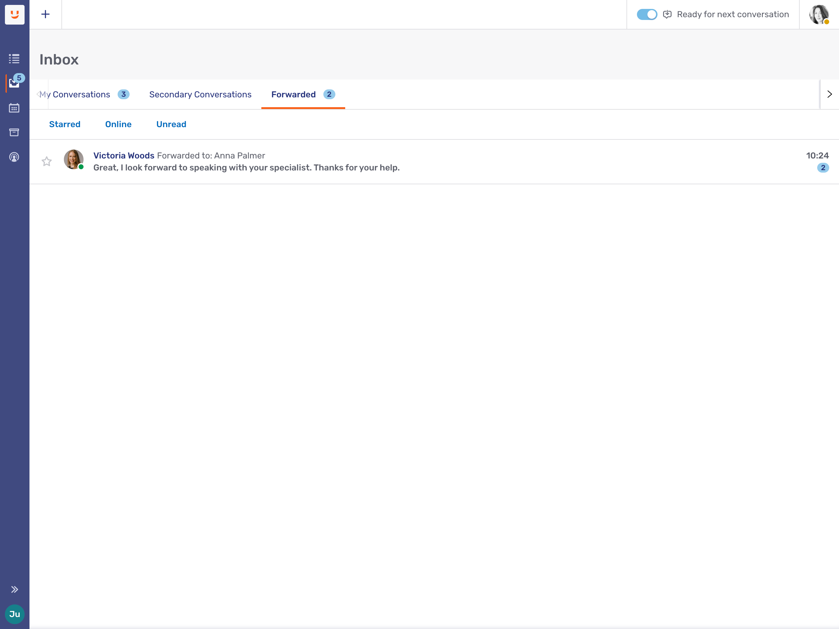
In the picture of the Forwarded tab below, the assigned agent has forwarded a conversation with the visitor Victoria Woods to the agent Alex Palmer. As soon as Alex Palmer redeems the invitation, the original assigned agent’s participation in the conversation ends and the conversation is removed from the list of conversations in their Forwarded tab.
The Inbox menu item in the sidebar sports a badge which displays the sum of unread messages in the My Conversations, Secondary Conversations, and Forwarded tabs.
Inbox filters
Each of the inbox tabs has a number of filters above the list of conversations. These allow you to limit the conversations you see to those that satisfy certain conditions.
If, for example, you were looking for an ongoing conversation with a client who contacted you via WhatsApp, you could use the Channels filter to display only WhatsApp conversations. Alternatively, you could use the Visitors filter to display only the conversations with that particular client.
On the My Conversations tab, you can look for secondary agents with the Agents filter. On the Secondary Conversations tab, the same filter allows you to search for the assigned agent of conversations that you’re participating in as a secondary agent.
Finally, there are three predefined filters:
-
The Starred filter shows only conversations you have starred with the star icon
 to the left of the participants' avatars.
 -
The Online filter only shows conversations where the context person is online.
-
The Unread filter only displays conversations with messages that you haven’t read yet.
You can combine filters to reduce the number of conversations displayed even further.
Conversation broadcast
Conversation broadcasts are a way to send the same message to multiple conversations. This is useful if, for example, you want to inform several clients of an investment opportunity.
If the broadcast feature is enabled, you see a Select option next to the filters. Clicking it lets you select conversations to broadcast a message to. To do so, check the appropriate boxes that appear to the left of each conversation.
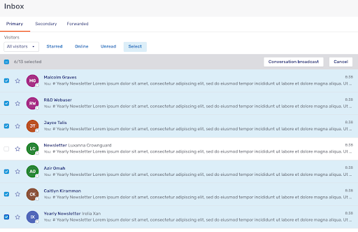
Note that you can only select conversations within a single inbox tab. You can’t include primary and secondary conversations in the same broadcast, for example.
Once you’ve selected the conversations you want to include in your broadcast, click Conversation broadcast in the bar that appeared above the list of conversations. This opens the broadcast form:
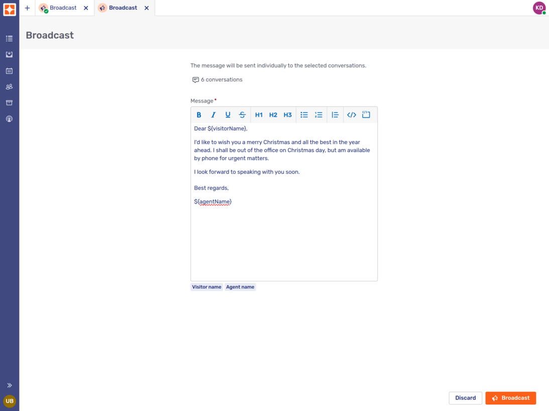
Write your message. If you aren’t normally able to apply formatting to your messages, you should avoid doing so here, too.
Beneath the text input field there are two placeholders, one for the customer’s name, one for yours. Use them to add a small personal touch to the message.
Once you’ve finished, click the Broadcast button  to begin broadcasting.
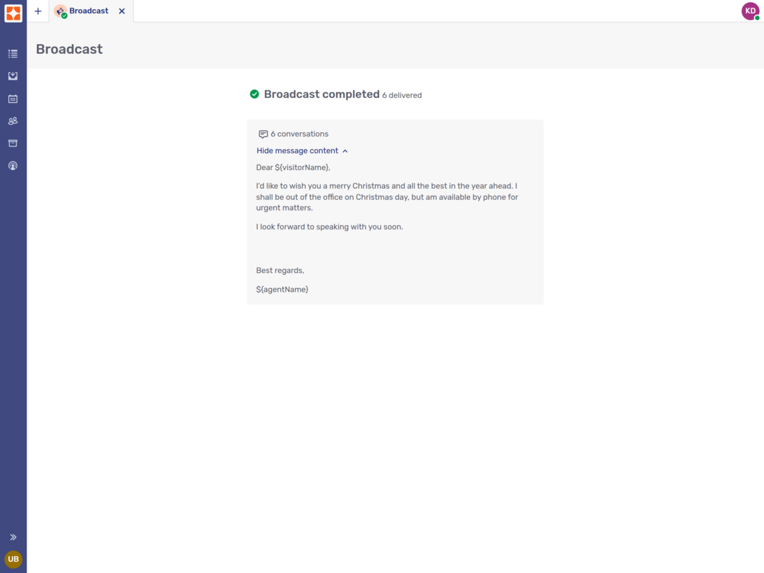
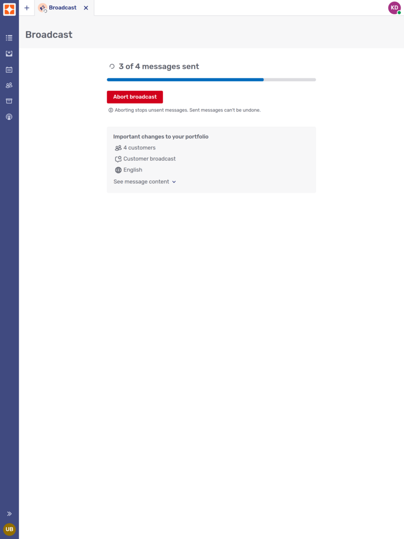
During the broadcast, Unblu displays an Abort broadcast button. If you click it, any deliveries that haven’t been completed yet are canceled. Delivered messages are left untouched.
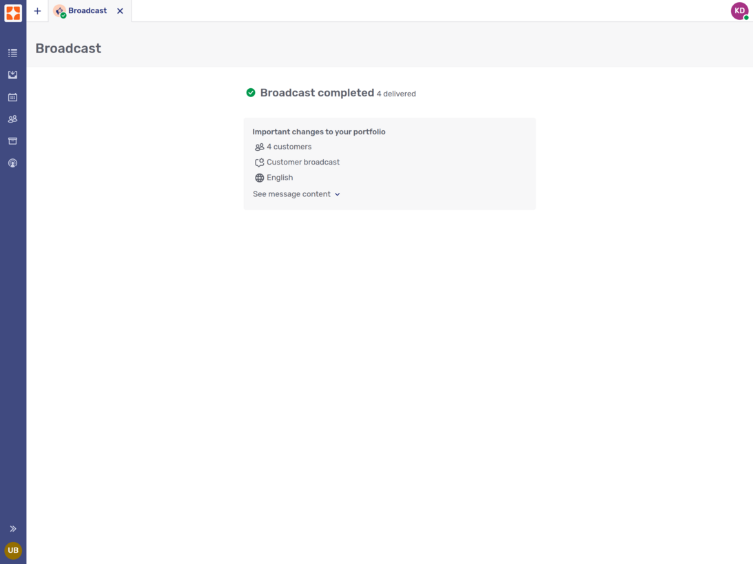
When Unblu has completed the broadcast, it displays a result page. The page tells you how many messages were delivered. By default, the content of the message you sent is hidden. To display it, click See message content.
If your message was delivered to all the recipients you selected, the page looks like this:
If Unblu was unable to complete the delivery for certain conversations, those conversations are listed on the result page.
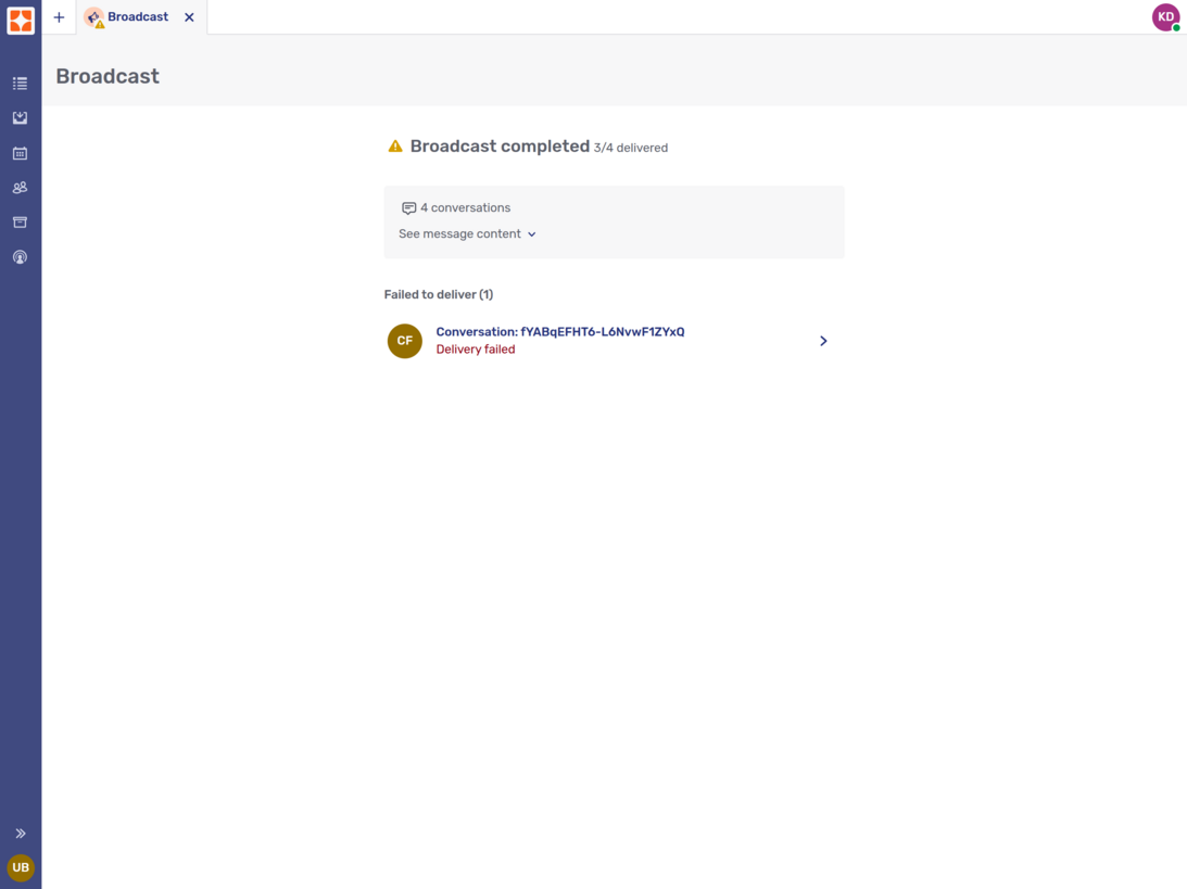
Clicking a conversation opens it in a new Agent Desk tab.
Scheduled conversations
Scheduled conversations are conversations that you set up to start at a certain time in the future.
Overview
Clicking the Scheduled conversations entry in the navigation menu on the left opens the overview, which contains two tabs:
-
The Upcoming tab lists all the scheduled conversations you organized with a scheduled start time in the future. This includes conversations that you started before their scheduled start time, if the start time hasn’t yet been reached. In the picture below, this applies to the second conversation in the list.
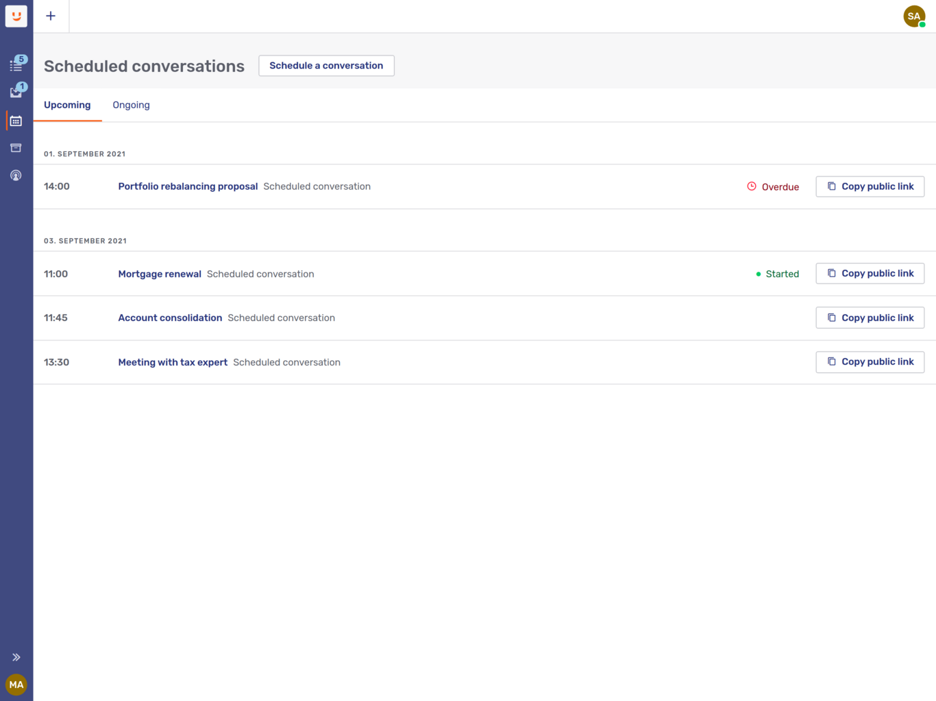
Scheduled conversations with a start time in the past that haven’t started yet are also listed on the Upcoming tab. They’re marked with an Overdue badge, like the first conversation in the picture above.
-
The Ongoing tab lists all your scheduled conversations with a start time in the past that have already started.
On each tab, conversations are displayed in chronological order.
-
On the Upcoming tab, the further in the future a conversation is scheduled to start, the further down the list of scheduled conversations it appears.
-
On the Ongoing tab, the more recently a conversation was scheduled to start, the closer to the top of the list of conversation it appears.
Scheduled conversations that have ended are accessible from the conversation history, like any other conversation.
If you close an ongoing the tab of an ongoing scheduled conversation and want to return to it later, you can find it on the Ongoing tab in the scheduled conversations overview, not in your inbox.
Creating scheduled conversations
To create a scheduled conversation:
-
Open the scheduled conversation overview and click Schedule a conversation. If there is more than one template for scheduled conversations, a dropdown opens where you can choose a template. If there is only one template for scheduled conversations, clicking the button takes you to the next step.
-
In the New conversation fly-in page that appears, enter the following information:
-
A topic for the conversation
-
The date and time the conversation is scheduled for
You can also change the language or locale of the conversation, as well as add secondary agents to the conversation. Secondary agents you add here aren’t invited to join the conversation. They’re automatically added to the conversation.
You can change all these elements after creating the conversation.
-
-
Click Save to complete the creation process. This closes the fly-in page and displays a modal dialog where you can open the conversation without starting it.
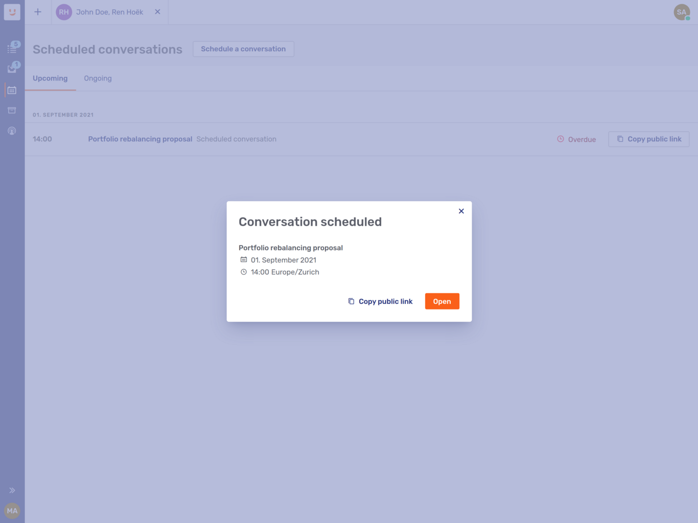
If public links are enabled, the modal dialog also includes a public link that you can send to multiple visitors.
To create personal invitations for individual participants, or to edit the details of the conversations, click Open. This opens the conversation in the main area of the Agent Desk.
Alternatively, close the dialog window. This returns you to the Upcoming tab of the scheduled conversation overview.
Editing a scheduled conversation
To edit the topic, date, and start time for scheduled conversations:
-
Click the Edit icon
 for the conversation you want to edit in the list of scheduled conversations. This opens the Edit conversation fly-in page.
 -
Make your changes and click Save.
Only authorized participant types may edit scheduled conversations. By default, this is only the conversation’s assigned agent.
You can also edit the topic, date, start time, and locale of an open scheduled conversation. To do so, click the Conversation info icon  in the context bar. This opens the context panel on Conversation info page. Next, click the Edit button at the bottom and make your changes. When you’ve finished, click Save.
Inviting and admitting visitors to a scheduled conversation
Invitations for scheduled conversations work the same way as for other types of conversation:
-
Email invitations generate an email with a link that opens the scheduled conversation in the Visitor Desk.
-
Private link invitations generate a link that you can send to the invitee by email, add to a shared calendar appointment, or provide them some other way. Again, the link opens the scheduled conversation in the Visitor Desk.
| Since visitors can only redeem PIN invitations in the integrated visitor UIs, but scheduled conversations open in the Visitor Desk, you can’t use PIN invitations for scheduled conversations. |
Public links open the Visitor Desk on the Join conversation page:
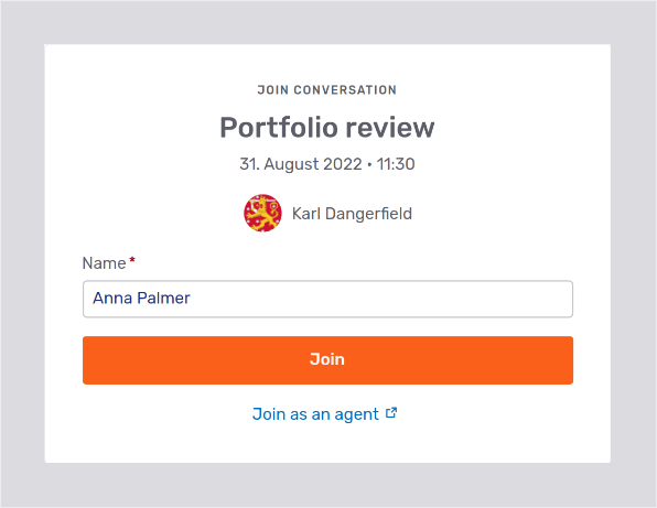
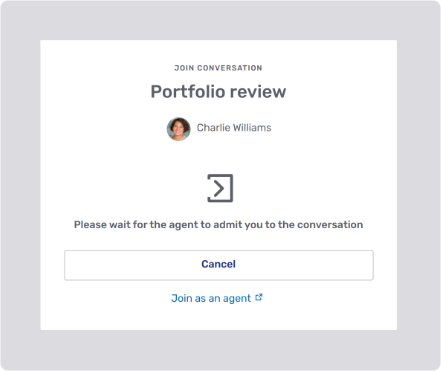
The visitor fills in their details and clicks the Join button. They then have to wait for an agent to review their admission request. If no agent has the conversation open in the Agent Desk, the page asks them to wait for an agent to join:

If an agent is viewing the conversation, the visitor is asked to wait for the agent to admit them:
In the Agent Desk, a modal dialog lists the visitors who have requested to be admitted to a conversation:
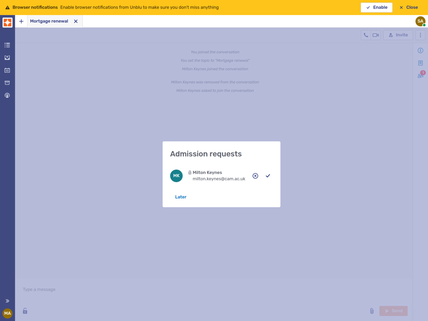
If more than one visitor wants to join the conversation, you can grant or deny each request individually.
Visitors who redeem personal invitations are automatically admitted to the conversation.
Inviting agents to a scheduled conversation
If you invite another agent to join a scheduled conversation, the invitation appears in their queue. Once they click Answer, the conversation opens , just like any other conversation they answer, and they immediately join the conversation.
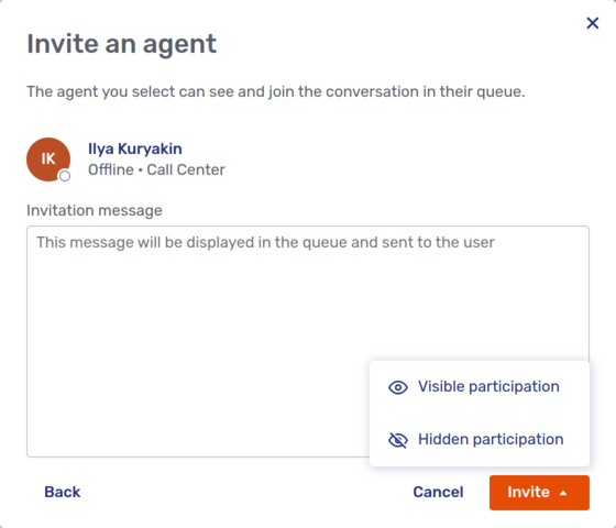
When you invite an agent to a conversation, you can choose whether they should join the conversation as a secondary agent visible to the other participants, or as a hidden participant.
Starting a scheduled conversation
Scheduled conversations don’t start automatically. An agent who is participating in the conversation has to start it. To do so, open the conversation by clicking it in the overview, then click the Start button in the upper right-hand corner of the screen:
Alternatively, open the context panel on the Conversation info page and click the Start button at the bottom.
Invitees who try to join a conversation before you start it are shown the Waiting room page in the Visitor Desk. The page includes a message asking them to wait until the conversation has started:
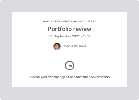
Once an agent starts the conversation, visitors see the usual UI elements, such as the chat view and collaboration layers.
Branches
If your organization uses Unblu Branch, you may have the Branches entry in the navigation menu. Clicking it opens the overview of all active branches.
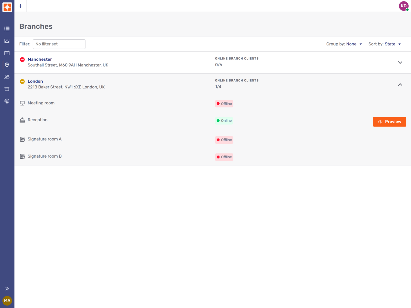
Each branch is listed with the following information:
-
An icon indicating the availability of the branch and its Branch clients
Table 1. Branch state icons Icon State 
All Branch clients are online.

Some Branch clients are offline or have issues. For example, a Branch client may not be configured correctly, or the client’s main camera isn’t operational.

All Branch clients are offline.
-
The name and address of the branch
-
The number of online Branch clients as a share of the total number of Branch clients
-
Clicking a branch’s list entry expands it to display all the Branch clients with their names and online states.
If the feature is enabled, Branch clients that are online also have a Preview button. Clicking the button launches a conversation on the Branch client which you can then view as a ghost participant.
Customer view
If enabled by your organization, clicking the Customer view entry in the navigation menu opens the customer list. It shows each customer’s online state (Online, Offline, or Last seen) and their details: their email address, phone number, labels, external messengers, and source ID.
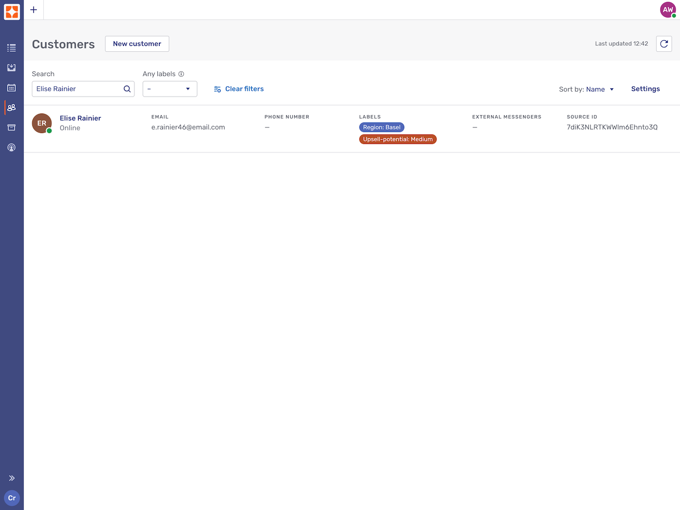
By default, the customer list displays all the customers that are visible to you. You can filter the list by label or search term. Any filters you set apply until you click the  Clear filters button.
The search results on display aren’t updated automatically when the data change, for example, when a label is applied to an additional customer. To update the search results, refresh the page or click the Refresh button  .
.
Clicking a source ID copies it to the clipboard.
You can perform the following actions:
-
Search for customers by their first name, last name, nickname, username, email address, and source ID.
-
Filter by labels to find a specific customer group, for example, all customers that are located in a certain region.
-
Sort customers by name and online state.
To create a new customer, click the New customer button. This opens a fly-in page where you can enter the new customer’s details:
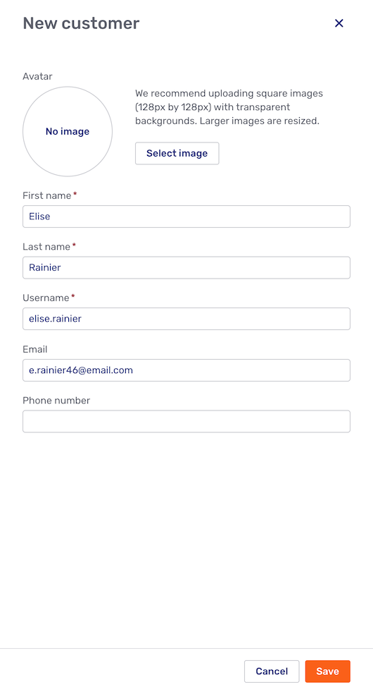
Clicking Save automatically adds the customer to the customer list.
The Settings menu allows you to select which filters and columns are visible above the customer list and to change the columns' order.
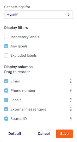
By default, any changes you make to the settings are limited to yourself. However, you can modify the settings for your team or the entire Unblu account if you have the necessary permissions.
Customer broadcast
Customer broadcasts are a way to send the same message to multiple clients. This is useful if, for example, you want to inform several clients of an investment opportunity.
If the broadcast feature is enabled, you see a checkbox to the left of each customer in the customer view. You also see an action bar above the list of customers with a checkbox to select all customers.
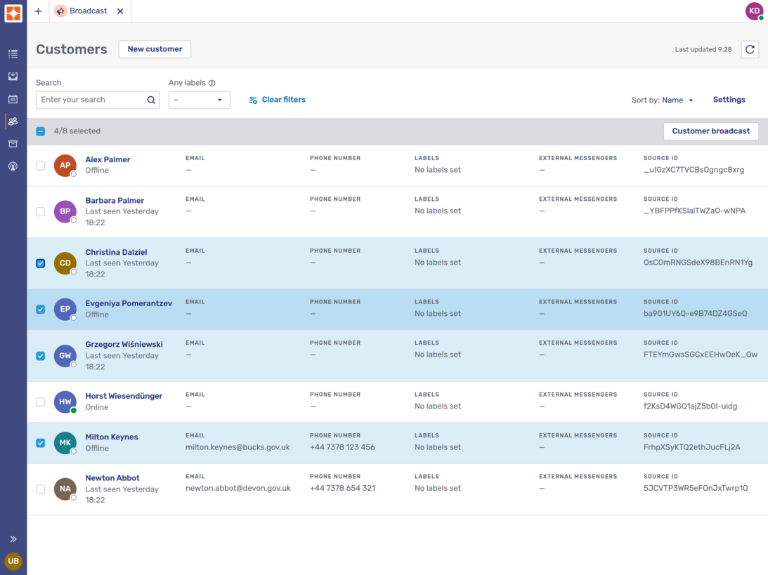
The action bar also holds the Customer broadcast button used to start the broadcast once you’ve selected the customers you want to include in the broadcast. Clicking the button opens the broadcast form:
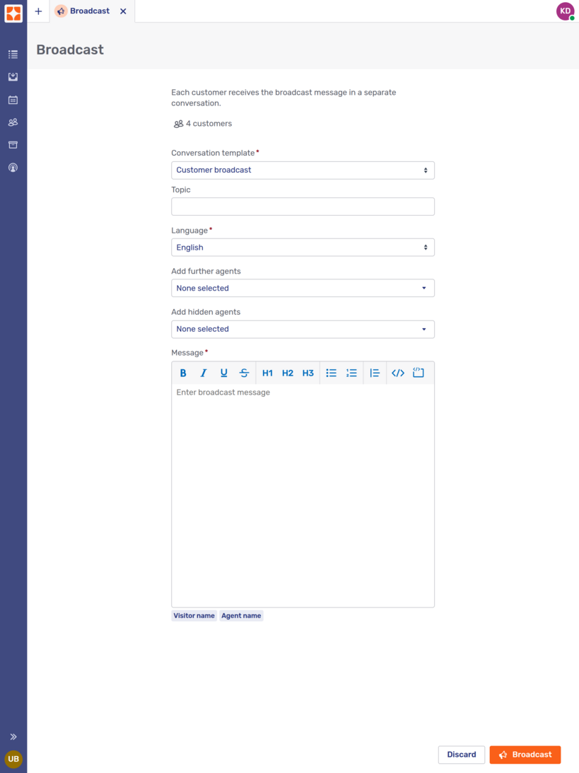
The fields available in the form depend on the conversation template you select from the select element at the top of the form.
-
Topic lets you specify the topic of the conversation.
-
Language is the language of the conversation.
-
Add further agents lets you add secondary agents to the conversation. Agents you add this way are visible to the visitor.
-
Add hidden agents lets you add hidden secondary agents to the conversation. Agents you add this way aren’t visible to the visitor.
-
The only field that’s always available is the Message field. This is where you write the message for the broadcast. If you aren’t normally able to apply formatting to your messages, you should avoid doing so here, too.
Beneath the text input field there are two placeholders, one for the customer’s name, one for yours. Use them to add a small personal touch to the message.
Once you’ve finished composing your message, click the Broadcast button to begin broadcasting. Unblu creates a new conversation with each of the recipients you selected, adds you (and any other agents you selected) to the conversation, and sends the message.
During the broadcast, Unblu displays an Abort broadcast button. If you click it, any deliveries that haven’t been completed yet are canceled. Delivered messages are left untouched.
When Unblu has completed the broadcast, it displays a result page. The page tells you how many messages were delivered. By default, the content of the message you sent is hidden. To display it, click See message content.
If your message was delivered to all the recipients you selected, the page looks like this:
If Unblu was unable to complete the delivery for certain customers, the conversations with those customers are listed on the result page. Clicking a conversation opens it in a new Agent Desk tab.
Customer dashboard
Clicking a customer opens their dashboard.
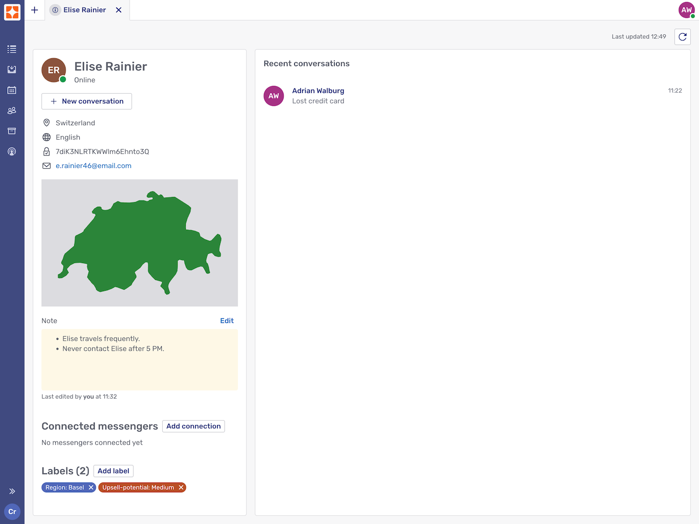
The customer dashboard opens in a new tab within the Agent Desk. This means you can have the dashboards of multiple customers open at the same time.
The right side lists the most recent of the customer’s conversations that you’re allowed to see. Clicking a conversation opens it in a new Agent Desk tab and switches to it.
On the left, you see the following customer information:
-
Online state
-
Most frequent locations
-
Most frequently used languages
-
Source ID. Clicking the source ID copies it to the clipboard.
-
Email address
-
Note.
You can edit the note associated with a customer. However, another agent may be editing it at the same time, and if you just save your change, you overwrite the other agent’s change. You should therefore always refresh the dashboard by clicking the Refresh button
before you save changes to a customer’s note. -
Connected messengers.
This information is only visible if external messengers are set up in Unblu. If there are, you can edit the external messengers associated with the customer.
-
Labels. You can add and remove customer labels.
Conversation history
The conversation history provides access to all your conversations. (Supervisors and admins also have access to other users' conversations.) It includes both ongoing conversations and ones that have already ended.
The list items in the conversation history show a lot of information about the conversations:
-
The date the conversation was created
-
The type of conversation, for example Chat invite or Audio call
-
The name of the assigned agent
-
The name of the context person
-
The state of the conversation, for example Active, Ended, Offboarding etc.
-
How long the conversation lasted
-
How long the visitor had to wait for an agent to answer their request
-
How the visitor rated the conversation
Here is an example of what an agent’s conversation history looks like:
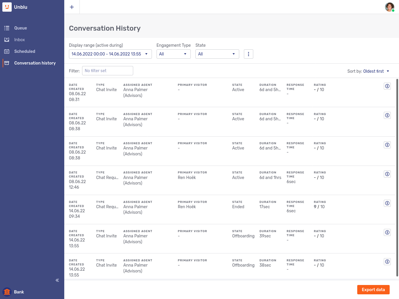
The Export data button at the bottom of the list lets you export the data as a CSV or XLSX file, depending on how your organization has configured Unblu.
Clicking a conversation displays its contents. See Viewing a conversation below for more details.
Conversation history filters
Like the inbox and the queue, the conversation history provides various filters to specify which conversations to list. You can filter by:
-
Display range. This refers to when the conversation was in progress. The default range is the current day.
-
The Conversation state.
-
Agent.
-
Team.
-
Language.
-
Visitor source ID. This is the visitor’s username if they’re authenticated by another system that propagates their identity to Unblu.
-
Primary visitor. Use this filter to search by the person ID of the conversation’s context person.
-
Conversation scheduled date. This refers to when the conversation is or was scheduled to take place.
-
Conversation ID. Selecting this filter disables all other filters.
| The conversation history displays conversations even if their start and end times were outside the display range. For example, if a conversation started at 09:00 and ended at 12:30, setting the display range to 10:00—11:00 displays the conversation, even if there was no activity in the conversation between 10:00 and 11:00. |
The display range filter is always displayed. You can specify which other filters to show by clicking the more icon .
The filter field also lets you search for text in the conversations' information. This lets you search for conversations by the names of participants, for example. You can’t use the filter to search through conversations' message contents, though.
If you apply multiple filters, the conversation history only displays conversations that match all your filter criteria. For example, if you specify a display range and a language, the conversation only lists conversations in that language that were ongoing during that period.
If you select multiple values for a single filter, on the other hand, the conversation history displays all conversations that match any of the values you selected for that particular filter. For example, if you select the languages Czech and Swedish in the language filter, the conversation history lists all conversations whose language was either Czech or Swedish.
The maximum number of conversations displayed in the history is defined in the configuration property com.unblu.conversationhistory.limit. The default value is 100.
Conversation details fly-in page
Clicking a conversation’s information icon opens a fly-in page with additional details:
The fly-in page contains the following information:
-
An overview of the conversation’s details. Some of the details are always visible, others are in a collapsible section you open by clicking the Show more action.
For more information on which details are available, refer to Conversation info panel below.
-
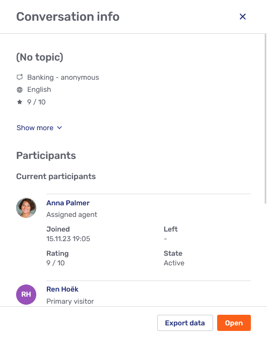
Information on the conversation’s participants:
-
Who the participants are or were
-
When they joined and left the conversation
-
What their participation type in the conversation was: primary visitor, assigned agent, secondary visitor, secondary agent, or bot.
-
Whether they’re still participating or not
-
How they rated the conversation
-
-
Links to the conversation recordings that were made in the course of the conversation.
There are also three buttons on the page:
-
The Configure button opens the configuration of the conversation.
-
The Export data button exports the details as a CSV file.
-
The Open button displays the conversation.
Viewing a conversation
When you open a conversation in the conversation history, it opens with you participating as a ghost. Instead of displaying your avatar in the conversation tab, it displays a ghost icon  . This is the case even if the conversation is still active and you’re the conversation’s assigned agent.
In this view, you can see everything that has taken place in the conversation so far, including the entire onboarding process. If Unblu’s translation feature is enabled, you can use it in this view.
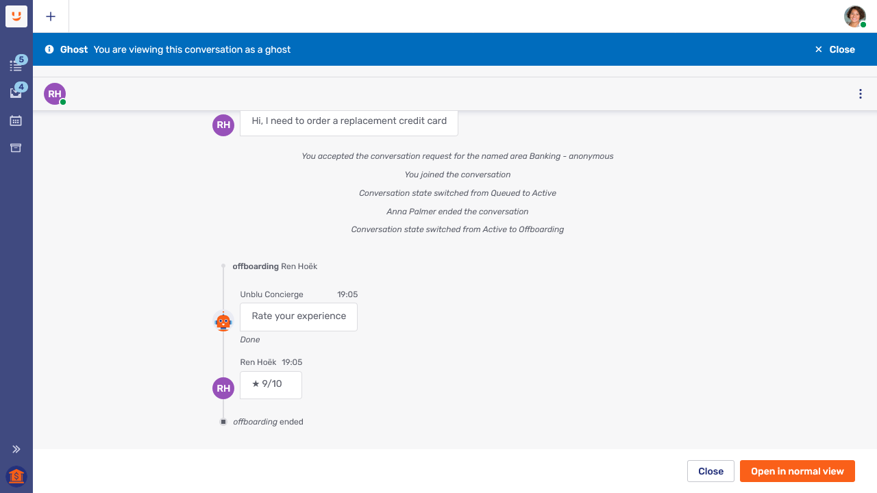
The users who can view an agent’s conversations as a ghost are:
-
Admins
-
The agent’s supervisor
-
Agents whose visibility rules allow them to see the conversation
Agent monitor
The Agent Monitor allows supervisors and administrators to monitor the capacity of agents and named areas. They can also get an overview of the conversations that agents are currently engaged in.
-
Supervisors can monitor agents on teams they’re responsible for.
-
Administrators can monitor any agent of the Unblu account they administer.
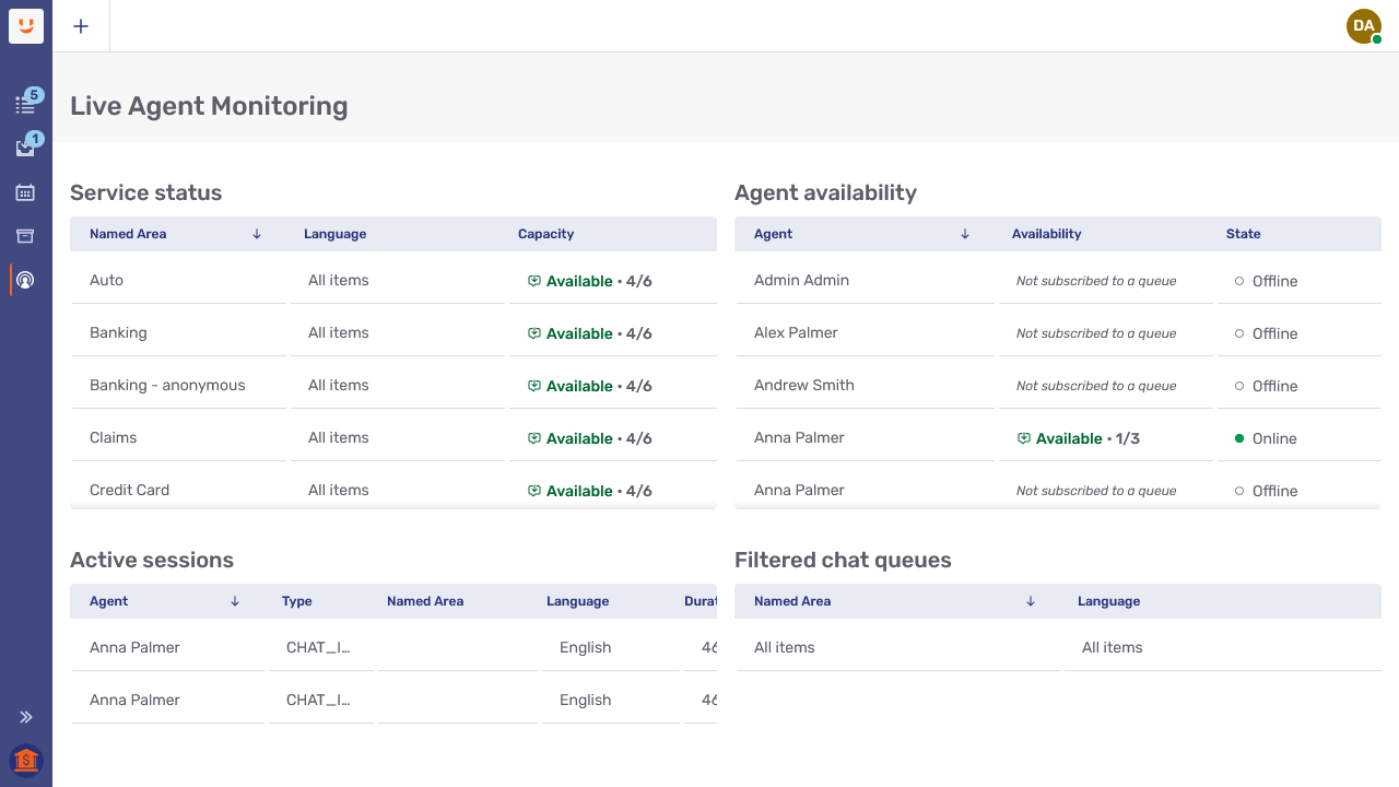
The content area of the agent monitor is divided into four panels:
- Service status panel
-
Shows the capacity by named area and language.
- Agent availability panel
-
Shows each agent’s capacity and their availability.
- Active sessions panel
-
Provides information about the active conversations, including the type and duration of the conversation, and the agent handling the conversation.
- Filtered chat queues panel
-
Shows the filters that agents are applying to their queues. This can be helpful when trying to determine why a certain conversation isn’t being accepted by any agents: maybe none of them can see it because of the filters they’ve set in their inbox.
You can sort the contents of any panel according to any of the columns. To make the column headers wider, hover over the column header and drag.
Availability
Availability can apply to named areas or individual agents. The agent monitor distinguishes between three different levels of availability: Available, Busy, and Unavailable.
Availability by named area
In the service status panel, availability is displayed in the Capacity column and refers to all the agents assigned to the various named areas. The numbers after the availability status show the total current capacity utilization for all the agents.
-
When there are agents with capacity available to accept conversations in a named area, its availability status is Available.
-
When no agent has capacity to accept conversations in a named area, its availability status is Busy.
-
If there are no agents logged in to Unblu who accept conversations in a named areas, its availability status is Unavailable.
In the picture above, all the named areas have an available capacity of four conversations and a total capacity of six conversations.
Agent availability
The availability information in the agent availability panel refers to each agent’s personal availability. The numbers in brackets show their personal current capacity utilization.
In the picture above, the agent Anna Palmer has an available capacity of one conversation and a total capacity of three conversations.
An agent’s personal availability status can be affected in a number of ways:
-
If an agent sets their online status to Away in the Agent Desk user menu, their availability status switches to Unavailable.
-
If an agent has reached the maximum number of concurrent active sessions allowed, their availability status switches to Busy.
If you’re using automatic queue dispatching with priority band busy limits, the agent availability only reflects an agent’s availability status for priority 1 requests.
If automatic queue dispatching is active, agents can change their availability status independently of their online status. for more information, see automatic request dispatching.
If you don’t want visitors to see the availability of your agents, you can disable availability badges.
Filtering
Selecting an entry in any of the four panels filters the entries in the other panels that are relevant to the entry selected.
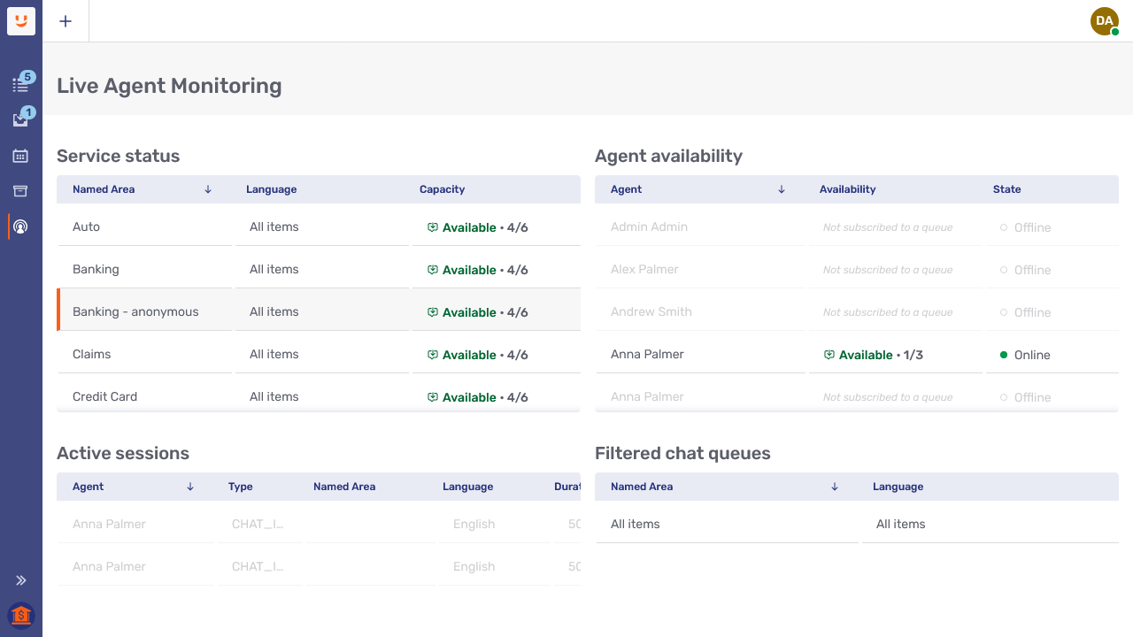
In the picture above, the named area "Banking - Anonymous" has been selected in the service status panel. This is indicated by the vertical orange bar to the left of the entry. As a result of this selection, you can see at a glance which entries in the other panels apply to this named area. Entries that don’t apply to it are grayed out.
Conversation panel
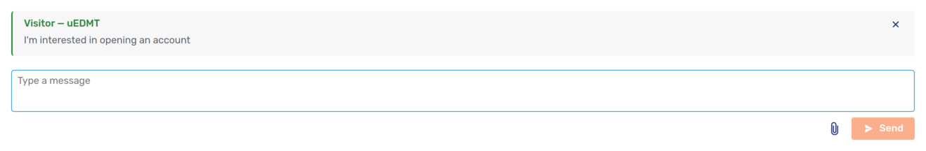
The effect of clicking Answer for a conversation in the queue depends on the type of conversation request you’re answering. As a rule, the Agent Desk opens the most appropriate view for the request at hand. For example, if you respond to a live chat request, the conversation panel displays the messaging view.
Sending messages and uploading files
Both agents and visitors can send messages and upload files in public mode from the bottom of the conversation panel. In public mode, messages and files are visible to all the conversation participants.
If a message you send is rejected by a message interceptor, Unblu displays the notice Message blocked above the message. The reason the message was rejected appears beneath the message text.
Rejected messages are always visible to the sender. Which other participants can see a rejected message depends on the rejection severity and the type of participant. For more information, refer to Rejection severity levels.
Sending internal messages
When enabled, internal messaging mode lets agents exchange messages privately with each other in a conversation, without visitors in the conversation seeing their messages. They can also upload files as internal or public files.
Once internal messaging mode is enabled, to send an internal message:
-
Click the open padlock icon
 next to the text input field.
The color and placeholder text of the text input field change to indicate the message is internal. The open padlock icon changes to a closed padlock icon
 .
.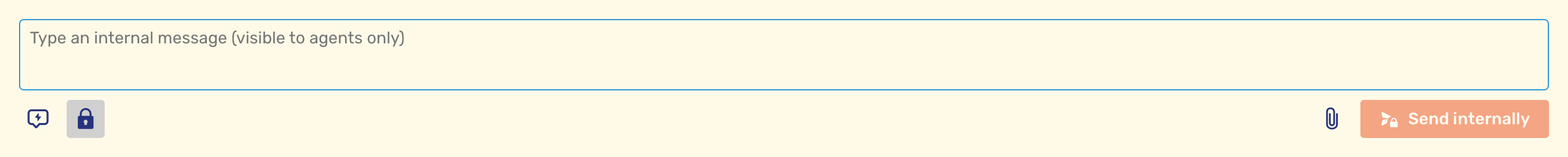
-
Type the internal message and click the Send internally button.
The message appears in the conversation in a different color to indicate that it’s an internal message. A padlock icon is displayed beside the sender’s name.
-
To toggle back to public message mode and send a message visible to the visitor, the click the closed padlock icon. Alternatively, use the (configurable) keyboard shortcut to toggle between messaging modes. The default shortcut is Ctrl+M.
Replying to individual messages
If it’s enabled for your user type, hovering over a message displays the reply icon  . When you click the icon, the message you clicked appears above the text field where you type your response.
If you’re replying to an internal message, Unblu automatically activates internal messaging mode for the reply. The message you’re replying to and the area of the text input field appear in a different color.
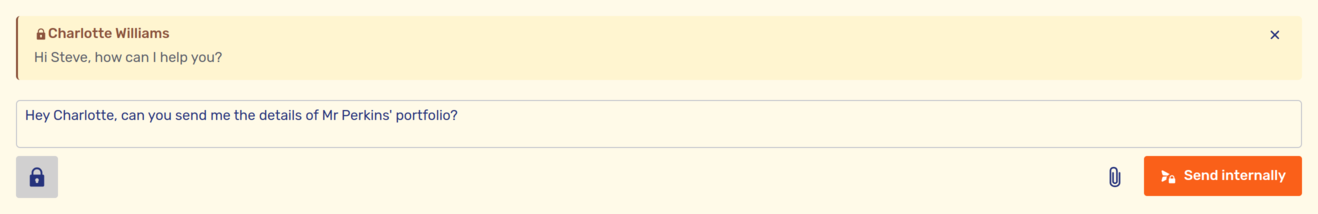
Switching to public mode by clicking the closed padlock icon automatically removes the internal message you’re replying to.
If you click the cross icon on the internal message you’re replying to, your message is sent to the conversation as an internal message. If you want to send it as a public message, click the closed padlock icon to switch to public mode.
Once you send your reply, it appears in the conversation:
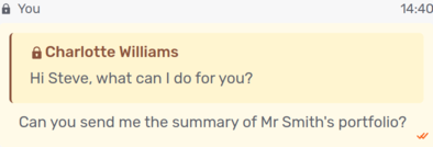
Above your reply, you can see the first sentence of the message you replied to. Clicking the sentence takes you to the original message, so you can read it in its entirety.
| If you reply to an internal message but don’t have permission to send internal messages yourself, your reply is sent to the conversation as a public message, and visitors can see it. The internal message you replied to isn’t sent to the conversation. |
Requesting chat suggestions
If your organization has implemented a system that can suggest answers to visitor messages, and you have permission to use the suggestion source, you can see the chat suggestion icon  when you move the mouse pointer over a chat message from another participant. (The icon may be in the kebab menu .) Clicking the icon asks the suggestion source of the current conversation for a suggestion of how to respond to the message.
If Unblu is configured to allow it, you can "edit the prompt" beforehand, that is, edit the message you request a suggestion for. This is especially useful if the message contains spelling errors or uses a different term from the one your organization uses for a product. In this case, you must click Generate suggestion to get a suggestion.
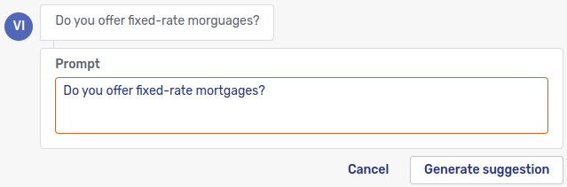
Your organization may also provide a set of predefined prompts. If that’s the case, there’s a Templates button above the text field for editing the prompt. Clicking it displays a list of prompts you can generate suggestions for instead of the chat message.
When the suggestion source responds, the suggestion is only displayed to you:
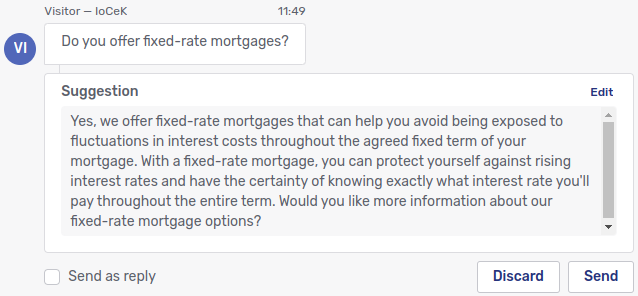
You now have several options:
-
If the suggestion isn’t helpful, click Discard. The suggestion is discarded immediately and leaves no trace in the chat history.
-
If you’re satisfied with the suggestion as it is, click Send. The suggestion is then sent to the chat as it is.
-
If you think the suggestion needs some changes, click Edit above the suggestion. This displays the suggestion in a text field where you can edit it.
If Markdown is enabled, you can use Markdown when you edit the suggestion.
-
If you check the Send as reply box before clicking Send, the suggestion is sent to the chat as a reply to the message you requested a suggestion for.
Once you click Send, the suggestion is sent to the chat:
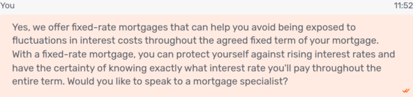
If you asked for a suggestion on an internal message,the suggestion is sent as an internal message. If the suggestion was requested on a public message,the suggestion is sent as a public message.
All chat suggestions you send to the chat, whether you edit them or not, are sent in your name. There’s no way of distinguishing messages you composed yourself from ones that originated with a suggestion source.
If the suggestion source can’t make a suggestion—because it doesn’t understand the request, for example—the message No suggestion found appears beneath the message you requested a suggestion for. This message is only visible to you.
| Chat suggestions are only available on text messages. You can’t ask for suggestions in response to image uploads, for example. |
Translating chat messages
If your organization uses Unblu’s chat translation feature, translated messages in a conversation have a label. The label includes a link to the original message and information about the language the original message is in:
If messages aren’t translated automatically (you can configure this in your language settings), hovering over a message that can be translated displays the translate icon  . Clicking it translates the message into the target language.
Uploading internal files
The file upload system is aware of the messaging mode in use. When an agent clicks the upload file button  , the current messaging mode is applied to the file upload. If the agent drags and drops a file, a dialog appears to select the mode required:
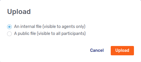
In the All shared files view, the Upload file button opens a dropdown to select the mode.
Sending WhatsApp message templates
If you’re in a conversation with a visitor over WhatsApp, the appearance of the conversation panel can vary.
-
In an ongoing conversation where the visitor sent a WhatsApp message in the last 24 hours, you see the usual text input field:
 Figure 37. WhatsApp conversation with text field available
Besides sending the usual chat messages, you have an additional option: Next to the button that lets you switch between public and internal mode, you’ll find a WhatsApp button
 . Clicking it opens a dialog where you can choose a WhatsApp message template to send to the conversation:
 Figure 38. WhatsApp message template dialog
WhatsApp message templates are always sent publicly, even if you enable internal mode. -
If you created the conversation as an outgoing conversation, or the visitor hasn’t sent a WhatsApp message within the last 24 hours, you can’t send normal chat messages to the conversation. You can only send WhatsApp message templates. Instead of the usual text input field, the bottom of the conversation panel displays a button.
 Figure 39. WhatsApp conversation displaying the button to open the WhatsApp message template dialog
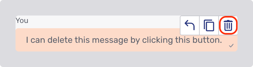
Deleting messages
The delete messages feature lets you remove messages you’ve sent or received, either for yourself only or for everyone in the conversation, depending on your permissions. Messages are deleted only from the UI and aren’t permanently removed from the system. To delete a message, hover over it and click the delete button  .
.
Clicking the delete button opens a modal dialog with up to three options, depending on your permissions.

What you see in place of a deleted message depends on your permissions. It can be one of the following:
-
A collapsible section containing the deleted message’s content
This option always includes the placeholder text followed by a chevron
 that can be clicked to reveal the content.
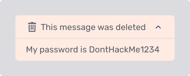 Figure 42. A deleted message placeholder with the deleted content displayed
 -
A placeholder only
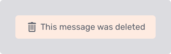 Figure 43. A deleted message placeholder
 -
A blank space, with no indication that a message existed. This occurs when you don’t have permissions to see either the placeholder or the deleted content.
You can’t use the delete action on the following messages:
-
Deleted messages
-
Messages rejected by a message interceptor
-
System messages
-
Failed or canceled file messages
When a message is deleted, you can’t see who it was deleted for. For example, if you delete your own message for yourself, there’s no indication that other participants can still see it.
To delete all messages in a conversation at once, see Delete all messages in the Control bar section.
Deleting files
File deletion follows the same rules as message deletion. This includes both the permissions that control who can delete messages and what you see in place of the deleted message. If you don’t have the permissions to delete messages, you can’t delete files in any conversation.
To delete a file, follow the same steps described in Deleting messages.
You can’t delete failed or canceled file messages.
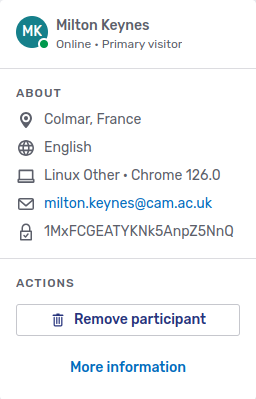
Participant information popup
In the upper left-hand corner of the conversation panel, you can see avatars that represent the other participants in the conversation. Clicking a participant’s avatar displays a dropdown containing information on that participant:
You can see the following information in the About section of the popup:
-
The user’s approximate location. This information is determined based on the user’s IP address.
In the image above, the user is located in Colmar, France, or thereabouts.
-
The user’s language, which in this example is English.
-
The operating system and browser the user’s running. In this case, the user’s computer is running version 96 of Google Chrome on Linux. The version of Linux is unknown, so it’s referred to as "Other."
The participant information popup shows information about each device the user is currently accessing the conversation with. This means that there can be multiple entries for both the operating system and browser as well as the language. Because of the method for determining a user’s location, there may even be multiple entries for their location.
-
The user’s email address.
-
The user’s phone number. This information isn’t present in the screenshot above.
-
The user’s propagated username or their user ID next to a closed lock icon
 .
.If a user hasn’t been authenticated, the popup displays an open lock icon
 with the label Unauthenticated:
 -
Predefined and custom actions that can be invoked on the user in question are listed in the Actions section of the popup.
-
The Remove participant button lets authorized users remove individual participants of a conversation from that conversation.
If secondary agents can set a new assigned agent for a conversation, they can use this button to remove the current assigned agent and reassign the conversation to themselves or another secondary agent. For more information, refer to the section Reassigning a conversation upon removing the assigned agent below.
-
The Assign to agent button is only available on the avatar of secondary agents. It lets the assigned agent reassign the conversation to that agent. The previous assigned agent may then be removed from or leave the conversation without ending it.
You can’t reassign conversations to hidden agents.
The More information element at the bottom of the participant information popup opens the participant details panel.
Reassigning a conversation upon removing the assigned agent
Secondary agents may be allowed to remove the assigned agent from a conversation. With the necessary permissions, they can directly reassign the conversation to themselves or another agent when they remove the assigned agent.
| If a secondary agent may remove the assigned agent but not reassign the conversation, a confirmation message appears when they click Remove participant and the conversation ends when the assigned agent is removed. |
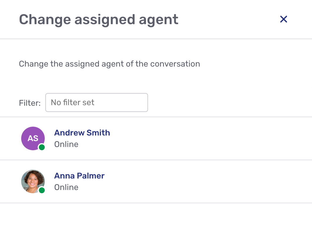
To remove the assigned agent, the secondary agent opens the assigned agent’s participant information popup and clicks the Remove participant button. The effect this has depends on how many agents are participants in the conversation:
-
If there’s only one secondary agent in the conversation (the person removing the assigned agent), the conversation is automatically assigned to them when they remove the assigned agent.
-
If there are two secondary agents in the conversation, a dialog appears asking who the next assigned agent should be:
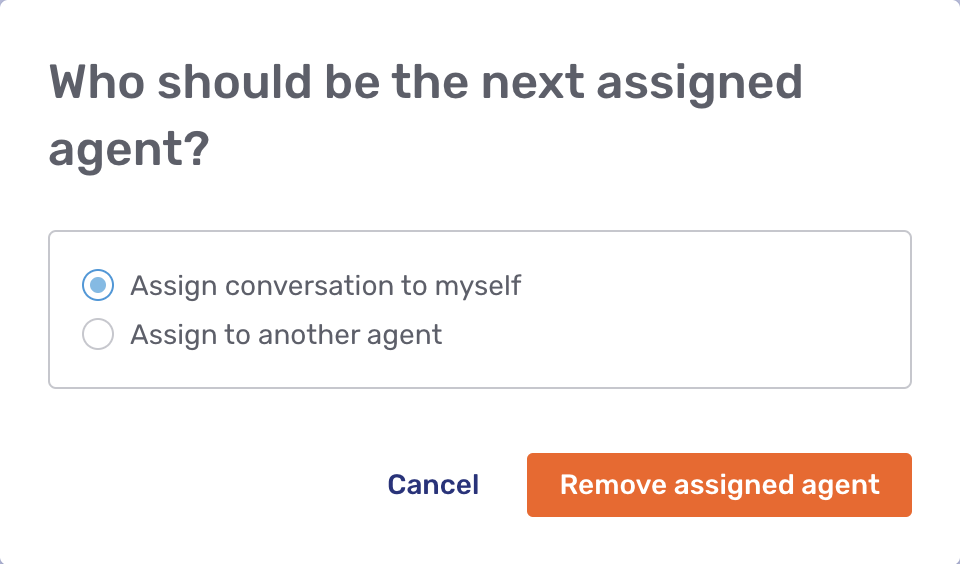
-
If there are more than two secondary agents in the conversation, a dialog appears as above, asking who the next assigned agent should be.
If they choose Assign to another agent, a fly-in page appears where they can choose the specific agent:
Control bar
At the top of every conversation’s tab is the control bar. It holds actions that affect the conversation participants or the type of engagement taking place.

Depending on how your organization’s configured Unblu, some of the actions discussed below may be in the overflow menu rather than in the control bar itself. Other actions may not be available to you at all.
Forward conversation action
The Forward button opens the following menu:
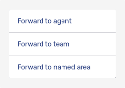
Selecting one of the menu items opens a modal dialog where you can select whom exactly the conversation should be forwarded to. The picture below shows the dialog after selecting Forward to team:
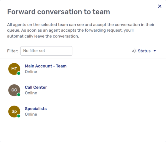
When you click the person, team, or named area that you want to forward the conversation to, a text field appears where you can add a message for them. This message is optional, and it isn’t visible to visitors in the conversation.
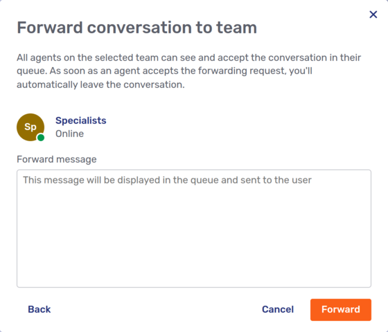
Once you’ve finished typing your message, click Forward.
Forwarded conversations are listed in the Forwarded tab if your inbox is configured to display this tab.
When you open a forwarded conversation, a banner indicating that it’s been forwarded is displayed at the top of the conversation. You can revoke a forwarding from the banner. You can also directly forward the conversation to someone else. This has the effect of revoking the original forwarding and forwarding the conversation again.
When another agent answers the forwarded request, you automatically leave the conversation and the conversation is no longer listed in the Forwarded tab. For more information about what this entails for you, refer to the documentation on the conversation life cycle.
Invite participant action
The Invite button opens the following menu:
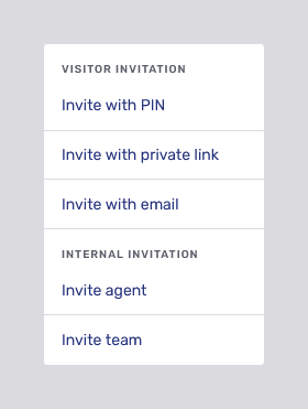
As with the forward conversation menu, selecting either Invite an agent or Invite team opens a fly-in page where you can choose whom to invite and add a message to include with your invitation. Depending on your configuration, you can also choose to invite the agent or team as a hidden participant in the conversation.
For customers, you can choose between three different types of invitation, each of which opens a different modal dialog.
-
Clicking Invite with PIN opens the PIN invitation dialog:
 Figure 46. PIN invitation modal dialog
 -
Clicking Invite with private link opens a modal dialog where you can generate a private link to the conversation. You can copy the link and send it the person you want to invite:
 Figure 47. Private link invitation modal dialog
 -
Clicking Invite with email opens a modal dialog where you can enter the email address of the person you want to invite to the conversation.
 Figure 48. Email invitation modal dialog
The Send invitation button is only enabled when you’ve entered an email address. Unblu generates an email containing a private link to the conversation and sends it to the email address you entered:
All three types of visitor invitation expire after a period. By default, PIN invitations expire sooner than email and private link invitations.
Email and private link invitations that have already been generated are listed on the fly-in page of the respective link type, along with a countdown to each invitation’s expiry time and a link to revoke the invitation. When an invitation expires, its Revoke link is replaced by a Renew link which lets you generate a new invitation.
If enabled by your organization, the Invite menu also contains a button to copy a public link to access the conversation.
Share action
The Share action provides access to the various ways for you to collaborate with other participants in a conversation. The types of collaboration you can launch, and therefore the contents of the Share action, vary from organization to organization.
By default, the action is in the overflow menu of the control bar. However, your organization may have placed it directly in the control bar. What happens when you click the action depends on a several factors:
-
If you’re only able to launch one type of collaboration, clicking the action initiates collaboration.
-
If you can launch more than one type of collaboration, clicking the action opens a menu of the available collaboration layers. Clicking one of the options initiates collaboration.
If you can launch the same collaboration layer in relation to multiple participants—you’re able to launch embedded co-browsing for different visitors, for example—you must first select the type of collaboration you want to launch, then select the user you want to launch the collaboration layer on.
-
If you’ve already launched a collaboration layer, that type of collaboration has a blue dot next to its entry in the Share action menu.
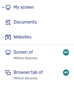
You can collaborate on any participant’s screen, but only on a visitor’s browser tab.
The participants' names and avatars in the menu are particularly important if there are more than two participants in a conversation. The extra information helps to ensure that you don’t start a collaboration with the wrong contents.
Initiating collaboration
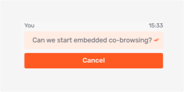
Selecting one of the menu items doesn’t necessarily immediately launch a co-browsing or screen sharing session. It sends a collaboration request to the context person and to the participant whose content would be shared.
Suppose you’re in a conversation with two visitors, Alice and Bob. If you want to share Bob’s browser tab, then by default, both Alice and Bob receive a collaboration request. This is what the request looks like in the Floating Visitor UI:
Both Alice and Bob must give their consent for the embedded co-browsing session to go ahead. If they fail to do so within a certain time, the collaboration request times out.
You can cancel the collaboration request in the Agent Desk chat panel:
Collaboration actions
Once collaboration starts, the main content area of the Agent Desk displays the appropriate collaboration layer in the collaboration space.
In case you’re uncertain, the type of collaboration you’re currently engaged in is visible in two different places:
-
The icon and a brief description of the current type of collaboration are displayed in the top bar of the collaboration space.
-
In the Share action, a blue dot next to the appropriate icon indicates which type of collaboration is currently taking place.
Besides the hint about the type of collaboration in progress, the bar at the top of the collaboration space contains at least two actions.
-
The maximize content icon
 on the left hides the top bar, the agent conversation bar, and the sidebar. This increases the space available for the collaboration space.
When the content of the collaboration space is maximized, the icon is replaced by the minimize content icon
 . Clicking the icon displays the top bar and the agent conversation bar. It doesn’t reopen the sidebar.
 -
The Stop button
 on the right allows you to stop collaborating. Doing so doesn’t end the conversation.
If there are collaboration tools available in the type of collaboration taking place, the actions for them are also displayed in the top bar.
| Icon | Description |
|---|---|
|
Toggle mark mode. This allows you to highlight areas of the screen for the other participants. To mark an area in mark mode, press and hold your primary mouse button in one corner of the area you want to highlight, then drag the cursor to the opposite corner of the area. While you’re doing this, Unblu shows a dashed rectangle around the area selected. Once you release the mouse button, Unblu highlights the area you selected. If you just want to point to a particular feature of the page or document in mark mode, click it. Unblu displays a pulsating circle to draw the other participants' attention to it. |
|
Toggle remote control of the cursor in the co-browsing layer. The remote control tool gives you control over the mouse pointer in the collaboration layer. You can click page elements and fill in text fields, provided they aren’t protected. While somebody other than the person sharing the collaboration layer has control of the mouse pointer, their display name appears next to the pointer. |
|
Turn scroll lock on or off for the co-browsing layer. Scroll lock ensures that your view of the co-browsing layer remains fixed, even if the other participant scrolls up or down on the page you’re viewing together. |


Mark mode and remote control mode may be configured to require the approval of one or more participants in a conversation. If that’s the case, they’re automatically asked for their approval when you try to activate the tool in question. You can see the approval message in the list of messages. You can cancel the request there, too, but you can’t approve the request on someone else’s behalf.
| Which collaboration tools are available depends on the type of collaboration and the configuration of your Unblu installation. |
To the right of the collaboration space, you can see the conversation’s messaging view. You can collapse it to give the collaboration pane more room by clicking the hide chat panel icon  . If you want to expand the chat panel, click the show chat panel icon
  .
.
Recording
If your conversation is recorded automatically, there’s an indicator in the control bar. Initially, it indicates that Unblu’s starting the recording:
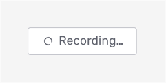
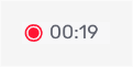
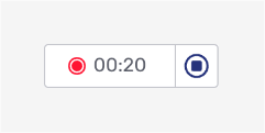
Once the recording has started, Unblu displays the Recording icon  and a timer that shows how long it’s been recording the conversation.
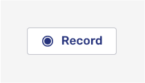
If you can manually start recording a conversation, Unblu displays the Record button to the right of the collaboration action:
When you click the button, Unblu displays the indicator to tell you it’s starting the recording. Once the recording is in progress, there’s an indicator similar to the one for automatic conversation recording. In the case of a recording started manually, the indicator also has a Stop recording button  :
:
End conversation action
The End conversation button does exactly that: it ends the conversation. Depending on how Unblu is configured, it may display a dialog asking whether you really want to end the conversation. The action is only available to users entitled to end the conversation. Who may end a conversation can be configured in the conversation templates and in the conversation itself.
Once a conversation has ended, you can no longer add content to it. You can access conversations that have ended in the conversation history and from the Other conversations tab of the participant details panel.
For more information about conversation states, refer to Conversation life cycle.
Leave conversation action
The Leave conversation button lets users leave a conversation without ending it. Once you leave a conversation, you no longer have access to it. Depending on your participant type, leaving the conversation may also affect the conversation state.
The button is only available if your participant type is allowed to leave a conversation.
If you’re the assigned agent of a conversation and there are other agents in the conversation as well, a modal dialog appears when you click *Leave conversation:
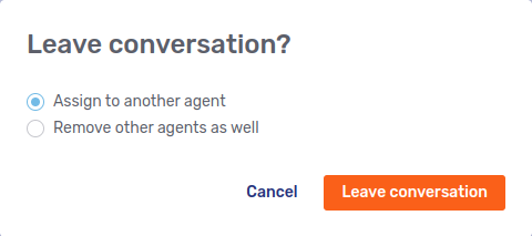
If you select Assign to another agent, a fly-in page appears listing all the secondary agents in the conversation. When you click the agent you want to reassign the conversation to, a text field appears where you can add a message for the agent. To complete the reassign process, click Assign.
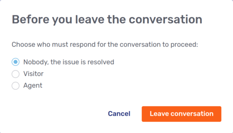
If the conversation state changes to UNASSIGNED when you leave—for example, because you chose to remove all agents from the conversation—you might have to set the awaited person type. In that case, Unblu displays a modal dialog when you click Leave conversation:
For more information on the differences between leaving and ending a conversation, refer to Leaving vs ending a conversation.
Multiple collaboration layers
It’s possible to collaborate in different ways at the same time. For example, a visitor could share their browser tab with you while you share your screen with them. You can only ever see one of the collaboration layers at any one time. However, running more than one collaboration layer simultaneously makes it easier to switch between them.
When multiple collaboration layers are active in a conversation, the active collaboration layers are marked with dots to their left when you click the Share action. The collaboration layer currently in view has a darker dot than the others:
In the example above, there are two collaboration layers, a universal co-browsing layer and a screen-sharing layer. The screen-sharing layer is the one currently visible in the collaboration space: the dot to its left is darker than the other dot.
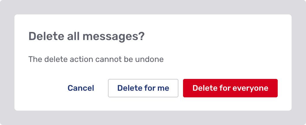
Delete all messages
The Delete all messages action removes all messages in a conversation, including system messages.
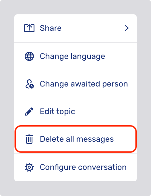
When you click the Delete all messages button, a dialog opens with up to three options, depending on your permissions.
Context bar
The context bar is located on the right of the main content area. It provides access to six context panels:
-
Branch
-
Chat
-
Conversation info
-
Files
-
Participants
-
Summary
Branch panel
If your organization uses the Unblu Branch feature and you’re in a conversation with a Branch client, the Branch action  displays the floor plan of the Branch where the Branch client is located.
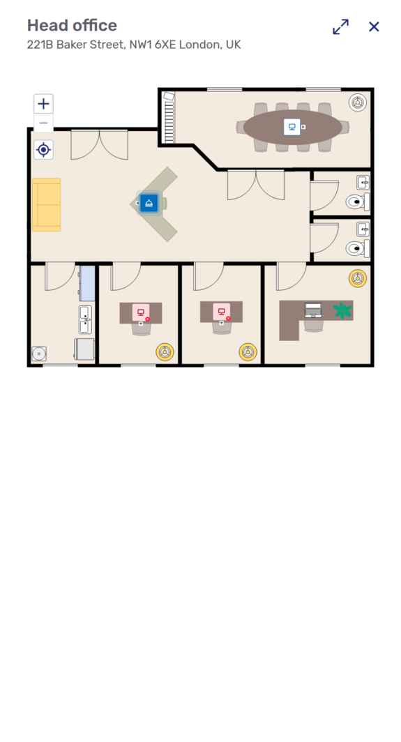
In the floor plan, the color of the Branch client’s icon tells you about its state:
-
The Branch client that’s connected to the conversation is blue.
-
Available Branch clients and other Branch devices have white icons.
-
Branch clients that are offline have red icons.
The client’s state also appears in the tooltip when you hover over the icon.
In the upper left-hand corner of the panel, there are controls to zoom in and out of the floor plan. The Focus button  below the zoom buttons centers the floor plan on the Branch client you’re conducting the conversation with.
Clicking a Branch device opens the device’s URL.
Clicking a Branch client displays a menu like the one below:
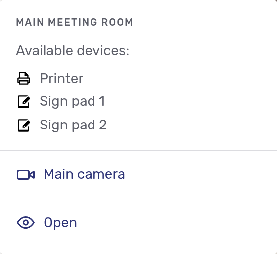
-
The top section of the menu lists the client devices connected to the Branch client.
-
The bottom section of the menu lists the main camera and a set of functions you can execute. Which functions are available depend on the Branch client’s status.
-
The connected Branch client has the Open function, which simply hides the Branch panel.
-
Available Branch clients have two functions:
The Transfer call function lets you transfer the current conversation from the connected Branch client to the Branch client you clicked.
The Preview function launches a conversation on the Branch client you clicked and connects you to it as a ghost participant. It always uses the Branch client’s main camera. If you want to join the conversation, click the Join button.
The Preview function is only available if your organization has enabled it. -
Unavailable Branch clients don’t have any functions.
-
Auxiliary cameras
Depending on how your organization has configured Unblu, auxiliary cameras connected to the Branch client appear either in the bottom section of the menu or on the floor plan. In the latter case, only auxiliary cameras of the Branch client taking part in the conversation currently on display in the Agent Desk are visible.
Chat panel
The Chat action  is only available if you’re in a call or a collaboration session. Clicking it opens the conversation’s chat in a panel on the right of the main content area. It also resizes the main content—the call or collaboration layer—to accommodate the chat panel. This way, you have access to all the communication channels that are in use within a conversation at once.
Conversation info panel
The Conversation info action opens the conversation info context panel:
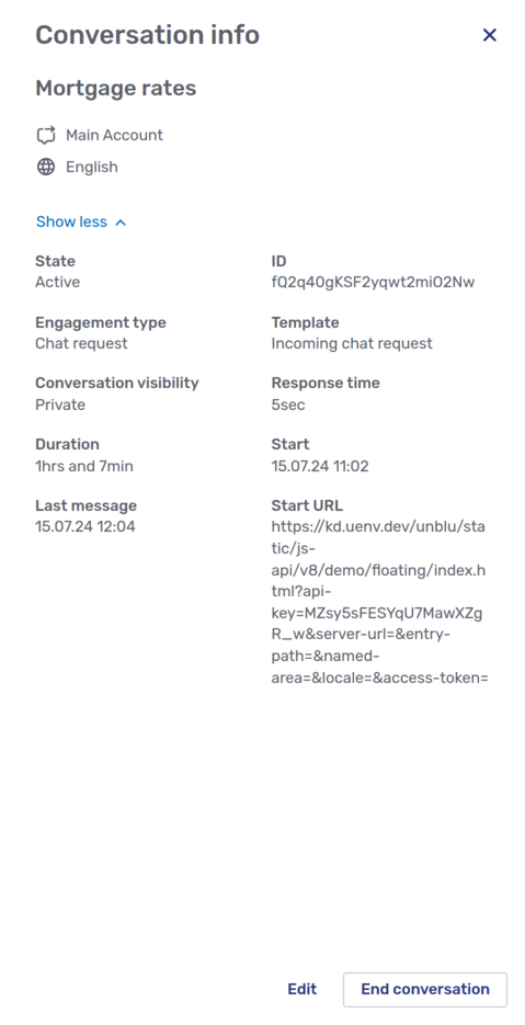
The panels contains the following information:
-
An overview of the conversation’s details:
-
The conversation topic
-
The recipient of the conversation
-
The conversation language
-
The average rating of the conversation
-
The external messenger the conversation was conducted with
-
The source URL
-
For scheduled conversations, the conversation’s scheduled date and time
Apart from the conversation topic, the entries are only displayed if they have a value. For example, if a conversation doesn’t have a rating, the average rating isn’t listed.
-
-
A public link you can share to allow others to join the conversation. This section is present if public links are configured for the type of conversation you’re viewing.
-
A collapsible section that you can open by clicking the Show more action. This section contains additional details about the conversation:
-
The conversation state
-
The conversation ID
-
The engagement type
-
The template used to create the conversation
-
The response time, that is, how quickly an agent answered the conversation request
-
The duration of the conversation
-
The conversation’s start and end date
-
The person who ended the conversation
-
The reason the conversation ended
-
The time the last message was sent to the conversation
-
The time the last conversation recording ended
-
The call session ID
-
The start URL, that is, the URL of the page the conversation was started on
-
-
The Edit button lets you change the conversation’s topic, its language, and the conversation visibility. If the conversation is a scheduled conversation, you can also change its scheduled date and time.
-
If the conversation’s already started, there’s an End conversation button to end the conversation.
-
If the conversation is a scheduled conversation and the conversation hasn’t started yet, the page has a Start button to start the conversation and a Cancel conversation button to cancel it.
The Conversation info icon is only available if Unblu is configured to display it.
Files panel
The Files action  gives access to all the files uploaded to a conversation, including any video screenshots or recordings made in the course of the conversation. It also lets you upload files to the conversation.
Participants panel
The Participants action  opens the participants panel.
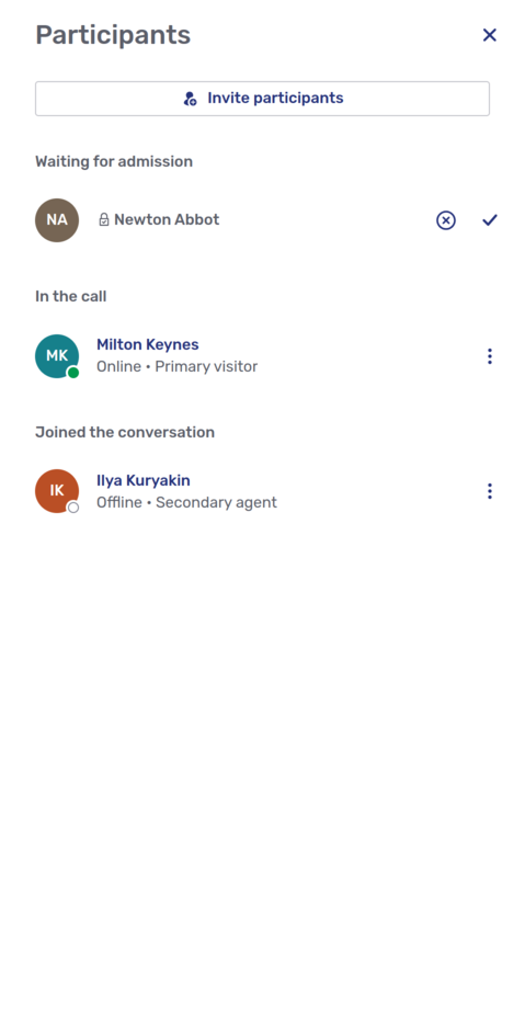
The panel lists all the other participants in the conversation. Participants are grouped by their status:
-
Waiting for admission
-
In the waiting room
-
In the call
-
Joined the conversation
Each participant’s entry sports a kebab menu that gives you access to actions you can carry out on the person. By default, the only action available is to remove the participant from the conversation.
Participant details panel
If there’s only one other participant in the conversation, it automatically opens that participant’s details. The participant details panel is also displayed if you click a participant on the participants panel.
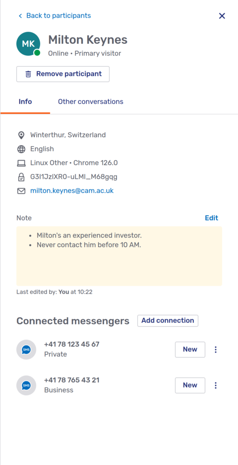
Besides the information and actions that also appear in the participant information popup, the participant details panel contains the following elements:
-
If you’re allowed to start outbound conversations that use Unblu’s chat, there’s a button beneath the visitor’s name to do so.
-
If the participant is an anonymous visitor, you can change their nickname with the Edit nickname action.
-
If the participant’s a visitor, the Info tab includes a Note section. Depending on your permissions, you may be able edit the note.
-
If you can launch outbound conversations with external messengers such as WhatsApp or SMS text messaging, the Info tab has a Connected messengers section.
-
The Add connection action lets you create a new messenger contact for the visitor.
-
To launch an outbound connection, click the New button on the appropriate contact.
-
The Link to another person action in the kebab menu of a connected messenger lets you transfer an outbound contact to another visitor. You can transfer connected messengers between authenticated visitors and link an anonymous visitor’s contact to an authenticated visitor You can’t link an authenticated visitor’s contact to an anonymous visitor.
For more information on creating outbound conversations, refer to Starting outbound conversations above.
-
-
The Other conversations tab next to the Info tab lists other conversations with the participant that you have access to. Which conversations this includes depends on how your organization ha configured Unblu and on the visibility rules in place.
-
The Back to participants action at the top of the participant details panel takes you to the participants panel, even if there’s only one other participant in the conversation.
Summary panel
If your organization uses Unblu’s AI-based conversation summary feature, the Summary action  gives you access to any summaries that have been generated for the conversation in question.
If you have to review summaries before they’re saved, the summary draft is displayed for review in the panel once a summary’s been generated for a conversation. The draft is displayed in a WYSIWYG editor so you can make changes to it.
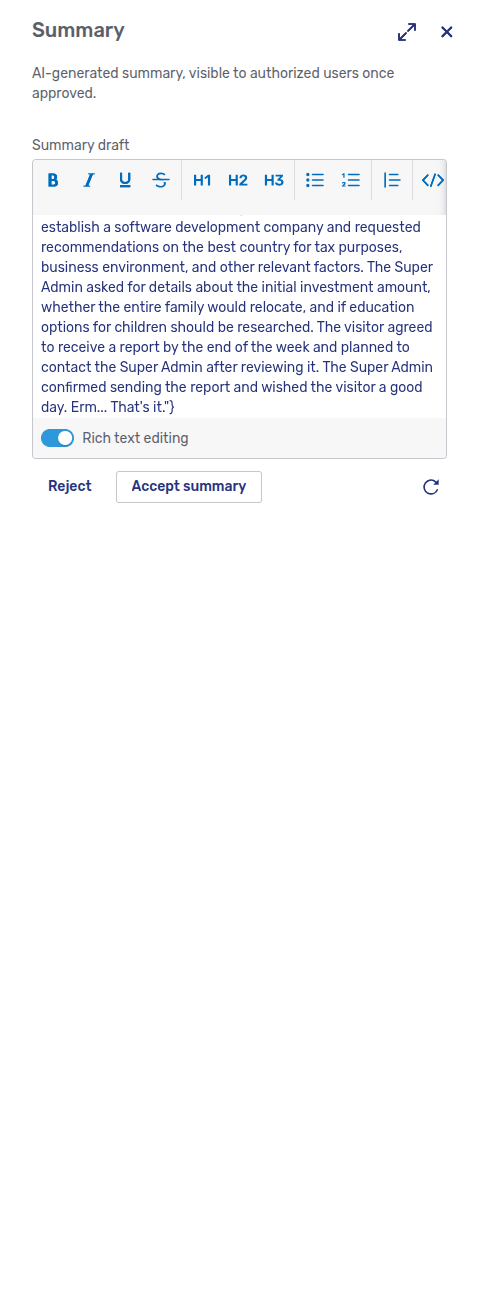
When a draft is displayed, you have three options:
-
To accept a summary, click Accept summary.
-
To generate another summary, click the Refresh button
. -
To reject the summary, click Reject. Unblu won’t generate another summary.
The latest accepted summary appears in the same view of the summary panel, but you can no longer edit the summary.
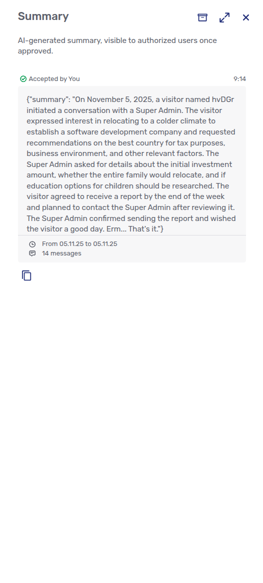
Depending on the intervals at which summaries are generated, you can review earlier summaries by clicking the Past summaries button  . This takes you to the Past summaries view of the summary panel.
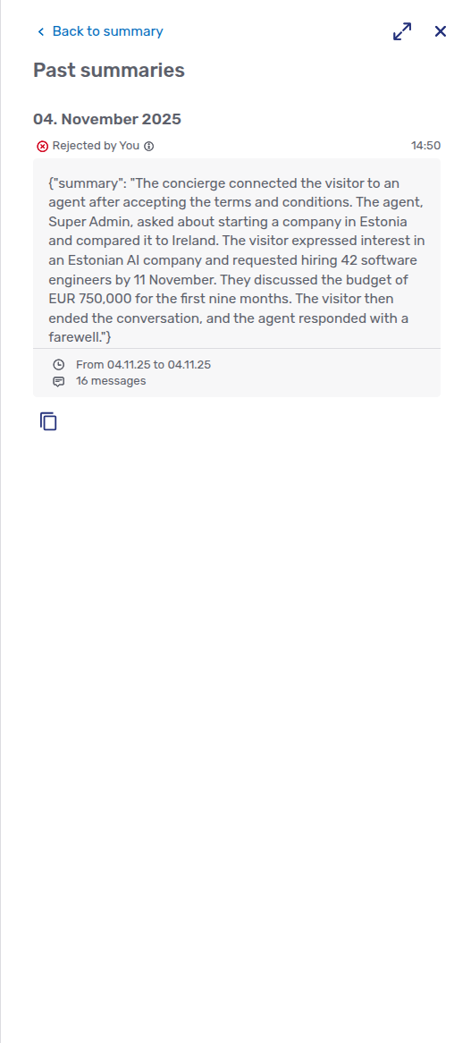
If summaries need reviewing, each summary is preceded by an indication of whether the summary had been accepted or rejected. All rejected summaries also appear in the Past summaries view.
Live chat, audio call, and video call requests
If the visitor requested a live chat, an audio call, or a video call, the appropriate view opens when you answer the request. The views in the Agent Desk are similar to the ones in the Floating Visitor UI. The main differences are:
-
In the Agent Desk, there’s no option to pop the conversation into a separate window.
-
The Agent Desk can display the call view and the messages of a conversation side by side.
-
The Agent Desk provides canned responses.
For more information on the other view actions, consult the Floating Visitor UI guide.
Using canned responses
Canned responses are predefined text snippets that agents can use in live chats. They can include predefined placeholders for the agent’s and visitor’s names, as well as custom placeholders that must be replaced by the agent. Canned responses can be defined at the account, team, and user level.
To use a canned response in a conversation, type the appropriate keyboard shortcut in the text input field. Alternatively, press the Canned response icon  next to the field. Both actions open the canned response dialog above the text input field:
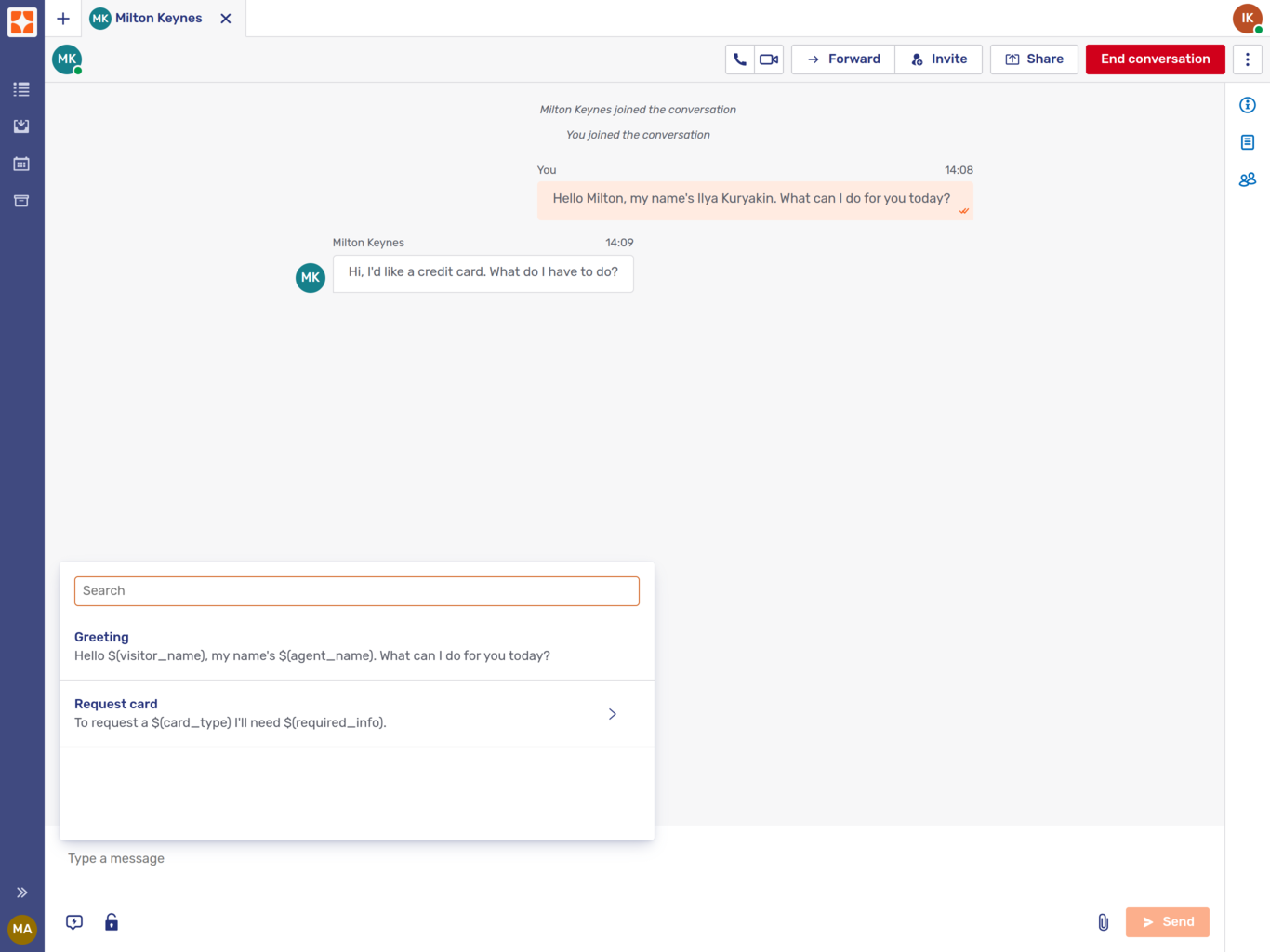
The dialog lists all the canned responses available to the agent in the same language as the current conversation. The list is arranged in alphabetical order by title. Titles need not be unique, so each item also displays the beginning of the text of the canned response. This makes it easier to distinguish between canned responses.
The filter box above the list allows you to search through the available canned responses by title and by content. The picture above shows a canned response dialog after clicking the icon and typing re in the text input field.
Canned responses with one or more custom placeholders have an arrow  to their right. When you select such a canned response, the entire text of the canned response is displayed in the dialog, and you can replace the custom placeholders with content suited to the conversation.
There are two types of custom placeholders: text placeholders and multiple-choice placeholders.
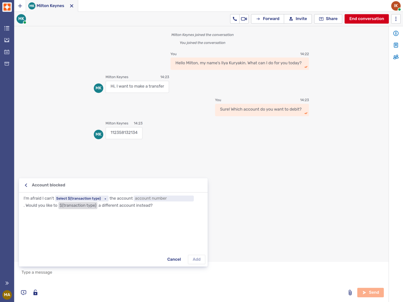
Multiple-choice placeholders are shown as buttons with the label Select and the placeholder title. When you click the button, the available options are listed for you to select from.
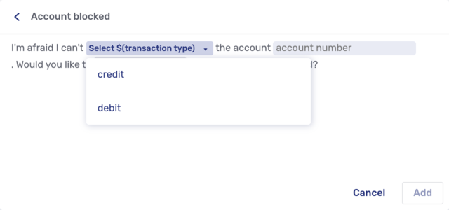
Text placeholders appear as boxes in the text. The box contains the hint defined for the canned response. When you select a text placeholder, the hint disappears and is replaced by the text you enter.
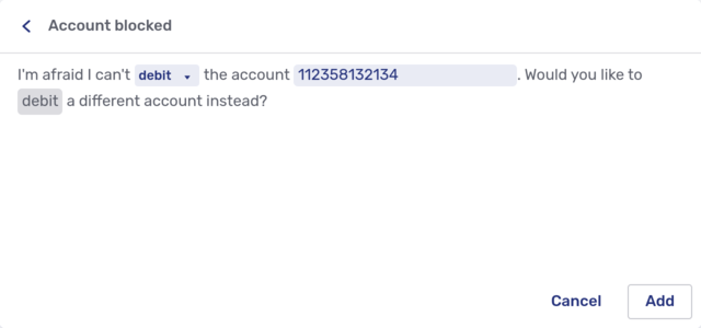
As you can see in the picture above, you can use the same placeholder more than once in a canned response. Selecting or entering a value for the first occurrence of a placeholder applies the same value to all the other occurrences of that placeholder. You can only assign a value to the first occurrence of the placeholder. By default, the first occurrence of a placeholder is pale blue. Subsequent occurrences are gray.
Once you’re happy with the text, click Add to insert the text in the text input field. The button is only available if you’ve assigned every placeholder a value. You can continue to edit the text, either manually or by adding another canned response.
| If you want to add a new line, use Alt+Enter or Shift+Enter. |
To send the message, press the Enter key or click the Send message icon  .
.
Using closed captions in calls
Closed captions work the same way in the Agent Desk as they do in the Floating Visitor call UI. For more information, refer to the Closed captions section of the Floating Visitor UI guide.
Collaborating during a call
If you decide to start collaborating during a call, the visitor may have to give their consent. If so, they receive a message that they must confirm in the chat panel. Although the chat panel icon in the Floating Visitor UI shows a badge, visitors might not realize they have to go there before they can start collaborating with you.
Refer to the relevant section of the Floating Visitor UI guide for further details.
Agent Desk user menu
Clicking the avatar in the upper right-hand corner of the Agent Desk opens the Agent Desk settings menu:
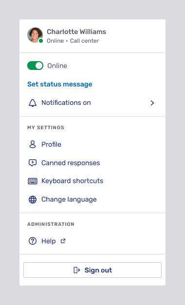
Agent information
At the top of the menu, there is a brief summary of your details: your avatar, name, online status, and the team you’re in. The status shown here is mirrored by the badge in the lower right-hand corner of the avatar.
Availability switch
The next element in the menu is a switch to toggle between the statuses Online and Away. The availability status you set here affects your status: if you toggle the switch to Away, your status changes to Unavailable, and the badge on your avatar turns yellow to reflect this change. To disable these badges, refer to Disabling availability badges.
Depending on how your organization has configured the agent status indicator, visitors in your ongoing conversations may be informed that you’re unavailable.
Status message
Beneath the availability switch is a link labeled Set status message. If you click the link and enter a message in the text field that appears, the message is displayed with your status in the secondary conversations tab of the inbox and in the user details popup when somebody clicks your avatar in a conversation.
Once you enter a status message, the link is replaced by one labeled Edit status.
| The status message also appears in visitor interfaces like the Floating Visitor UI. |
Notification status
The last entry in the first section of the settings menu shows your notification status.
Pausing notifications
If you’re allowed to pause notifications yourself, the menu entry opens the pause notifications menu:
If you select the option Automatically, Unblu automatically pauses notifications when you’re on an audio or video call in Unblu, or when you open a collaboration layer. Depending on how your organization’s configured Unblu, it may also pause notifications for other reasons, such as meetings scheduled in your calendar, or calls in other applications such as Microsoft Teams.
Once the reason for pausing notifications ends, Unblu automatically resumes sending you notifications.
You can also choose to pause notifications for a specific duration. The pause notifications menu includes options for various predefined durations. Selecting Custom time opens a dialog where you can enter the date and time Unblu should resume sending you notifications:
The entry in the Agent Desk user menu depends on the option you choose:
-
If you pause notifications automatically, but notifications aren’t paused at present, the menu entry displays the notifications on icon
 and looks like this:
-
If you pause notifications automatically and notifications are currently paused, the menu entry displays the notifications paused icon
 and the reason notifications are paused:
-
If you haven’t paused notifications, the menu entry displays the notifications on icon, but it looks like this:
-
If you pause notifications for a specific duration, the menu entry shows the notifications paused icon and the time Unblu will resume sending you notifications:
| Pausing notifications only affects web push notifications and mobile notifications. You still receive notifications in the Agent Desk. |
My settings
The next section of the menu is dedicated to various settings that only affect you.
Profile
The Profile link takes you to the General tab of your Agent Desk user profile.
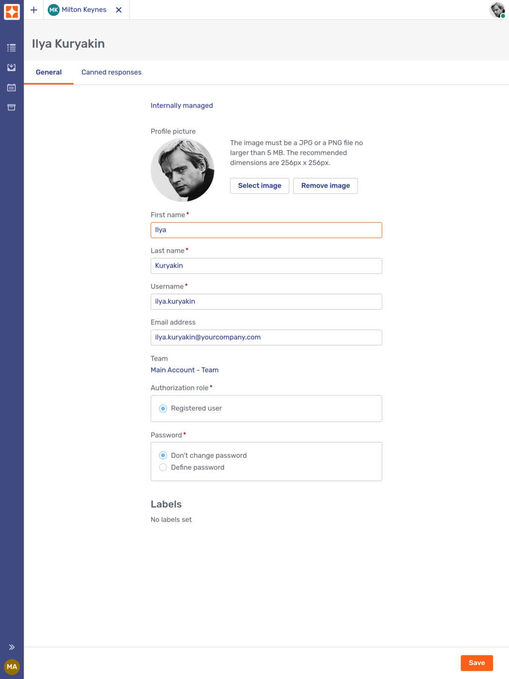
You can change a number of personal settings, including your first and last name, your username, and the labels assigned to you. To change your avatar, upload a new picture with the Select Image button.
If you want (or need) to change your password, select the Define password radio button. This displays two additional input fields for you to define and confirm your new password.
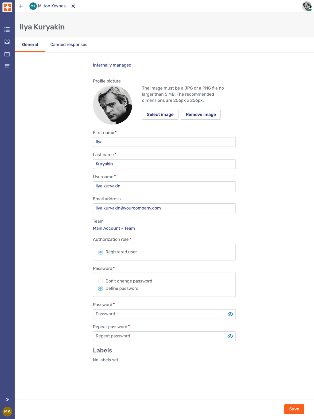
Remember to save any changes you make by clicking the Save button. If you don’t, Unblu displays a dialog asking whether you want to discard the changes.
If you want to save your changes, click Keep editing to return to the main window, then click Save.
| You can’t edit your profile if it’s managed in an external system. You can still edit your canned responses, labels, and deputies, though. |
Canned responses
Canned responses are predefined text snippets that you can use in chat messages. They help reduce the amount of typing you have to do for frequently used messages.
Canned responses can be defined for entire Unblu accounts, teams, or individual agents.
The Canned responses menu item opens the Canned responses tab of your Agent Desk user profile.
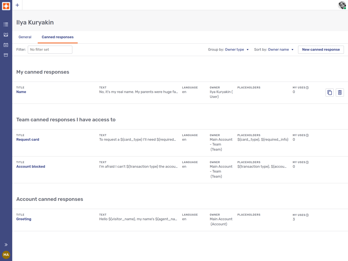
-
Canned responses under the heading My canned responses are only available to you.
-
Canned responses under the heading Team canned responses I have access to are available to anyone in the team in question. This is because subteams inherit the canned responses of their parent teams. You may therefore have access to canned responses from multiple teams.
-
Canned responses under the heading Account canned responses are available to all the registered users of an Unblu account.
The overview pictured above belongs to a supervisor of the team "Client advisors". As a result, they can duplicate and delete not only their personal canned response, but also the one owned by the team that they supervise. That’s what the Copy  and Trash can icons are for.
Agent can see how many times they’ve used a canned response in a given period in the My uses column. Hovering over the information icon beside My uses shows the period of time configured.
For more information on how to use canned responses, see the section on using canned responses above.
Filtering canned responses
There are three different ways to influence the overview of canned responses.
- Filtering
-
If you enter a term in the filter text field, only canned responses with that term in the key, title, text, or owner field are listed.
- Sorting
-
By default, canned responses are sorted by the name of their respective owners. You can choose to sort them by title, language, number of uses, text, owner type, or owner name instead.
If the canned responses are grouped, the sorting is applied in each group.
- Grouping
-
By default, canned responses are grouped by owner type, that is, agent, team, or account.
It’s also possible to group them by owner name. In that case, if you’re a member of a team that’s a subteam of another team, the canned responses of your team and its parent team are grouped separately.
Alternatively, you can choose not to group the canned responses at all and display them as a flat list.
Creating canned responses
The New canned response button opens a fly-in page where you can create a new canned response.
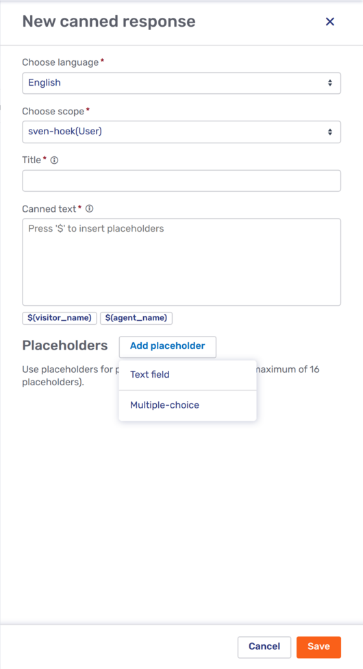
-
The Choose language dropdown allows you to specify which language the canned response is in. When you open the canned response dialog in a conversation, it only displays canned responses in the same language as the conversation you are in.
-
If you are a supervisor or administrator, you can specify the scope of the canned response with the Choose scope dropdown. This allows you to create new canned responses for a team or the Unblu account, not just for yourself.
You can only specify the scope of a canned response if you opened the overview of your canned responses. If you open the canned responses of a user, a team, or an account, the new canned response is automatically created within the scope of that user, team, or account, respectively.
It isn’t possible to select another user as the scope of the canned response. In other words, you can’t create canned responses for the exclusive use of another user.
-
The Title is displayed in the canned response dialog above the text input field when you are in a text conversation. It should be a brief description of the canned response no more than 250 characters long.
You can use the same title multiple times, or create a personal canned response with the same title as a canned response provided to your entire team. This is especially useful when you create canned responses in multiple languages but always want the title to be in your own language.
-
The Canned text is the text that should be inserted in the text field. If Markdown is enabled, you can use it in canned texts.
If you type the dollar sign $ in the canned text input field, Unblu displays a list of the placeholders available for the canned text. The two predefined placeholders
$(visitor_name)and$(agent_name)allow you to include a visitor’s name or your own name in a canned response without having to enter them. However, you can define your own custom placeholders.You can also add a placeholder by clicking the button sporting its title shown beneath the canned text input field .
Once you’re happy with your new canned response, click Save to save it. It appears in the canned response overview immediately.
Custom placeholders
Placeholders make it easier to adapt the text of a canned response to the particular circumstances of a conversation. This can make the same canned responses useful in multiple contexts, thereby reducing the number of canned responses you need to maintain.
To create a custom placeholder, click Add placeholder beneath the Canned text field of the New canned response fly-in page. This opens a menu where you can choose the kind of placeholder you want to create:
-
Text field placeholders create a field in the canned text that you can fill with any text you like.
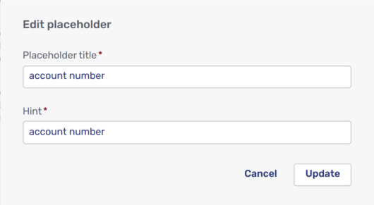
-
The Placeholder title is used to select the placeholder and add it to a canned text. For example, to select the placeholder defined in the picture above, you would enter
$(account number)in the canned text.Within each canned response, every placeholder title must be unique.
-
The hint appears in the canned response dialog in a chat conversation. Its purpose is to remind you of the content you should enter in the field.
-
-
Multiple-choice placeholders let you choose from a predefined set of choices.
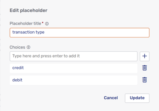
-
As with text field placeholders, the Placeholder title is used to select the placeholder and add it to a canned text. It can be up to 200 characters long and must be unique within a canned response.
-
In the section entitled Choices, add the different options agents should be able to choose from. Enter the text that should appear and click the plus icon
.You must add at least two choices, and can add up to 16 choices. The choices must be unique within each multiple-choice placeholder.
-
Once you have finished setting up your custom placeholder, click Update to make it available for use in the canned response.
| Custom placeholders aren’t shared between canned responses. If you want to use the same placeholder in more than one canned response, you have to add it to each canned response individually. Alternatively, you can duplicate the canned response from the canned response overview and then adapt the text. |
Deputies
If your organization uses Unblu’s deputy delegation system, you may have a Deputies item in the Agent Desk user menu. The menu item opens the Deputies tab of your profile.
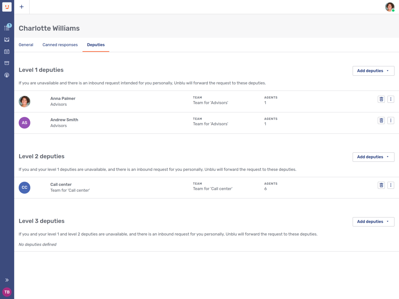
The tab displays all your deputies and shows which delegation level they’re assigned to. If you don’t respond to a conversation request sent to you personally, your level 1 deputies are notified. They can then accept the request in your place. If your level 1 deputies don’t respond to the request, your level 2 deputies are notified, and so on.
If you’re authorized to manage your deputies, you can add and remove deputies and move them to a different delegation level:
-
To add a new deputy, click Add deputies. Next, select whether you want to add an agent or an entire team as your deputy. This opens a fly-in page where you can choose the deputy you want to add.
The fly-in page only lists agents or teams that aren’t already your deputies.
Use the My team filter to limit the list of possible deputies to agents in your team, or to your team and its subteams.
-
To move a deputy to a different delegation level, click the options menu
next to the deputy in question. Next, select which level you want to move the deputy to.Unblu moves the deputy to their new level immediately.
-
To remove a deputy, click the delete button
next to the deputy. Doing so removes the deputy immediately.
If you can’t manage your deputies, the Add deputies, delete button, and options menu won’t be present. You’ll still be able to see who your deputies are.
Keyboard shortcuts
Keyboard shortcuts are an alternative way of completing an action that you would normally use your mouse for. The Agent Desk has an extensive set of keyboard shortcuts to make it easier to navigate the UI and to access various actions. UI elements that have a shortcut associated with them display that shortcut as a tooltip when you hover over the element with your cursor.
The Keyboard shortcuts item in the Agent Desk user menu open a modal dialog that lists the current keyboard shortcuts.
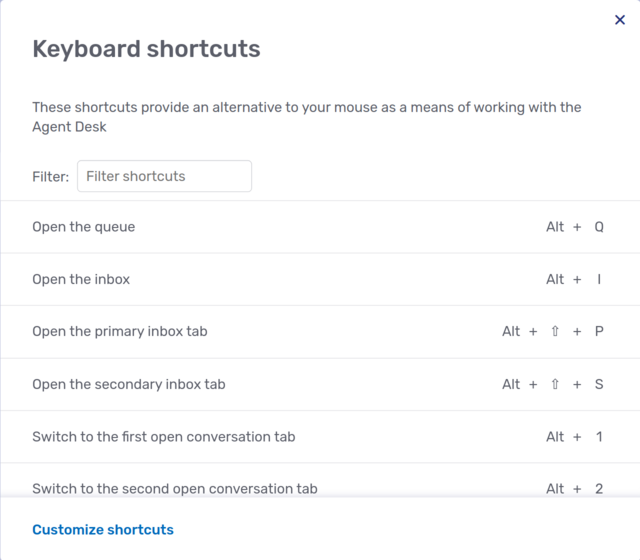
The modifiers displayed are based on those available in your operating system. The default keyboard shortcuts have been chosen so as not to clash with the keyboard shortcuts used by common browsers.
If you prefer to specify your own keyboard shortcuts, click Customize shortcuts to open the editing modal dialog:
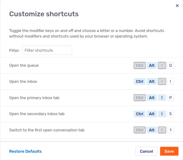
To change a keyboard shortcut, first click the modifier or modifiers that you want to use and enter a letter or number in the text field at the end of the line. It isn’t possible to change a shortcut by placing the cursor in the text field and pressing the combination of keys you wish to assign to the action in question.
Bear the following points in mind when customizing shortcuts:
-
Make sure that the shortcut you want to assign to an action isn’t already used by your browser.
-
You can create keyboard shortcuts with up to three modifiers. In the picture above:
-
Open the queue uses one modifier, Alt.
-
Open the inbox uses two modifiers, Ctrl+Alt.
-
Open the secondary inbox tab uses three modifiers, Ctrl+Alt+Shift.
You should always include at least one modifier in each shortcut. If you create a shortcut without modifiers, or only with the Shift key as a modifier, you won’t be able to enter that character in a text field.
-
-
If you assign the same shortcut to more than one action, the Agent Desk carries out all the actions.
Suppose you wanted to ensure that you always turn your camera and microphone on or off together. In that case, you could define the same keyboard shortcut for both Toggle the camera in a call and Toggle the microphone in a call. When you use that shortcut, it carries out both actions, turning both the camera and the microphone on or off.
Once you’re happy with your custom shortcuts, click Save.
If you want to revert to the default keyboard shortcuts, click Restore defaults.
Language settings
The last option in the My settings section opens a modal dialog for your language settings:
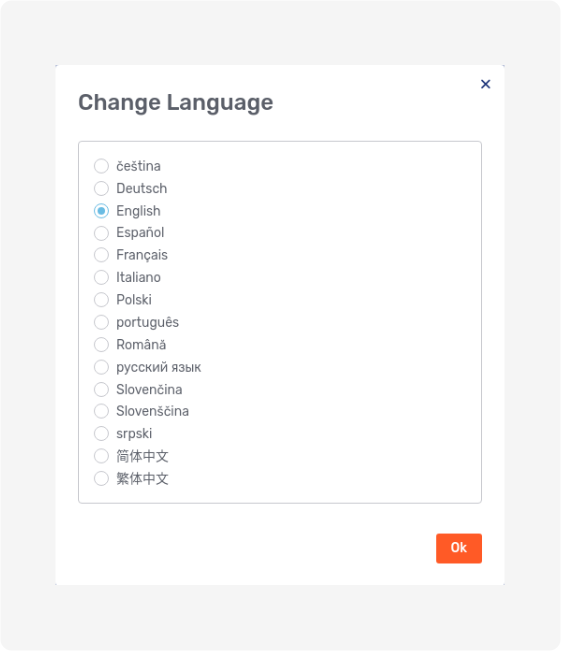
Select the language you want the Agent Desk to be displayed in and click OK.
If your organization uses Unblu’s chat translation feature, the modal dialog looks different, with a dropdown to set the Agent Desk language and a toggle to enable translations:
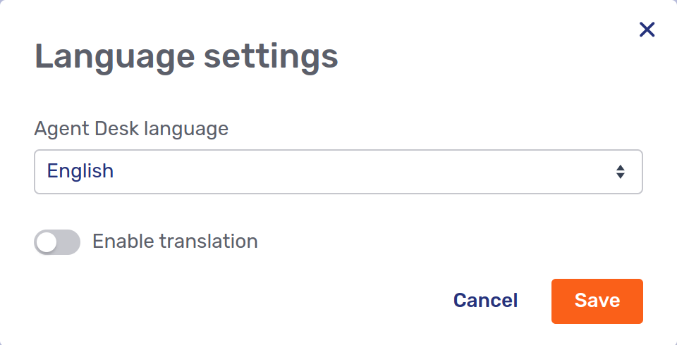
When you enable translations, additional settings appear:
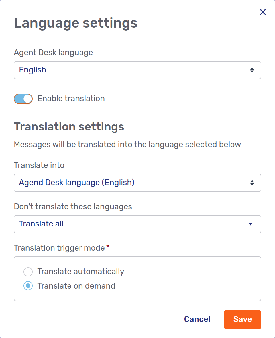
-
The Translate into dropdown lets you specify which language chat messages are translated into. The setting overrides the default target language your organization specifies.
-
You may prefer to see chat messages in all the languages you speak (or are learning to speak), not just the target language. The Don’t translate these languages element lets you exclude languages from translation.
This option is especially useful if chat message are translated automatically.
-
The Translation trigger mode defines when Unblu translate chat messages.
-
If you select Translate automatically, chat messages that aren’t in the target language or an excluded language are automatically translated.
-
If you select Translate on demand, you must trigger the translate action by hovering over the chat message you want to translate and clicking the translate icon
.
This setting overrides the default trigger mode you organization specifies.
-
Administration and About Unblu Spark
Supervisors, administrators, and superadmins have an Administration section in the Agent Desk user menu. All three user roles have a link labeled Account settings, which opens the Account Configuration interface.
If your organization uses the Unblu Conversational Bot and you’re an authorized content manager, the Administration section has a link labeled Conversational Bot settings that launches the Bot Dialog Builder.
Superadmins also have a link labeled Global settings, which opens the Global Configuration interface.
At the bottom of the settings menu is the link About Unblu Spark. When you click the link, Unblu displays a modal page with the Unblu version number and some other information.
See also
-
For information on customizing the features available in the Agent Desk, refer to the UI customization guide.
-
For information on adapting the Agent Desk’s theming, refer to the UI theming cheat sheet.