UI customization guide
This article discusses various ways you can customize the behavior of the Agent Desk and the Floating Visitor UI to suit the needs of your organization. It explains how the configuration of various options affect the way the user interface appears to users.
| For information on customizing the appearance of the UIs, refer to UI theming cheat sheet. |
Numerous aspects of the user interfaces change depending on how you configure Unblu. In the Agent Desk, this includes:
-
The sidebar menu
-
The Agent Desk user menu
-
The plus icon menu

-
The collaboration area top bar
-
Various elements of the control bar, such as the Forward, Invite, and End conversation buttons or the Share menu
Some UI elements that change are present in both the Agent Desk and the visitor UIs:
-
The engagement UI
-
The collaboration layer controls
-
The message view or chat panel, which includes the list of messages and the message input field
Common elements are only discussed in the section on the Floating Visitor UI and collaboration space.
Customizing the Agent Desk
The image below shows the various parts of the Agent Desk you can customize:
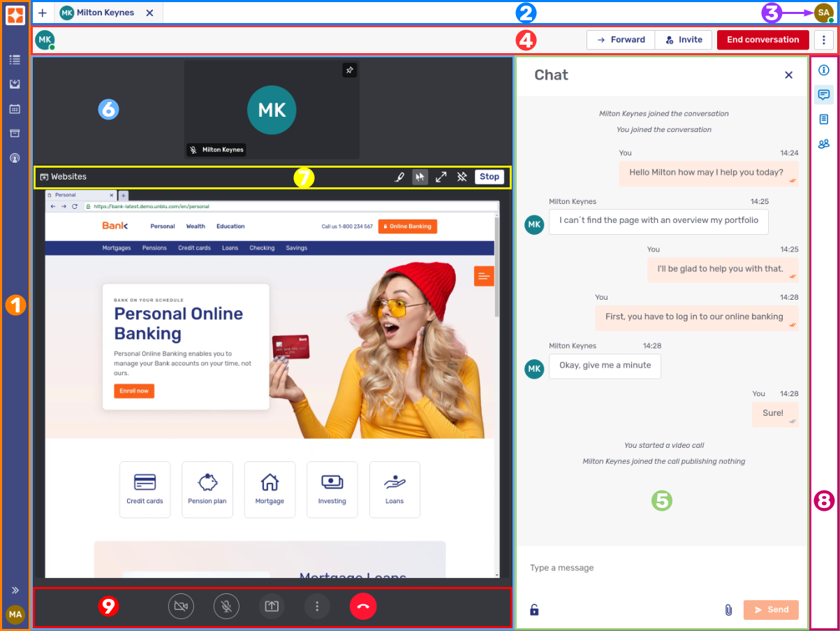
The numbered parts of the Agent Desk are:
-
The user’s avatar, which provides access to the Agent Desk user menu
How your configuration affects each of these parts is discussed in turn.
The sidebar and its related views
By default, the left navigation sidebar is collapsed and only shows icons. To expand the sidebar and make the icons' labels visible, click the Toggle navigation bar button  at the bottom of the sidebar.
The menu in the sidebar consists of at most six entries, each providing access to a different view:
Queue
The Queue entry in the sidebar menu is displayed if com.unblu.desk.ui.showQueue is true. When selected, it opens the queue view.
The requests in the queue are displayed in the order they were added to the queue, with the oldest request at the top. You can highlight that requests have been waiting more than a certain period by setting a warning and a danger threshold with the configuration properties com.unblu.queue.ui.warningTimeThresholdSeconds and com.unblu.queue.ui.dangerTimeThresholdSeconds, respectively.
-
When a request reaches the warning threshold, the color of the timer changes to that specified in com.unblu.theme.color.warning. If com.unblu.queue.ui.showWarnTimeIcon is
true, Unblu displays a warning icon next to the timer. The color of the icon is specified in com.unblu.theme.color.warning.
 -
When the request reaches the danger threshold, the color of the timer changes to that specified in com.unblu.theme.font.colorTextError. If com.unblu.queue.ui.showDangerTimeIcon is
true, Unblu displays a danger icon next to the timer. The color of the icon is specified in com.unblu.theme.color.error.
 -
If you set both thresholds to 0, all new conversation requests start as if the danger threshold had been crossed.
-
If you set the danger threshold to a value smaller than the warning threshold, the warning threshold is treated as if it were the danger threshold. The danger threshold itself is ignored.
Configuring the queue is discussed in a separate article, Queue and request dispatching configuration. That article also describes how your configuration affects the queue in the Agent Desk.
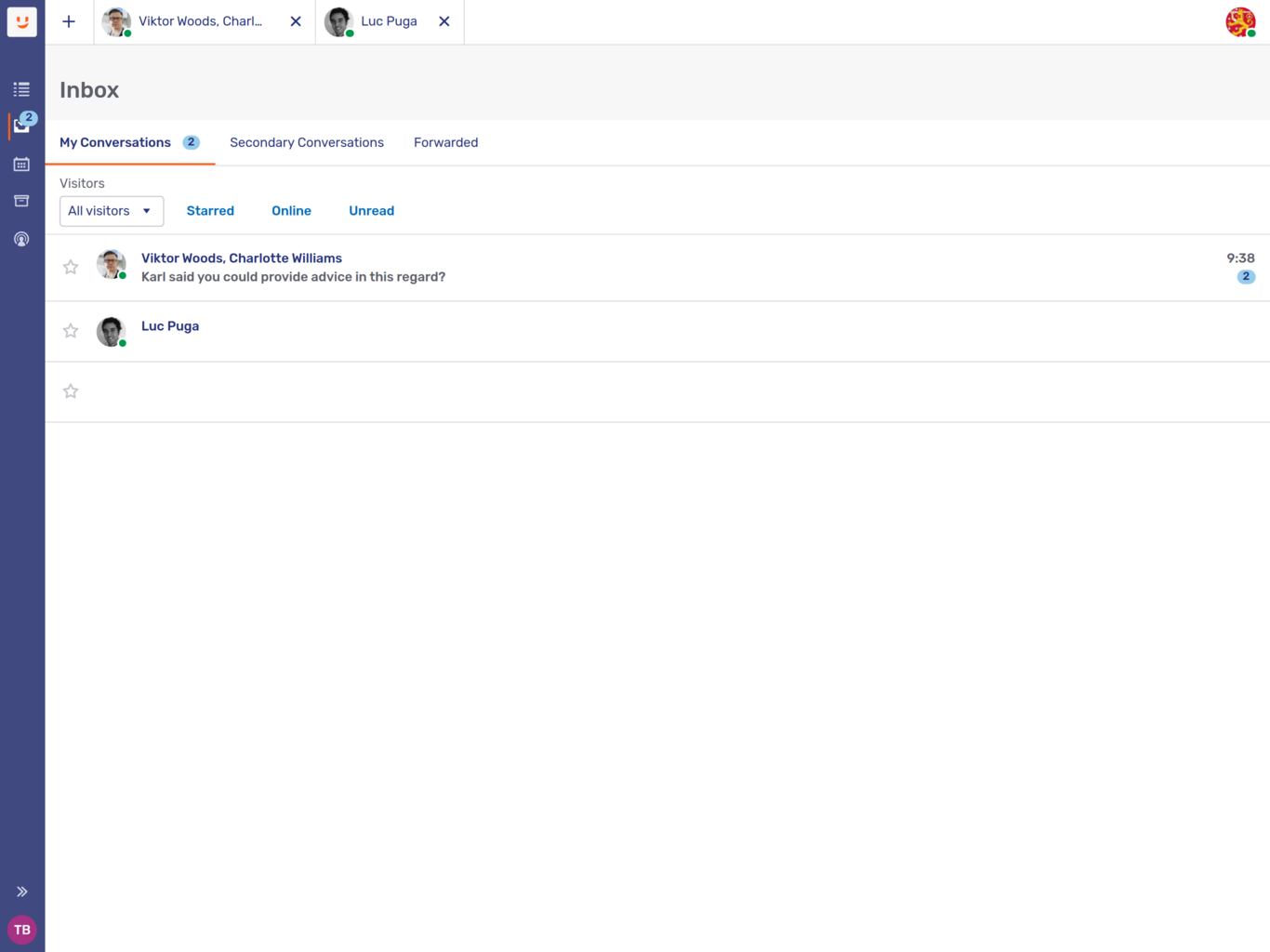
Inbox
The Inbox menu entry is displayed if com.unblu.desk.ui.showInbox is true. Clicking it opens the inbox with the user’s ongoing conversations.
By default, conversations are grouped in three tabs, My Conversations, Secondary Conversations, and Forwarded. This makes it easier for agents to distinguish between conversations where they’re the assigned agent, ones where they’re only secondary agents, and conversations that they have forwarded to another agent.
You can, however, configure Unblu to display an agent’s own and secondary conversations in a single list by setting the configuration property com.unblu.agent.inbox.ui.displayOwnAndSecondaryConversationsInTabs to false. In this case there’s no indication whether the agent’s participating in a conversation as the assigned agent or as a secondary agent.
You can opt to display the conversations an agent has been invited to and conversations forwarded to an agent in their inbox rather than the queue. To do so, set com.unblu.desk.ui.showTargetedInvitationsInInbox to true.
Conversations in the inbox are listed in order of the time of the last message sent to the conversation. You can choose to list conversations in ascending or descending order with the configuration property com.unblu.agent.inbox.ui.defaultSortOrder. By default, they’re listed in descending order.
Forwarded tab
By default, forwarded conversations are listed in the Forwarded tab until they’re accepted. If you want them listed in the My conversations tab instead, set the configuration property com.unblu.agent.inbox.ui.displayForwardedConversationsInTabs to false.
You can open the tab using a keyboard shortcut defined in com.unblu.agent.inbox.shortcuts.openInboxForwardedShortcut. The default shortcut is Alt+Shift+F.
The text displayed in the tab is configurable with the following text properties:
-
com.unblu.agent.inbox.ui.tabTitleForwardedConversations: Forwarded tab label.
-
com.unblu.core.client.agent.inbox.AgentConversationListItemView.forwardedRecipient: The text displayed for the recipient in case of forwarding.
-
com.unblu.agent.inbox.shortcuts.openInboxForwardedTitle: Label for the shortcut.
-
com.unblu.agent.inbox.ui.emptyForwardedInboxLabel: Text displayed when there are no forwarded conversations.
When another agent answers the forwarded request, the original assigned agent’s participation in the conversation ends automatically and the conversation is no longer listed in their Forwarded tab.
When an agent opens a conversation they’ve forwarded, Unblu displays a banner indicating that it’s been forwarded at the top of the conversation. You can revoke a forwarding from the banner.
You can configure the text in the banner using the following text properties:
-
com.unblu.conversation.forward.banner.bannerTitle: Title of the forwarding banner.
-
com.unblu.conversation.forward.banner.bannerText: Text displayed in the banner to describe the forwarding.
-
com.unblu.conversation.forward.banner.revokeButton: Button to revoke the pending forwarding.
Group avatar
In the various lists of conversations in the inbox, each conversation sports the context person's avatar. This can be confusing if there are more than two participants in a conversation.
If you’d rather display a neutral group avatar, enable the configuration property com.unblu.conversation.ui.enableGroupConversationAvatar. When you do, Unblu displays an avatar with the user group icon  . The avatar is used in both the conversation tab in the Agent Desk top bar and the conversation list in the Visitor UIs.
When the agent hovers over the avatar, Unblu displays a tooltip telling them how many other participants are in the conversation. To customize the tooltip, edit the text property com.unblu.conversation.ui.groupConversationAvatarTooltip.
Customer view
To enable the Customer view menu, set com.unblu.desk.ui.showCustomerView to true.
Customer list
-
Use com.unblu.customers.enabledSearchFilterOptions to specify which label filter options are displayed by default. Agents can customize their displayed filters in their customer list settings.
-
Use com.unblu.customers.enabledListColumnOptions to specify which columns are displayed by default as well as the order they appear in. Agents can adapt the columns displayed to their needs in their customer list settings.
-
Search results are cached for the time specified in com.unblu.customers.customerListInvalidationTime. After this time is reached, the cached search result is invalidated. If the user then navigates away from the customer list and back again, the search result is updated. Before invalidation occurs, users must update the search results manually by either performing the search again or clicking the Refresh icon
 .
.
Customer dashboard
The customer dashboard displays information about the customer’s most frequent locations and most frequently used languages. The configuration property com.unblu.person.extendedPersonTimespan defines how far in the past Unblu should retrieve this information. Set com.unblu.customers.dashboard.info.displayCustomerLocations to false to hide the customer’s most frequent locations.
Conversation history
The Conversation history menu entry is displayed if com.unblu.desk.ui.showConversationHistory is true.
The only configurable option in the conversation history is the number of conversations that it should show. Set com.unblu.conversationhistory.limit to the maximum number of conversations to display in the conversation history.
There is no pagination in the conversation history. If more conversations match the criteria specified in the filter, Unblu displays a message to this effect. Users can then adapt their search criteria to further limit the number of search results.
Agents can export their conversation history from the Agent Desk. You can set the format of the exported file with the configuration property com.unblu.conversationhistory.exportAs. Choose between CSV and XLSX.
Agent monitor
The Agent monitor entry in the sidebar menu is displayed if com.unblu.desk.ui.showAgentAvailabilityMonitor is true and the user has the user role SUPERVISOR or higher.
The top bar
The top bar holds the plus menu , the tabs of open conversations, and the avatar for the Agent Desk user menu.

The plus menu and the avatar displayed on conversation tabs are configurable. How you configure the avatar is explained in the Group avatar section above.
The plus menu
The plus menu lets agents launch conversations with various engagement types. The content of the menu depends on the types of conversation that are enabled for the Unblu account in question.
| You can only enable collaboration layers for which you have a valid license. |
-
If com.unblu.messenger.universalCoBrowsingEnabled is
true, agents can initiate a conversation and launch a universal co-browsing layer collaboration layer without generating an invitation. The engagement type of the conversation is Universal co-browsing invite.The label of the menu item is the name of conversation template. For the default conversation template, the name is defined in the text property com.unblu.conversationtemplate.default.headlessPinName.
-
If com.unblu.messenger.embeddedCoBrowsingEnabled is
true, agents can initiate a conversation with a PIN invitation to an embedded co-browsing session. The engagement type of the conversation launched will be Embedded co-browsing PIN.The label of the menu item is the name of conversation template. For the default conversation template, the name is defined in the text property com.unblu.conversationtemplate.default.domcapPinName.
-
Setting com.unblu.messenger.screenSharingEnabled to
trueadds two entries to the menu:-
An entry for the agent to share their own screen. This creates a conversation with the engagement type Screen sharing invite. It will open the screen sharing collaboration layer and the dialog to choose what to share. The agent must invite visitors separately using the Invite button.
The label of the menu item is the name of conversation template. For the default conversation template, the name is defined in the text property com.unblu.conversationtemplate.default.screenSharingInviteName.
-
An entry for the agent to share the visitor’s screen. This generates a PIN invitation to a screen sharing session in a new conversation with the engagement type Screen sharing PIN.
The label of the menu item is the name of conversation template. For the default conversation template, the name is defined in the text property com.unblu.conversationtemplate.default.screenSharingPinName.
-
-
To allow agents to initiate conversations with a PIN invitation to a mobile co-apping session, set com.unblu.messenger.mobileCoBrowsingEnabled to
true. The engagement type of the conversation will be Mobile co-browsing PIN.The label of the menu item is the name of conversation template. For the default conversation template, the name is defined in the text property com.unblu.conversationtemplate.default.mobilePinName.
-
To allow agents to launch conversations with the engagement type Chat invite, set the configuration property com.unblu.agent.conversationtemplate.allowStartChatInviteConversations to
true.The label of the menu item is the name of conversation template. For the default conversation template, the name is defined in the text property com.unblu.conversationtemplate.default.chatInviteName.
-
Outbound conversations also have the engagement type Chat invite, but they require additional configuration.
-
To allow agents to launch outbound conversations, set com.unblu.conversation.outbound.allowCreateOutboundConversation to
true. (This property is set on the user, not the conversation template.) -
Next, make sure the engagement type of the conversation template is Chat invite.
-
On the template, set com.unblu.conversation.outbound.enableOutboundConversation to
true. -
If the outbound conversation uses an external messenger, set com.unblu.conversation.outbound.outboundChannel to point to the messenger in question.
-
To add a template for a particular engagement type to the plus menu, you must add it to the configuration property com.unblu.conversation.template.newConversationTemplateIds. If the configuration property is empty, or if none of Unblu’s collaboration layers are enabled, the plus menu isn’t visible in the Agent Desk.
You can add multiple templates for the same engagement type to the plus menu.
|
If you change the value of com.unblu.conversation.template.newConversationTemplateIds, however, and then uncheck all the options, Unblu doesn’t revert to default conversations templates. Instead the plus menu is empty, so it isn’t displayed. |
Full-text search
-
The button for full-text search
 appears in the top bar if com.unblu.desk.ui.showSearch is
 true. -
The color used to highlight the search term in the results is defined in com.unblu.search.ui.searchHighlightColor.
-
The keyboard shortcut to open the search tab is defined in com.unblu.search.ui.searchTabShortcut. The default shortcut is $mod+Shift+F.
The Agent Desk user menu
The Agent Desk user menu is available if com.unblu.ui.usermenu.userMenuEnabled is true. You can customize the menu with the following configuration properties:
-
If com.unblu.ui.usermenu.showStatusEditor is
true, the user menu includes a toggle for agents to change their online status. Beneath the toggle, there is a link labeled Set status message. This status message is displayed when a visitor clicks the agent’s avatar.Refer to The queue and manual and automatic request dispatching to learn about how an agent’s online status and their queue availability are related.
-
Set com.unblu.ui.usermenu.showManageProfile to
trueto grant users access to their profile. -
To give your agents the possibility to create personal canned responses, set com.unblu.ui.usermenu.showManageCannedResponses to
true. See canned responses for further details. -
com.unblu.ui.usermenu.showChangeLanguage lets agents change the language of the Agent Desk UI. The languages available are those listed in com.unblu.text.supportedLanguages.
-
With com.unblu.ui.usermenu.showManageAccount set to
true, authorized users can launch the Account Configuration interface directly from the Agent Desk. com.unblu.ui.usermenu.showManageGlobal provides the same functionality for accessing the Global Configuration interface.Similarly, when the user menu is displayed in the Account Configuration and Global Configuration interfaces, you can provide users with direct access to the Agent Desk by setting com.unblu.ui.usermenu.showOpenAgentDesk to
true. Only users with a role granting them access to the Agent Desk have the entry in their settings menu. -
With com.unblu.ui.usermenu.showHelp set to
true, the user menu includes a link to a help page. Specify the URL for the help page in com.unblu.ui.usermenu.uriHelp.If you provide a help page in multiple languages, you can specify the supported languages in the configuration property com.unblu.ui.usermenu.uriHelpSupportedLanguages. Unblu then replaces the variable
${lang}in the help URL with the language the agent is using in the Agent Desk.You can provide a fallback language in the configuration property com.unblu.ui.usermenu.uriHelpFallbackLanguage. Unblu use this language if no help page is available in the agent’s language.
-
com.unblu.ui.usermenu.showSignout determines whether the user menu includes the Sign out button.
The control bar
The control bar is located beneath the top bar and is displayed when a conversation tab is open.

The contents of the control bar depend on the type of conversation currently open.
The UI elements the control bar may contain are defined with the configuration properties in the com.unblu.core.client.agent.conversation.controlbar.AgentConversationControlBarConfig group of the conversation template for the type of conversation in question. By default, the control bar contains the following controls:
-
The Start button, if the conversation is a scheduled conversation that hasn’t started yet
Other common elements include:
-
The overflow menu

You can group actions displayed in the control bar by assigning them the same sort order. You can’t define the order of actions within a group displayed in the control bar.
To group actions in the overflow menu, assign them a sort order beginning with the same hundred. For example, to group Leave conversation and End conversation in the overflow menu in that order, you could assign them the sort orders 301 and 302, respectively. If other actions on the overflow menu have sort orders with the value 2_nn_, they would appear in a group above
The configuration property com.unblu.agent.conversation.controlbar.maxVisibleActions specifies how many actions are displayed in the control bar. Any more actions are moved to the overflow menu, even if they’re grouped with other actions.
The Forward button
The Forward button is used by authorized users to forward the current conversation to an agent, a team, or a named area. Which participants may forward conversations, and who they may forward them to, is determined by three configuration properties:
-
com.unblu.conversation.invitation.allowForwardToAgent specifies the participants who may forward a conversation to agents currently not participating in the conversation.
-
com.unblu.conversation.invitation.allowForwardToTeam lists the participants who may forward a conversation to a team.
-
com.unblu.conversation.invitation.allowForwardToNamedArea specifies which participants may forward a conversation to a named area.
The participation role of the person logged in to the Agent Desk determines the content of the Forward button menu.
-
If the user is authorized to forward the conversation to two or more types of entity, clicking the icon opens a menu, and the user can choose which type of entity the conversation they want to forward the conversation to.
-
If the user is only authorized to forward the conversation to one type of entity, clicking the icon opens the modal dialog where they can select the recipient of the conversation.
-
The Forward button doesn’t appear if the user isn’t authorized to forward the conversation.
The Invite button
The Invite button works similarly to the Forward button. It lets authorized users invite agents, teams, or visitors to the current conversation. Which participants may invite which types of participant to join a conversation is again specified in three configuration properties:
-
com.unblu.conversation.invitation.allowInviteAgent specifies the participants who may invite other agents to join a conversation.
-
com.unblu.conversation.invitation.allowInviteTeam lists the participants who may invite teams to participate in a conversation.
-
The configuration properties com.unblu.conversation.invitation.allowInviteVisitorPin, com.unblu.conversation.invitation.allowInviteVisitorPrivateLink, and com.unblu.conversation.invitation.allowInviteVisitorEmail specify who may invite visitors to join a conversation through a PIN, a private link, or by email, respectively.
The number of permissions the Agent Desk user has affects the behavior of the button in the same way as the Forward button.
-
If the user is authorized to invite two or more types of entity, clicking the button opens a menu, and the user can choose which type of entity the conversation they want to invite.
-
If the user is only authorized to invite to one type of entity, clicking the button directly opens the modal dialog where they can send the invitation to the entity.
-
If the user isn’t authorized to invite anyone to join the conversation, the Invite button isn’t visible.
If public links are enabled for the conversation, agents can access the public link in the Invite menu.
The conversation configuration button
The conversation configuration button  opens the settings of the conversation in question and allows the user to make changes to the settings of a single conversation, just as they would to those of a conversation template.
The button is present in the control bar (or the overflow menu) if the user logged in to the Agent Desk is an admin or superadmin. How the action appears depends on com.unblu.agent.conversation.controlbar.configureConversationActionDisplayMode.
The Share action
The Share action is used to launch a new collaboration layer. By default, the action appears in the overflow menu. Its contents depend on the types of collaboration layer that can be launched within the context of the running conversation.
Only participant types listed in com.unblu.conversation.collaboration.showLayerControls see the action. com.unblu.conversation.collaboration.action.displayInactiveLayers determines which types of participant see inactive collaboration layers in the menu.
How the Share action appears in the UIs is determined by the following configuration properties:
-
For the visitor UIs, com.unblu.conversation.actionbar.ui.shareActionDisplayMode specifies how to display the action. The action’s position relative to other actions is determined by com.unblu.conversation.actionbar.ui.shareActionSortOrder.
-
For the agent UIs, com.unblu.agent.conversation.controlbar.shareActionDisplayMode specifies how to display the action. The action’s position relative to other actions is determined by com.unblu.agent.conversation.controlbar.shareActionSortOrder.
Two configuration properties determine which layers users may start:
-
com.unblu.conversation.collaboration.switchOwnLayers lets users share and switch between their own layers, that is, layers they themselves are sharing.
By default, visitors are only allowed to share their own layers.
-
com.unblu.conversation.collaboration.switchOtherLayers lets users share and switch between layers other participants are sharing.
The display mode for conversation custom actions is defined on the custom action, not through configuration properties.
There are similar configuration properties for all other predefined actions that can appear in the action bar.
The values the configuration properties listed above can take are:
-
always_in_overflow -
The collaboration layer is only ever listed in the overflow menu, not in the action bar.
-
always_show -
The icon to switch to the collaboration layer always appears in the action bar.
The action provides enough room for four icons on normal screens, and three icons on small screens and mobile devices. If you add more icons to the action bar, this may have an adverse effect on the UI.
-
hidden -
Users don’t see the collaboration layer in the action bar or the overflow menu.
-
show_if_possible -
The collaboration layer’s icon appears in the action bar if there’s enough room to display it there. If the control bar or action bar is full, the collaboration layer is listed in the overflow menu.
| The relevant feature must be enabled for the settings to have an effect. |
Each conversation template can be configured individually to allow various types of collaboration:
-
Participants must be allowed to see and switch between layers. This is defined in the com.unblu.conversation.collaboration.switchOwnLayers and com.unblu.conversation.collaboration.switchOtherLayers configuration properties on the conversation template.
-
com.unblu.conversation.feature.embeddedCoBrowsingEnabled enables embedded co-browsing. The menu entry is configured via com.unblu.conversation.collabspace.layer.menuEntryRemoteLayerEmbeddedCobrowsing.
-
com.unblu.conversation.feature.universalCoBrowsingEnabled enables universal co-browsing. The label of the menu entry is defined in com.unblu.conversation.collabspace.layer.menuEntryLayerUniversalCobrowsing.
-
com.unblu.conversation.feature.contextMigrationCoBrowsingEnabled enables context migration co-browsing. The menu entry is determined by com.unblu.conversation.collabspace.layer.menuEntryRemoteLayerContextMigrationCobrowsing.
-
com.unblu.conversation.feature.screenSharingEnabled is used to enable screen-sharing. This generates a menu entry for each participant allowed to share their screen, which is specified in com.unblu.conversation.feature.screenSharingEnabledPerActor.
-
The label of the menu entry for agents to share their own screen is specified in com.unblu.conversation.collabspace.layer.menuEntryOwnLayerScreenSharing.
-
The label of the menu entry for the agent to share the screen of another participant is defined in com.unblu.conversation.collabspace.layer.menuEntryRemoteLayerScreenSharing.
-
-
Setting com.unblu.conversation.feature.mobileCoBrowsingEnabled to
trueenables mobile co-apping. The menu entry can be configured via com.unblu.conversation.collabspace.layer.menuEntryRemoteLayerMobileCobrowsing. -
com.unblu.conversation.feature.documentCoBrowsingEnabled enables document collaboration. The label of the menu entry is defined in com.unblu.conversation.collabspace.layer.menuEntryLayerDocumentCobrowsing.
You can only enable layers for a conversation that have been enabled for the relevant Unblu account. If one of the configuration properties mentioned above isn’t available in the settings of the conversation template, check the corresponding account-level property:
Leave conversation and End conversation buttons
-
Setting com.unblu.conversation.ui.showLeaveInAgentControlBar to
trueadds a button to the control bar that lets the agent leave the conversation. How the action appears is determined by com.unblu.agent.conversation.controlbar.leaveConversationActionDisplayMode.For visitors you need only set com.unblu.conversation.actionbar.ui.leaveConversationActionDisplayMode.
The Leave conversation button is only available if the user has a participation role in the conversation that’s allowed to leave a conversation. This is determined by com.unblu.conversation.lifecycle.allowLeave, which you can set in the conversation template. You can change the label of the button with the text property com.unblu.agent.conversation.ui.dialogButtonLeaveConversationLeave.
If you’ve enabled the awaited person type, you can configure the dialog that’s displayed when a participant leaves the conversation. For more information, refer to Configuring the awaited person type.
-
The End conversation button is displayed for all a conversation’s participants allowed to end the conversation. How the action appears is determined by com.unblu.agent.conversation.controlbar.endConversationActionDisplayMode.
Who may end a conversation is specified in conversation template’s configuration property com.unblu.conversation.lifecycle.allowEnd. The label of the button is defined in com.unblu.agent.conversation.ui.btnEndConversation.
You can remove the button from the the Agent Desk control bar by setting com.unblu.conversation.ui.showEndInAgentControlBar to
false.To show a confirmation dialog when a participant ends the conversation, include their participant type in com.unblu.conversation.ui.showEndConversationConfirmationDialog.
Launching calls
The possibility to launch calls is configured the same way as with collaboration layers:
-
Setting com.unblu.agent.conversation.controlbar.audioCallActionDisplayMode lets users start an audio call.
-
Setting com.unblu.agent.conversation.controlbar.videoCallActionDisplayMode lets users start a video call.
Both options are only available if com.unblu.messenger.callEnabled is true.
The actions' sort order is defined by com.unblu.agent.conversation.controlbar.audioCallActionSortOrder and com.unblu.agent.conversation.controlbar.videoCallActionSortOrder, respectively.
Participant information popup
When you click a participant’s avatar in the action bar, a popup appears. If com.unblu.conversation.ui.showPersonDetails permits it for the user, the About section of the popup shows the following information:
-
The user’s approximate location. This information is determined based on the user’s IP address, which is compared to a table of IP address blocks and their location.
-
The user’s language. How Unblu determines a user’s language is described in detail in the article Setting the visitor-side locale.
-
The operating system and browser the user’s running. If Unblu knows the version of the operating system and/or browser, this information is included as well. If the version is unknown, Unblu displays the term Other.
The operating system name displayed in the popup depends to an extent on the browser used. Thus someone using Google Chrome on Ubuntu is reported as running the operating system Linux Other. If they’re using Firefox, on the other hand, Unblu reports that the operating system is Ubuntu Other. -
The user’s authentication status. If they haven’t been authenticated, the lock icon is open and has the label Unauthenticated.
If the user’s authenticated identity has been propagated—because they launched a chat from within e-banking, for example—the lock icon is closed. The popup shows their propagated user ID as well as their email address and phone number (if available).
The participant information popup shows device-related information for each device the user is currently accessing the conversation with. This means that there can be multiple entries for both the operating system and browser, as well as for the language. Because of how Unblu determines a user’s location, there may even be multiple entries for their location.
By default, assigned agents, secondary agents, and ghost participants have access to the information listed above. To change which conversation participants have access, modify the configuration property com.unblu.conversation.ui.showPersonDetails.
The popup that appears when you click a user’s avatar may include other buttons:
-
Hide participation button. Clicking the button hides the agent’s participation in the conversation. The configuration property com.unblu.conversation.lifecycle.allowAssignedAgentToChangeParticipationVisibilities specifies if the assigned agent may change a secondary agent’s hidden status.
-
Assign to agent button. Clicking the button reassigns the conversation to the agent whose avatar you clicked. The button only appears if you click the avatar of an agent.
The configuration property com.unblu.conversation.invitation.allowSecondaryAgentsToSetNewAssignee specifies if secondary agents may reassign conversations.
-
Remove participant button. Clicking the button removes that user from the conversation and starts their offboarding process. The configuration property com.unblu.conversation.ui.removeParticipant specifies who may remove participants from a conversation.
The Actions section lists all the predefined and custom actions that can be invoked on the user. The sort order of the predefined actions is defined with com.unblu.conversation.person.action.ui.changeParticipationVisibilityActionSortOrder and com.unblu.conversation.person.action.ui.changeAssigneeActionSortOrder. The sort order of custom actions is defined on the custom actions themselves.
-
If com.unblu.conversation.ui.showPersonDetails allows it for the user, the More information action opens the participant in the participant details panel.
Other actions
There are a number of actions that can be added to the control bar or the overflow menu.
-
How to configure the Leave conversation and End conversation actions is described in the section Leave conversation and end conversation buttons.
-
The configuration properties com.unblu.conversation.availableCustomActionIds and com.unblu.conversation.enableAllCustomActions determine which custom actions are available in conversations based on the template in question.
-
Set com.unblu.agent.conversation.controlbar.downloadMsgLogActionDisplayMode to add an action that downloads a CSV file of the messages in a conversation. Only participants who have been authorized to do so in com.unblu.conversation.message.allowExportMessageLog see the action.
-
com.unblu.conversation.actionbar.ui.changeVisibilityActionDisplayMode. It provides secondary agents with a way to change their visibility to other participants in a conversation. The setting only has an effect if com.unblu.conversation.lifecycle.allowSecondaryAgentsToChangeVisibility is
true. -
The Delete all messages action becomes available once the requirements described in Delete all messages are met.
The properties in the com.unblu.core.shared.collaboration.conversation.config.conversation.ConversationConfiguration group define which participant roles may carry out certain actions.
The context bar
-
Setting com.unblu.conversation.ui.showConversationDetails hides the Conversation info button
 .
. -
The Files button is only available if file sharing is enabled in the conversation, that is, if com.unblu.conversation.feature.fileSharingEnabled is
true. -
The Participants button is only available to users allowed to access person details according to com.unblu.conversation.ui.showPersonDetails.
The conversation info panel
The content of the conversation info panel isn’t configurable. You can, however, define who can edit various aspects of a conversation when they click the Edit button at the bottom of the panel. The configuration properties to do so are in the com.unblu.core.shared.collaboration.conversation.config.conversation.ConversationConfiguration group.
The participant details panel
-
To open the context person’s details automatically when an agent opens a conversation, set com.unblu.conversation.ui.autoOpenContextPersonDetailsWhenOpeningConversation to
true. -
The person custom actions you can execute on a participant appear beneath the participant’s name. The configuration properties in the group com.unblu.core.client.conversation.participant.PersonActionsConfiguration define the order that person actions appear in. The action with the highest sort order appears as a separate button; the other actions appear in order in the kebab menu
. -
By default, assigned agents and secondary agents can change the nickname of anonymous visitors. To change that, edit the configuration property com.unblu.conversation.ui.allowChangeAnonymousVisitorNickname.
-
You can specify which conversations should appear on the Other conversations tab of the participant details panel with the following configuration properties:
-
Set com.unblu.conversation.contextpanel.participants.otherConversationsShowCollaborationTypes to
trueto include collaboration-centered conversations. -
Set com.unblu.conversation.contextpanel.participants.otherConversationsShowAudioVideo to
trueto include inbound audio and video conversations. -
Set com.unblu.conversation.contextpanel.participants.otherConversationsShowScheduled to
trueto include scheduled conversations. -
Set com.unblu.conversation.contextpanel.participants.otherConversationsShowEnded to
trueto include ended conversations.
The configuration property com.unblu.conversation.contextpanel.participants.otherConversationsLimit determines how many conversations appear on the tab.
-
Call controls
In audio and video calls, the message view is replaced by the call UI in the main content area. You can still view messages by opening the message panel from the context bar.
Unblu supports using a picture-in-picture (PiP) window for calls. This lets call participants see each other as they move between tabs or programs, making communication more effective.
To configure the dimensions of the window, use the configuration properties com.unblu.conversation.meetingui.pipWindowHeight and com.unblu.conversation.meetingui.pipWindowWidth.
Modern browsers such as Google Chrome (version 120 and newer) provide the Document Picture-in-Picture API to open a PiP window automatically. When the user navigates away from a tab displaying a video call, they’re prompted to grant permission for automatic PiP if they haven’t done so already.
If you want to disable automatic PiP windows for Unblu calls, set com.unblu.conversation.ui.autoOpenPipInCall to false. (The configuration property com.unblu.conversation.ui.autoOpenPipWhenStartingScreenSharingInCall is deprecated.)
The list of messages
| The configuration properties mentioned in this section affect the list of messages in the visitor UI, too. |
The list of messages shows all the messages exchanged in a conversation in order.
To speed up loading conversations with lots of messages, you can limit the number of messages preloaded when you open the conversation with com.unblu.conversation.messaging.ui.numberInitiallyDisplayedMessages. If the user scrolls up the conversation, Unblu automatically loads older messages once they almost reach the top of the currently displayed list of messages.
The number of messages loaded is determined by com.unblu.conversation.messaging.ui.numberOfAdditionalMessagesDisplayedWhenScrolledToTop. While the older messages are being loaded, the user sees a system message stating what Unblu is doing. You can adapt the text of the message by editing the text property com.unblu.conversation.messaging.ui.loadingMoreMessagesLabel.
When users hover over a message, Unblu displays the actions that can be invoked on the message in question. The sort order of predefined actions is defined by the following configuration properties:
The sort order of custom actions is defined on the custom actions themselves.
When a user selects the copy action  , use com.unblu.conversation.messaging.ui.copyMessageText to specify all the information that should be copied:
-
The message itself
-
The sender’s display name
-
The message timestamp
Very long messages can make it hard to navigate the list of messages. You can use com.unblu.conversation.messaging.ui.numberInitiallyDisplayedLinesPerMessage to limit the number of lines of a message that should appear initially. If the message has more lines, Unblu ends the last line with an ellipsis and displays a Show more action on the message. Clicking the action displays the entire message. When the message is expanded, the action is replaced with a Show less action.
Sending messages to the conversation
By default, hitting Enter when you’re writing a message sends the message to the conversation. To add a new line in a message, users must type Alt+Enter or Shift+Enter. You can change this behavior with the configuration property com.unblu.conversation.messaging.ui.messageInputSendBehavior.
The layer top bar
The layer top bar holds the button to maximize the view of the collaboration layer, and a button to stop collaborating on the layer. It also displays the collaboration tools and a label stating which type of collaboration is taking place in the layer.
-
The Stop button is only displayed to participant types allowed to stop the type of collaboration layer in question. You can specify this in the conversation template. Filter the template’s configuration properties by the term stop to review the options available to you.
-
Mark mode
 lets users mark an area of the collaboration layer. An agent could use this to point a client to a form field they need to fill in.
 -
Remote control
 lets users take control of the collaboration layer and click elements of a shared website, for example.
 -
Scroll lock
 activates scroll lock in the collaboration layer.
The tools displayed are the ones the participant in question is authorized to use in that particular collaboration layer. The article Configuring and manipulating collaboration layers describes the relevant configuration properties to define which participants may use which tools.
The About Unblu Spark modal page
The settings menu of the agent and admin UIs includes the link About Unblu Spark. You can configure what appears in the modal page with the following text properties:
-
com.unblu.desk.about.productInfoLabel displays information about the version of Unblu Spark the agent’s using. By default, this includes the version number.
-
com.unblu.desk.about.additionalAboutText can be used to display additional information in the modal page. By default, it contains a link to the Agent Desk guide.
You can use Markdown to format the additional text.
Customizing the Floating Visitor UI and collaboration space
When a visitor clicks the launcher button on your website, the Floating Visitor UI opens. For information on customizing the launcher button, refer to the relevant section of the UI theming cheat sheet.
By default, Unblu hides the launcher button when the Floating Visitor UI is open. To change this behavior, set com.unblu.siteintegration.ui.launcherButtonHideWhenOpen to false.
The Floating Visitor UI
The Floating Visitor UI includes a number of different customizable screens.
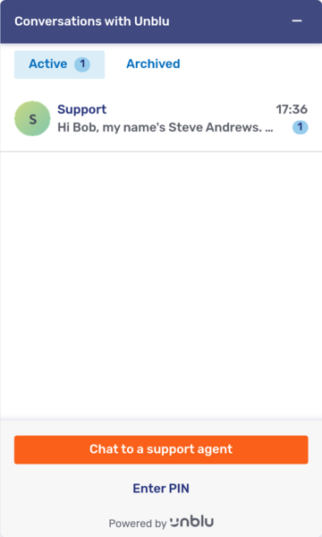
The welcome screen has at most three parts, labeled in the picture below:
-
The action bar
-
The conversation list
-
The engagement UI
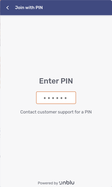
The PIN entry screen is for entering a PIN to join an existing conversation.
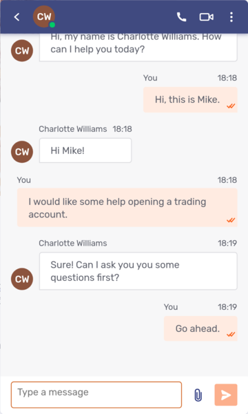
The chat screen is essentially the same as the Agent Desk message view. It consists of the action bar, the list of messages, and the message input field.
The action bar
-
How to configure the Leave conversation and End conversation actions is described in the section Leave conversation and end conversation buttons.
-
If com.unblu.visitor.ui.showOverviewActionBarCollapseAction is enabled, visitors can collapse the Floating Visitor UI.
-
Visitors can open the Floating Visitor UI of a conversation in a separate window provided com.unblu.conversation.actionbar.ui.popOutActionDisplayMode isn’t set to
HIDDEN. -
Set com.unblu.conversation.actionbar.ui.showFilesActionDisplayMode to let visitors open the file overview, which lists all the files shared in a conversation.
The action is only displayed if com.unblu.conversation.feature.fileSharingEnabled is
true. -
Set com.unblu.conversation.actionbar.ui.collapseActionDisplayMode to let visitors hide the Floating Visitor UI.
You can change the icon used for the Collapse UI action with the configuration property com.unblu.clientstate.actionbar.ui.collapseActionIcon.
-
Set com.unblu.conversation.actionbar.ui.downloadMessageLogActionDisplayMode to add an action that downloads a CSV file of the messages in a conversation. Only participants who have been authorized to do so in com.unblu.conversation.message.allowExportMessageLog see the action.
-
Set com.unblu.conversation.actionbar.ui.minMaxActionDisplayMode to let visitors minimize or maximize the message view or chat screen.
-
Set com.unblu.conversation.actionbar.ui.changeNicknameActionDisplayMode to let anonymous visitors edit their nickname. The action’s position relative to other actions is determined by its sort order which is specified in com.unblu.conversation.actionbar.ui.changeNicknameActionSortOrder.
To display the action on the overview as well, set com.unblu.visitor.ui.showOverviewActionBarChangeNicknameAction to
true. -
To remove the Go back button from the action bar of the chat screen, set the value of com.unblu.conversation.actionbar.ui.showBackButton as required.
On the PIN entry screen, you can remove the Go back button by setting com.unblu.visitor.ui.pinentry.allowBack to
false. This setting overrides the more general setting.Only remove the Go back button after careful consideration. Doing so can leave visitors stuck on a particular screen.
The sort order of predefined actions in the action bar is defined by configuration properties whose names follow the pattern com.unblu.conversation.actionbar.ui.<actionName>ActionSortOrder. The sort order of custom actions is defined on the custom actions themselves.
The call UI action bar
The call UI action bar is displayed in the Floating Visitor UI, Embedded Visitor UI, visitor mobile SDK, and agent mobile SDK. It has its own set of configuration properties in the com.unblu.core.client.conversation.call.CallActionBarConfig group.
-
Set com.unblu.conversation.call.actionbar.collapseActionDisplayMode to let visitors collapse the call UI (in the Agent Desk) or hide the Floating Visitor UI.
-
com.unblu.conversation.call.actionbar.popOutActionDisplayMode lets visitors separate the call UI from the current tab and display it in a separate browser window.
-
Set com.unblu.conversation.call.actionbar.cycleCameraActionDisplayMode so visitors can cycle between the different cameras available on their system. The action only appears on mobile devices with more than one camera.
-
Set com.unblu.conversation.call.actionbar.mediaSettingsActionDisplayMode to let visitors select the camera, microphone, and speakers they want to use in a call.
-
Set com.unblu.conversation.call.actionbar.minMaxActionDisplayMode to let visitors minimize and maximize the call UI.
-
Set com.unblu.conversation.call.actionbar.snapshotActionDisplayMode to let visitors take snapshots of the video stream in video calls. The action is only displayed for participants allowed to take snapshots in the conversation, which is defined in com.unblu.conversation.call.allowTakeSnapshot.
-
com.unblu.conversation.call.actionbar.backToChatActionDisplayModeWhenChatEnabled and com.unblu.conversation.call.actionbar.backToChatActionDisplayModeWhenChatDisabled define whether to display the Show chat button when the chat feature is enabled or disabled, respectively.
The values the properties can take are the same as those outlined in the section The Share action above.
The conversation list
The conversation list is displayed once a user has at least one ongoing conversation. It lists all ongoing conversations, but can be configured to include ended conversations, too.
To display ended conversations, enable com.unblu.visitorsession.showEndedConversations. Ended conversations that meet the following requirements will be displayed:
-
The conversation was initiated by a visitor, not an agent.
-
At least one participant transmitted a message.
You can change these requirements with the following configuration properties:
-
Set com.unblu.visitorsession.showEndedEmptyConversations to
trueto display ended conversations without messages in the list. -
Set com.unblu.visitorsession.showEndedPinConversations to
trueto include ended conversations that the visitor joined by entering a PIN. The setting applies to conversations with a PIN engagement type. -
Set com.unblu.visitorsession.showEndedCallConversations to
trueto show ended audio and video calls in the conversation list.The setting applies to conversations with an audio or video request engagement type, not to all conversations that included an audio or video call. Suppose you start a video call in a conversation that the visitor joined via PIN, and PIN conversations aren’t included in the conversation list. In that case, the conversation won’t appear in the conversation list.
By default, active and ended conversations appear in a single list. To display them in separate lists, set com.unblu.visitor.ui.endedConversationsDisplayMode to IN_ARCHIVE. This adds two toggle buttons to the UI that allow visitors to switch between the lists of active and ended conversations.
The buttons use the flat toggle button style, but you can customize their appearance, including their width and the gap between them, with the configuration properties starting with com.unblu.visitor.conversationlist.toggle.*.
The labels of the two buttons are defined in the text properties com.unblu.visitor.ui.activeConversationsFilterButtonLabel and com.unblu.visitor.ui.endedConversationsFilterButtonLabel, respectively.
Each entry in the conversation list has the following elements:
-
The avatar of the assigned agent (if present) or conversation recipient. If there are multiple participants and com.unblu.conversation.ui.enableGroupConversationAvatar is enabled, Unblu displays the group avatar.
-
A primary title. The primary title is displayed immediately to the right of the avatar.
-
An optional secondary title. The secondary title is displayed to the right of the primary title and abbreviated with ellipses if necessary.
If don’t want to show the secondary title in the conversation list, set com.unblu.visitor.ui.displaySecondaryTitleInConversationOverview to
false. -
The last message sent to the conversation. The last message is displayed beneath the primary and secondary titles.
The contents of the primary and secondary titles are determined as follows:
-
If a conversation has no topic and no assigned agent, its primary title is the recipient of the conversation, that is, the account, named area, or team it’s been assigned to. It won’t have a secondary title.
-
If a conversation has no topic but it has an assigned agent, its primary title is the name of the assigned agent. Its secondary title is the recipient of the conversation.
-
If a conversation has a topic but no assigned agent, its primary title is the topic of the conversation. Its secondary title is the recipient of the conversation.
-
If a conversation has a topic and an assigned agent, its primary title is the topic of the conversation. Its secondary title is the name of the assigned agent.
You can configure the format to display an assigned agent’s name in. See com.unblu.person.displayname.agentDisplayNameForAgentsEvaluationOrder and com.unblu.person.displayname.agentDisplayNameForVisitorsEvaluationOrder for further details.
For conversation recipients, you can choose whether to display their name or a static name for that type of recipient with the following properties:
You can specify the static name for each type of recipient in the following text properties:
The engagement UI
The engagement UI is the screen of the Floating Visitor UI that visitors use to start a conversation with your organization. It can be configured in various scopes:
-
Globally
-
For a single Unblu account
-
For a named area
-
For an API key
You can specify the types of engagement visitors are able to initiate with the following configuration properties:
-
Set com.unblu.messenger.startWithChatOptionEnabled to
trueto allow visitors to start a conversation with the engagement type chat request. -
Setting com.unblu.messenger.startWithOfflineChatOptionEnabled to
trueallows visitors to start a conversation with the engagement type offline chat request. -
Set com.unblu.messenger.startWithEmbeddedCobrowsingOptionEnabled to
trueto allow visitors to launch a conversation with the engagement type embedded co-browsing request. -
Set com.unblu.messenger.startWithUniversalCobrowsingOptionEnabled to
trueto allow visitors to launch a conversation with the engagement type universal co-browsing request.This configuration property is only available if com.unblu.messenger.contextMigrationCoBrowsingEnabled is also
true. -
Set com.unblu.messenger.startWithScreenSharingOptionEnabled to
trueto allow visitors to launch a conversation with the engagement type screen-sharing request. -
Set com.unblu.messenger.startWithTalkOptionEnabled to
trueto allow visitors to enter a PIN and join a running conversation. The engagement type of the conversation will have been determined when the agent started the conversation. -
Set com.unblu.messenger.startWithMobileCobrowsingOptionEnabled to
trueto allow visitors to launch a mobile co-apping session. The engagement type of the conversation will be mobile co-browsing request.This setting only affects the engagement UI in mobile apps that integrate Unblu.
-
Set com.unblu.messenger.startWithAudioCallOptionEnabled to
trueto allow visitors to start a conversation by initiating an audio call. The conversation will have the engagement type audio request. -
Set com.unblu.messenger.startWithVideoCallOptionEnabled to
trueto allow visitors to start a conversation by initiating a video call. The conversation will have the engagement type video request.
To add the controls that allow visitors to start conversations with the various engagement types from the visitor UI welcome screen, you need to set the configuration property from the list below that corresponds with the engagement type in question to true:
-
com.unblu.visitor.ui.engagement.showOfflineChatEngagementOption
-
com.unblu.visitor.ui.engagement.showRequestEmbeddedCobrowsingEngagementOption
-
com.unblu.visitor.ui.engagement.showRequestUniversalCobrowsingEngagementOption
-
com.unblu.visitor.ui.engagement.showRequestScreenSharingEngagementOption
-
com.unblu.visitor.ui.engagement.showAudioCallEngagementOption
-
com.unblu.visitor.ui.engagement.showVideoCallEngagementOption
These configuration properties are only available in the Account Configuration interface if the corresponding *.startWith<engagement-option>Enabled configuration property is true. For example, com.unblu.visitor.ui.engagement.showAudioCallEngagementOption isn’t available unless com.unblu.messenger.startWithAudioCallOptionEnabled is true.
You must also enable the feature in general for the configuration properties above to have an effect. Enabling, say, embedded co-browsing on the engagement UI doesn’t have an effect unless embedded co-browsing is enabled for the Unblu account in question.
The options to launch a chat, video call, and an audio call are displayed as buttons. By default, the chat button uses the primary button style. The audio and video buttons use the secondary button style. You can change this with the appropriate configuration property listed below:
-
com.unblu.visitor.ui.engagement.makeChatEngagementPrimary for the chat button
-
com.unblu.visitor.ui.engagement.makeAudioCallPrimary for the audio call button
-
com.unblu.visitor.ui.engagement.makeVideoCallPrimary for the video call button
All other options are displayed as links.
With the configuration property com.unblu.conversation.message.allowSeeTypingIndicator, you can specify which participant types see the typing indicator when another participant is entering a text message. This property is available in the conversation and conversation template scopes.
The list of messages
Customizing the list of messages is discussed above.
The collaboration space
The collaboration space consists of:
-
The area displaying the collaboration layer
-
The collaboration layer controls
Configuring the collaboration is discussed in the article Configuring and manipulating collaboration layers.
Customize Unblu UI page titles
The titles of Unblu pages have two parts:
-
A more general part that tells the user which UI they’re in, for example, Unblu Agent Desk
-
A more specific part that tells the user which part of that UI they’re in, for example, Inbox
You define whether to display the general or specific part first in the configuration property com.unblu.pagetitle.sortOrder. The separator between the two parts of the title is defined in com.unblu.pagetitle.partsSeparator.
By default, the more specific part appears first and the separator is ` - `. For an agent viewing the primary tab of their Agent Desk inbox, the default page title is thus Primary - Inbox - Unblu Agent Desk.
See also
-
How the queue and automatic request dispatching work are discussed in the article The queue and manual and automatic request dispatching.
For information on configuring the queue and request dispatching, refer to Queue and request dispatching configuration.
-
The Agent Desk guide explains how to use the Agent Desk.
-
The Floating Visitor UI guide describes the parts of the Floating Visitor UI.
-
The article Configuring and manipulating collaboration layers discusses collaboration layers and the collaboration layer controls.
-
For information on customizing the visitor queue status indicator, refer to Queue status for visitors.
-
For information on adapting the look and feel of the various Unblu UIs, refer to the UI theming cheat sheet.