|
This document describes version 6 of Unblu. If you’re using the latest major version of Unblu, go to the documentation of the latest version. The support period for version 6 ended on 29 August 2023. We no longer provide support or updates for this version. You should upgrade to the latest version of Unblu. |
Unblu UI theming cheat sheet
Collection of property keys to assist you in configuring the Unblu user interface
Where to start
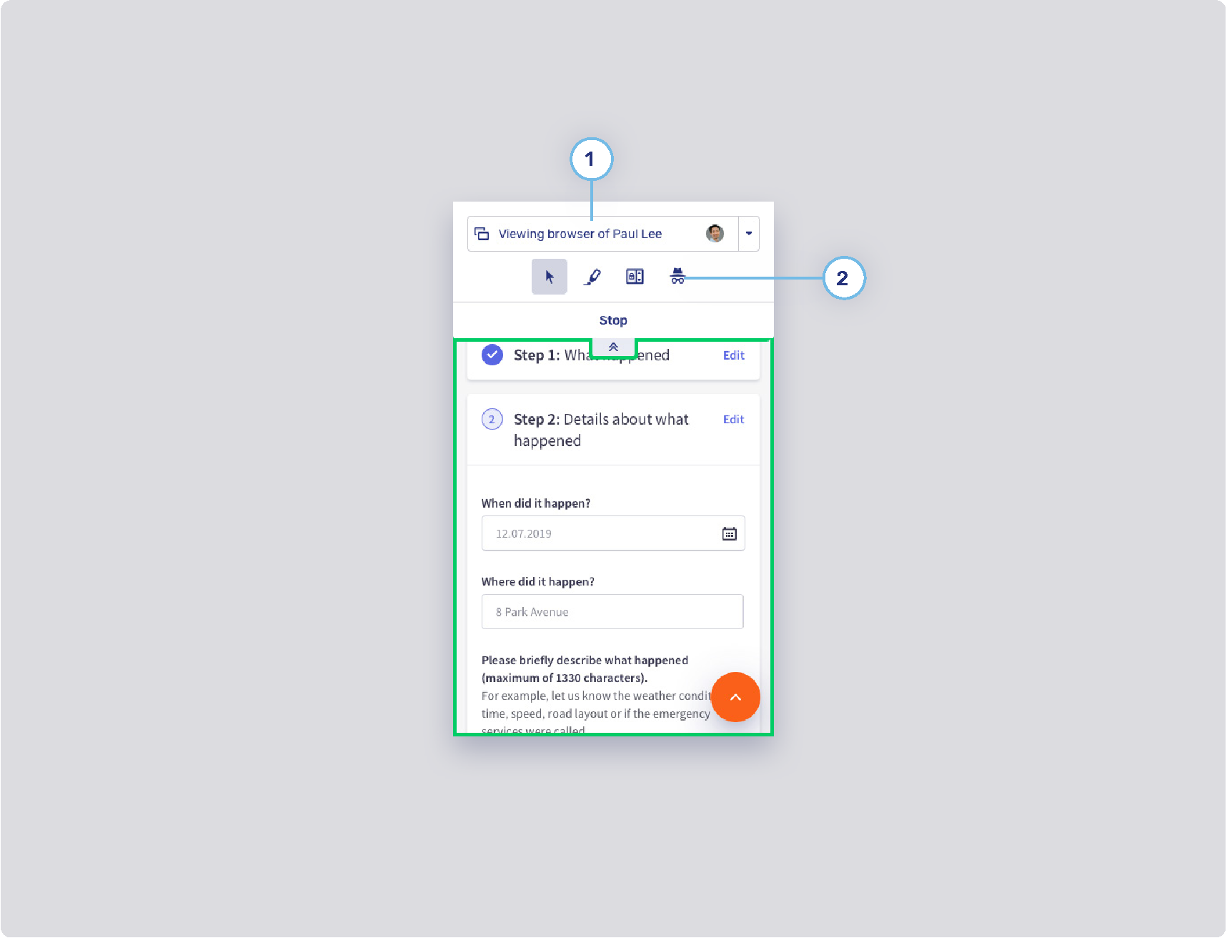
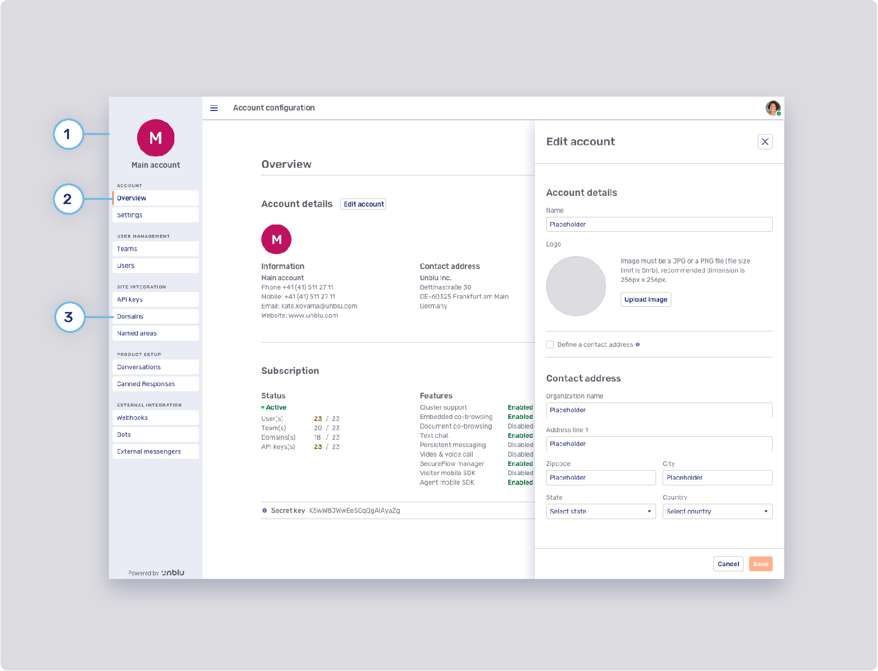
In order to start configuring your Unblu theming you must be an Admin or Superadmin. Once logged in, go to your Account space by clicking on the top right avatar and choosing “Manage account” from the list.
In the Account space side navigation bar, choose “Settings”.
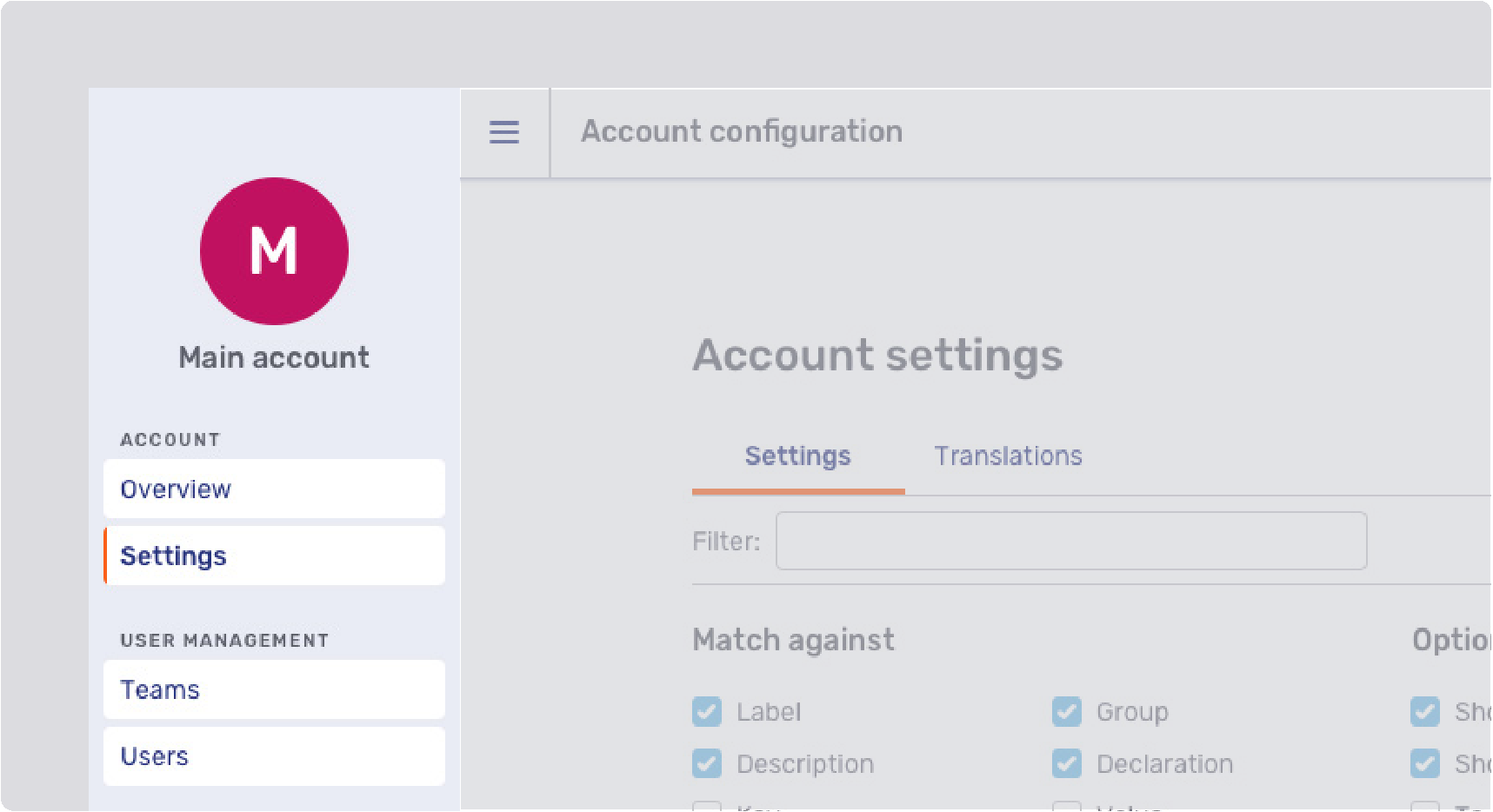
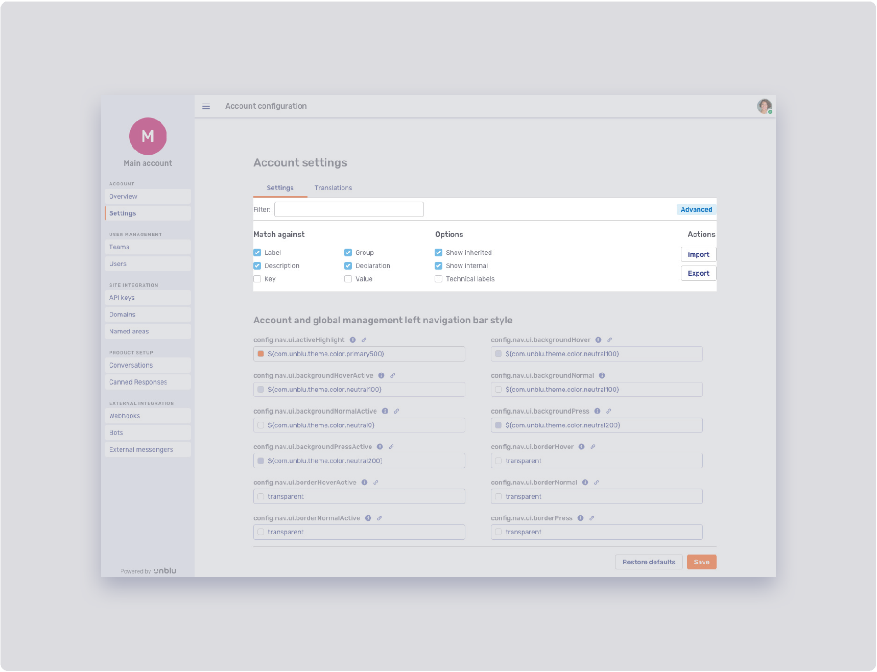
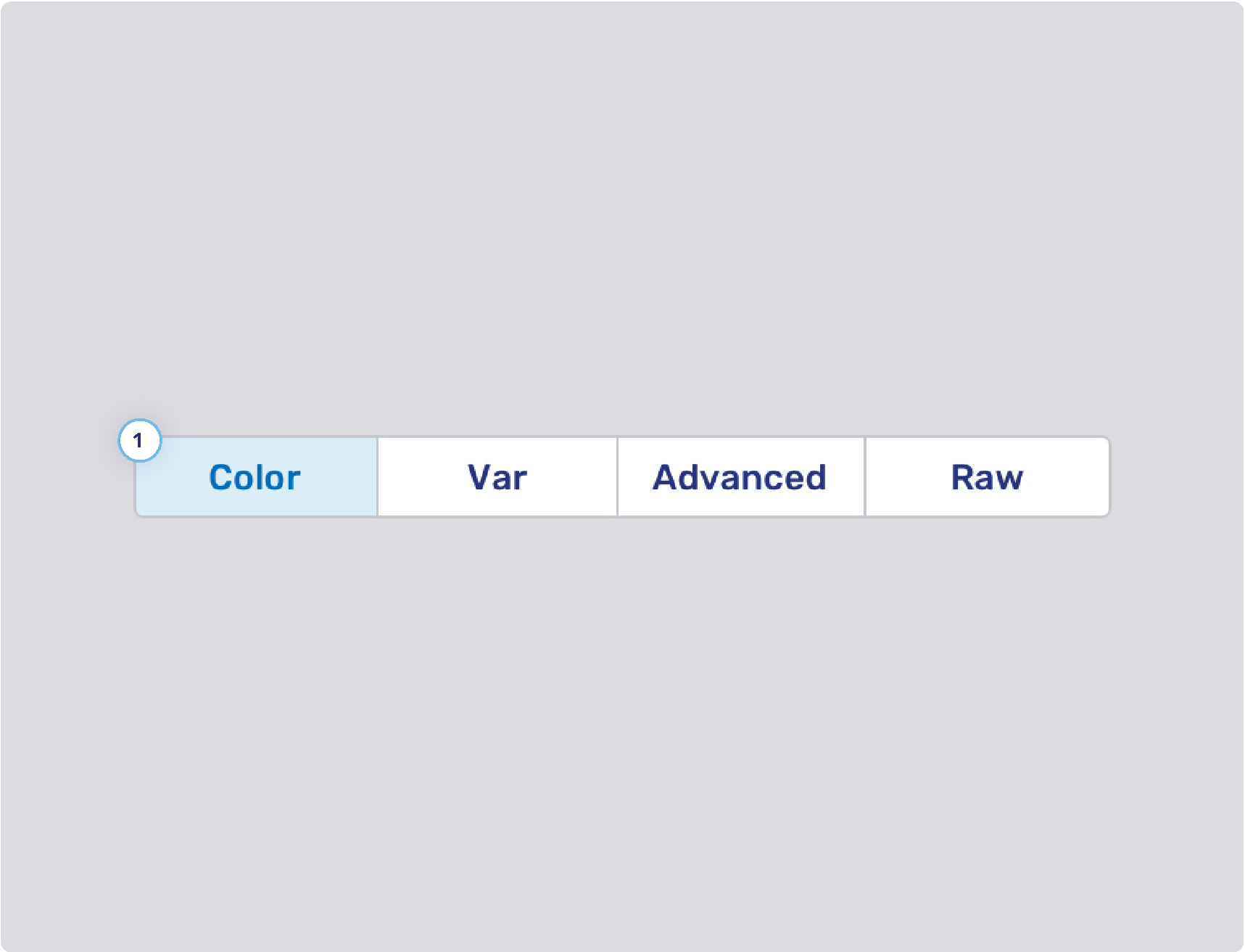
The Settings tab allows you to filter through configurations with the possibility of doing a more specific search by clicking on the Advanced button.
The advanced search allows you to match your filter value against a:
-
Label: filter for words in the configuration label.
-
Description: filter for words in the description of a configuration label.
-
Key: filter by the configuration property key
-
Group: filter for a specific group configuration block, such as: Font Configuration, Agent desk left navigation bar style, etc…
Under Options the following are available:
-
Show inherited (global level, product default): this filter is checked by default. It displays configuration settings that have been changed on account level.
-
Show unpopular (called “show internal” for superadmins): set of configuration keys that are not used often.
-
Technical labels: displays the configuration labels with technical names. When exchanging information about configurations, technical labels are required.
General configurations
Colors
The product color palette is defined by four main colors: primary, secondary, neutral and gray. Each of these colors have an extended color palette composed of varying degrees of saturation / brightness which can be used throughout various elements of the user interface.
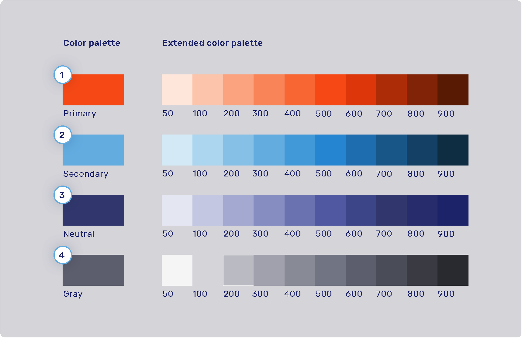
| 1. Primary palette | 2. Secondary palette |
|---|---|
|
Extended: |
Extended: |
| 3. Neutral palette | 4. Gray palette |
|---|---|
|
Extended: |
Extended: |
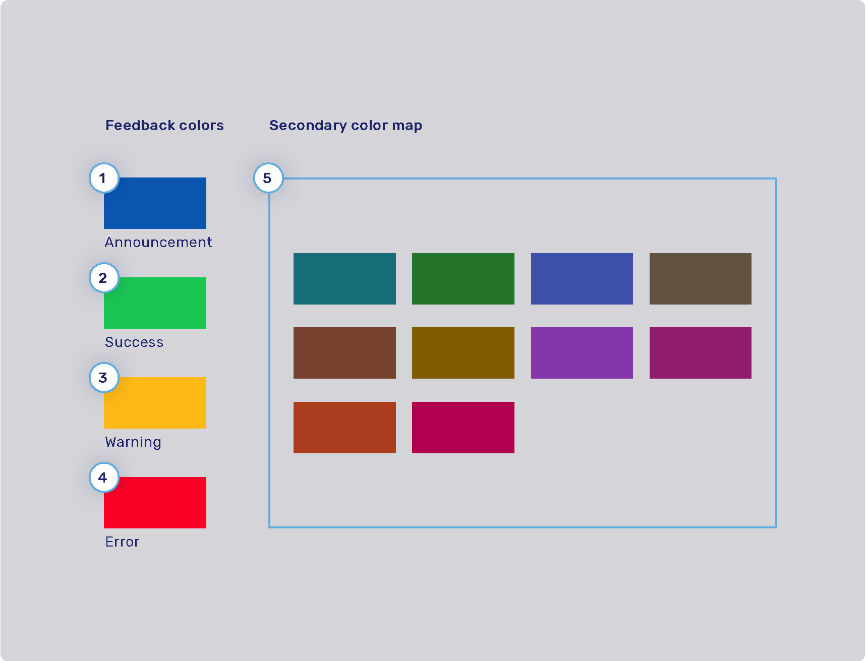
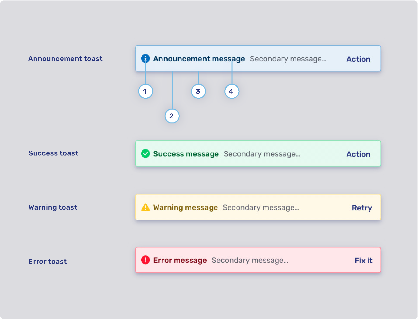
Feedback colors and secondary color map
-
1. Announcement highlight color: com.unblu.theme.color.highlightAnnouncement
-
2. Success highlight color: com.unblu.theme.color.highlightSuccess
-
3. Warning highlight color: com.unblu.theme.color.highlightWarning
-
4. Error highlight color: com.unblu.theme.color.highlightError
-
5. Secondary color map: com.unblu.theme.color.secondaryColorMap. Colors used for secondary elements such as avatars and virtual mouse cursor labels. These colors are chosen randomly from a set of colors determined in the configuration key above.
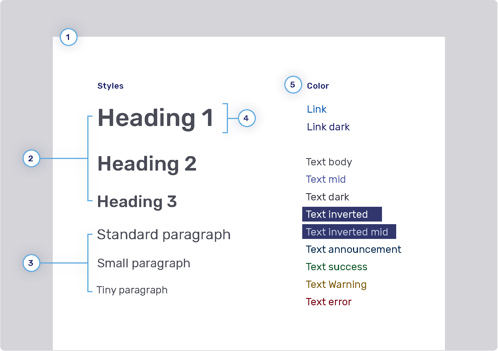
Font configuration
Size, color, weight of the text are properties that can be configured, however their placement in the UI cannot be modified. For example, if the UI uses a header 1 style, one cannot change it to h2.
-
1. Font family
-
2. Headings
-
Weight
-
Sizes
-
Heading 1: com.unblu.theme.font.heading1Size
-
Heading 2: com.unblu.theme.font.heading2Size
-
Heading 3: com.unblu.theme.font.heading3Size
-
-
Color
-
-
3. Paragraphs
-
Sizes
-
Standard: com.unblu.theme.font.paragraphSize
-
-
-
4. Font line height
-
5. Font color
-
Link
-
Text
-
Inverted: com.unblu.theme.font.colorTextInverted
-
Inverted mid: com.unblu.theme.font.colorTextInvertedMid
-
Announcement: com.unblu.theme.font.colorTextAnnouncement
-
Warning: com.unblu.theme.font.colorTextWarn
-
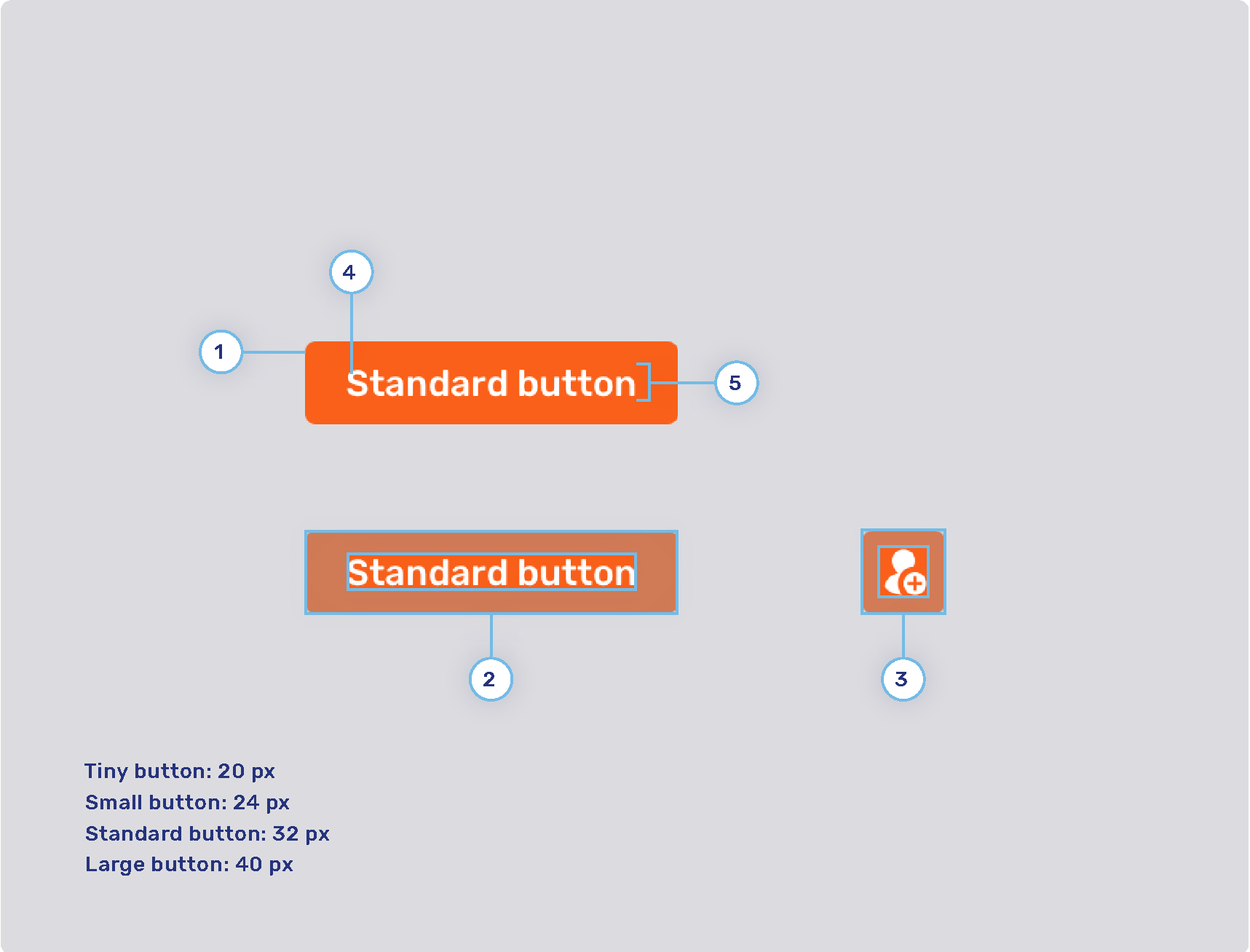
General style for buttons
-
1. Radius
-
2. Button padding
-
Button tiny
-
Button small
-
Button standard
-
Button large
-
-
3. Icon button padding
-
Button tiny
-
Button small
-
Button standard
-
Button large
-
-
4. Font weight
-
5. Line height
Primary and secondary buttons
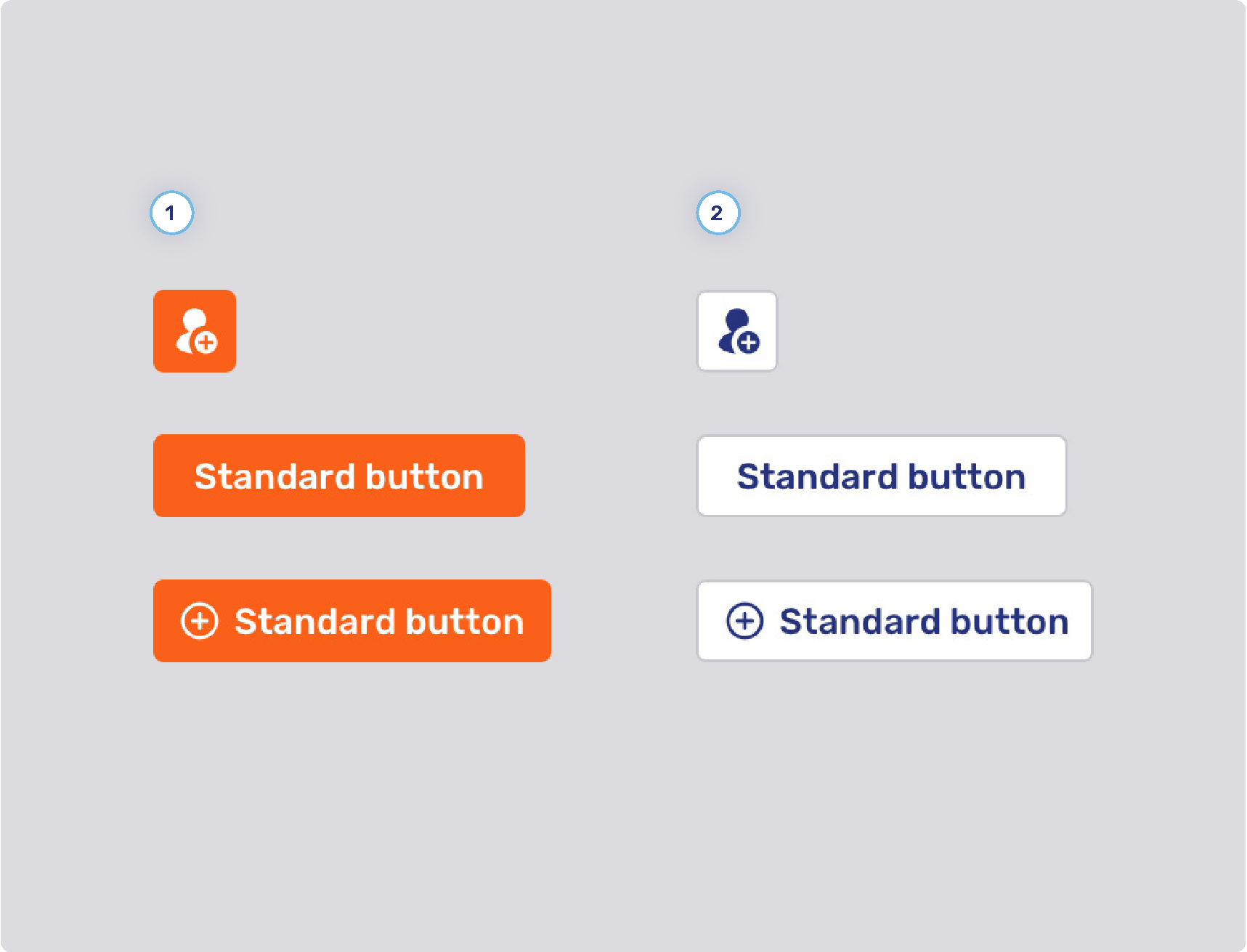
-
1. Primary button style
-
Background states
-
Border width
-
Border states
-
Foreground states
-
-
2. Secondary button style
-
Background states
-
Border width
-
Border states
-
Foreground states
-
-
3. General
-
Minimum button width (only applies to buttons for multiple choice questions)
-
Flat primary and secondary buttons
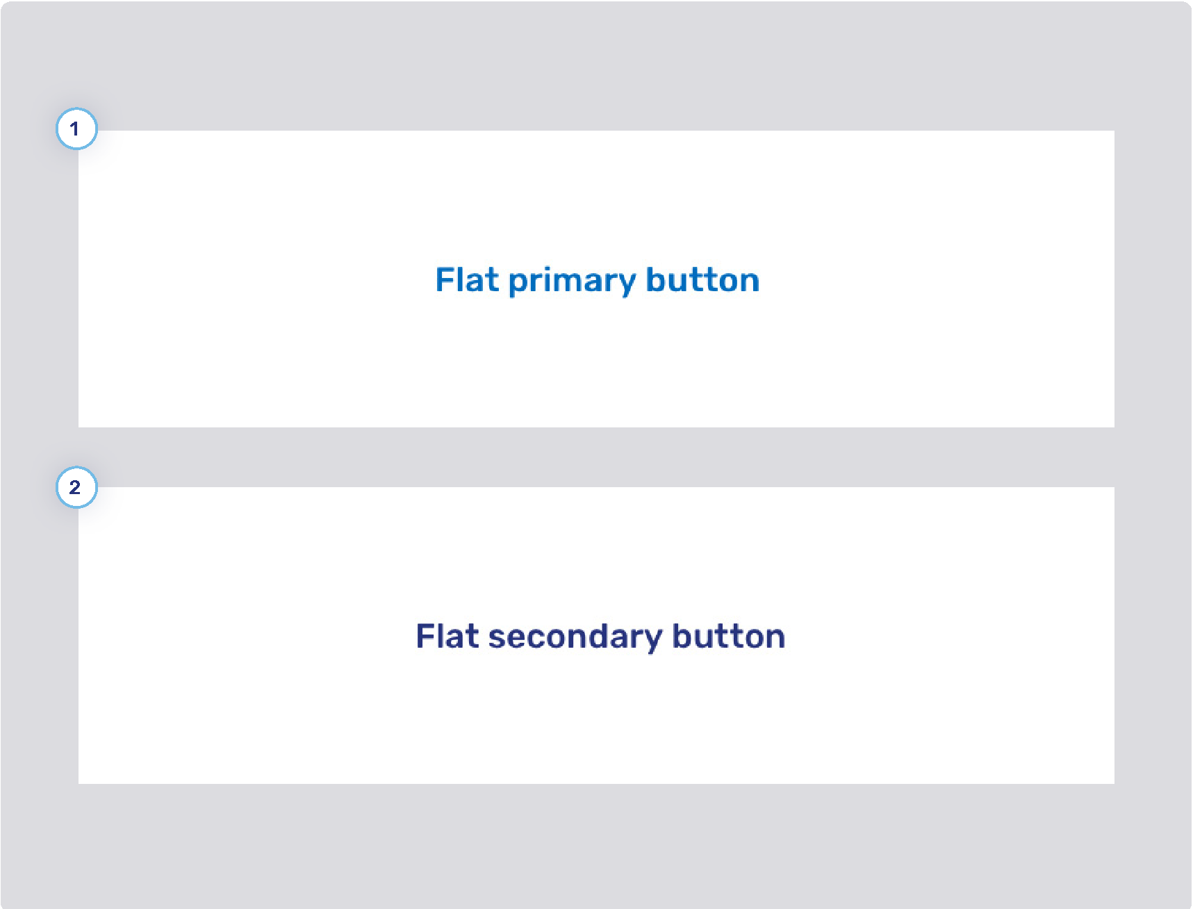
-
1. Flat primary button style
-
Background states
-
Border width
-
Border states
-
Foreground states
-
-
2. Flat secondary button style
-
Background states
-
Border width
-
Border states
-
Foreground states
-
Flat inverse button
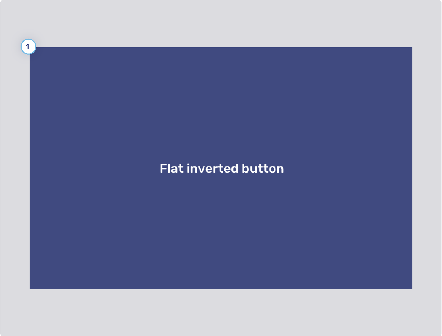
-
1. Flat inverse button style
-
Background states
-
Border width
-
Border states
-
Foreground states
-
Toggle button style
-
1. Toggle button style
-
Background states
-
Border width
-
Border states
-
Foreground states
-
Flat toggle button style
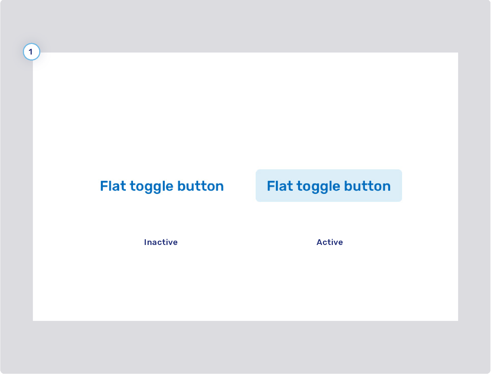
-
1. Flat toggle button style
-
Background states
-
Border width
-
Border states
-
Foreground states
-
Visitor theme
Launcher button

-
1. Launcher button
-
Display mode
-
Style
-
Padding
-
Icon
-
Size
-
States
-
Border
-
Text
-
-
2. Launcher button notification badge
Engagement UI

-
1. Action bar
-
2. Displayed logo
-
3. Font
-
4. Primary button
-
Refer to Primary and secondary buttons
-
-
5. Secondary button
-
Refer to Primary and secondary buttons
-
-
6. Online background color
-
7. Spacing
-
8. Offline background gradient color
-
9. Flat secondary button
-
Refer to Flat primary and secondary buttons
-
PIN entry panel
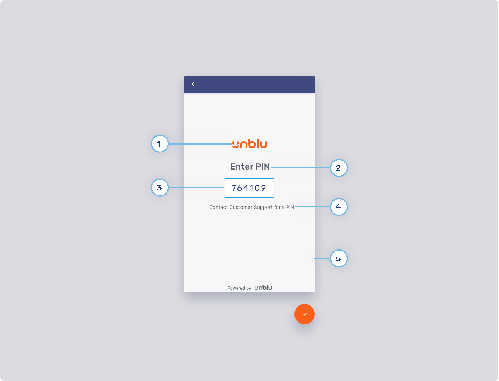
-
1. PIN UI logo
-
2. Header text
-
3. Input field style
-
Background color
-
Standard border color
-
Focus border color
-
Error border color
-
Valid border color
-
Radius
-
Padding
-
Width
-
Text
-
-
4. Body text
-
5. PIN UI background
Conversation inbox and asset panels
-
1. Conversation list background
-
2. Last unread message
-
3. Last read message
-
4. Sender’s label style
-
5. Last message time style
-
6. Notification badge
-
7. Title style
-
8. List item
-
9. Divider
-
10. Assets’ list background color
Chat conversation panel (1/3)
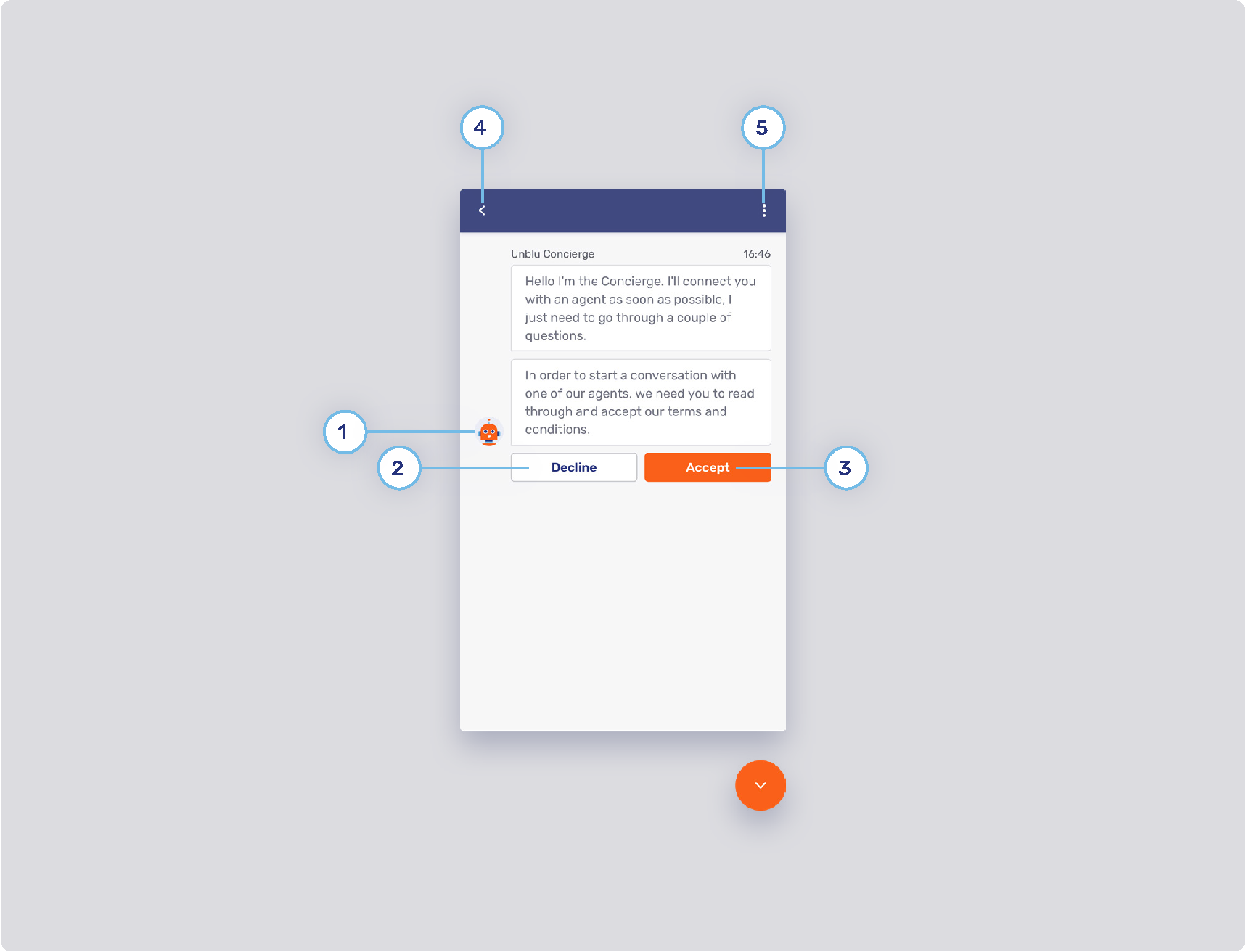
-
1. Unblu Concierge
-
Documentation to change the Concierge avatar and its name can be found here: Concierge Person
-
-
2. Secondary button style
-
Refer to Primary and secondary buttons
-
-
3. Primary button style
-
Refer to #primary-and-secondary-buttons>>
-
-
4. Back button
-
Configuration setting that determines if the visitor’s chat action bar will contain the back button (the back button allows the visitor to go back to the conversation overview):
-
-
5. Flat inverted button
-
Refer to Flat inverse button
-
Chat conversation panel (2/3)
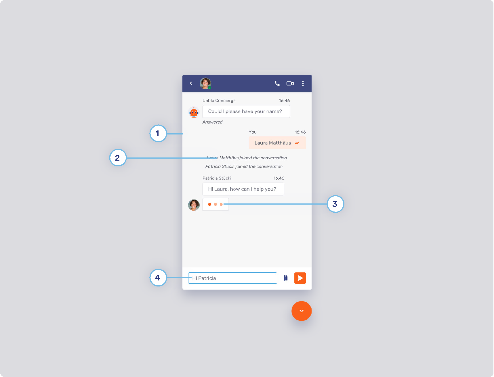
-
1. Chat background
-
2. System messages
-
3. Typing indicator color
-
4. Message input
-
Text
-
Behavior
-
Icons
-
Please note that icons in the product are not configurable. Therefore, the “Send message” button cannot be changed.
-
-
Chat conversation panel (3/3)
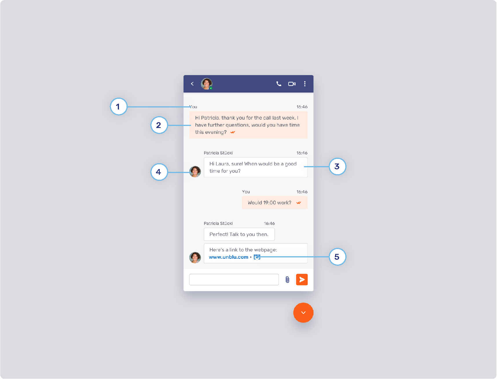
-
1. Message header
-
2. My message
-
Messages sent from by oneself.
-
Background
-
Border
-
Text
-
State tick color
-
-
3. Other message
-
Messages sent by others in the conversation.
-
Background
-
Text
-
-
4. Avatar position
-
5. Links
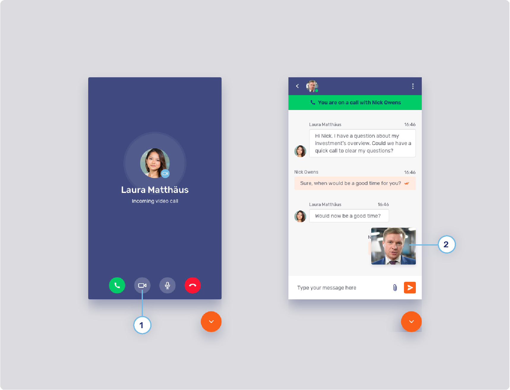
Video chat conversation panel (1/2)
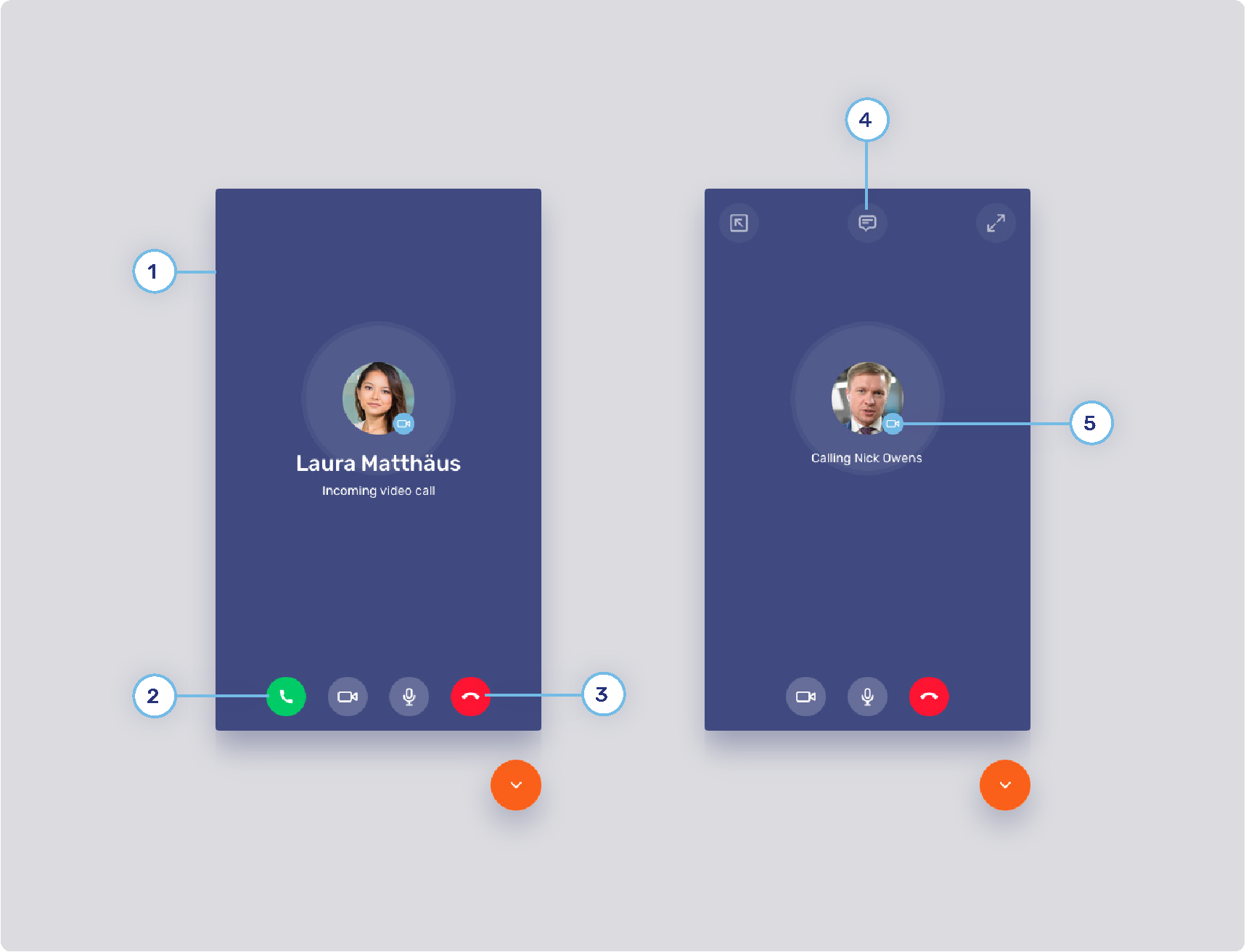
-
1. Video call background
-
2. Accept button color
-
3. Decline button color
-
4. Call action button style
-
Radius
-
States
-
Border
-
Icon
-
-
5. Call type background
Video chat conversation panel (2/2)
-
1. Call toggle button style
-
States
-
Border
-
Icon
-
-
2. Informational UI elements
-
3. Minimized video dimensions
Visitor collaboration space (1/3)
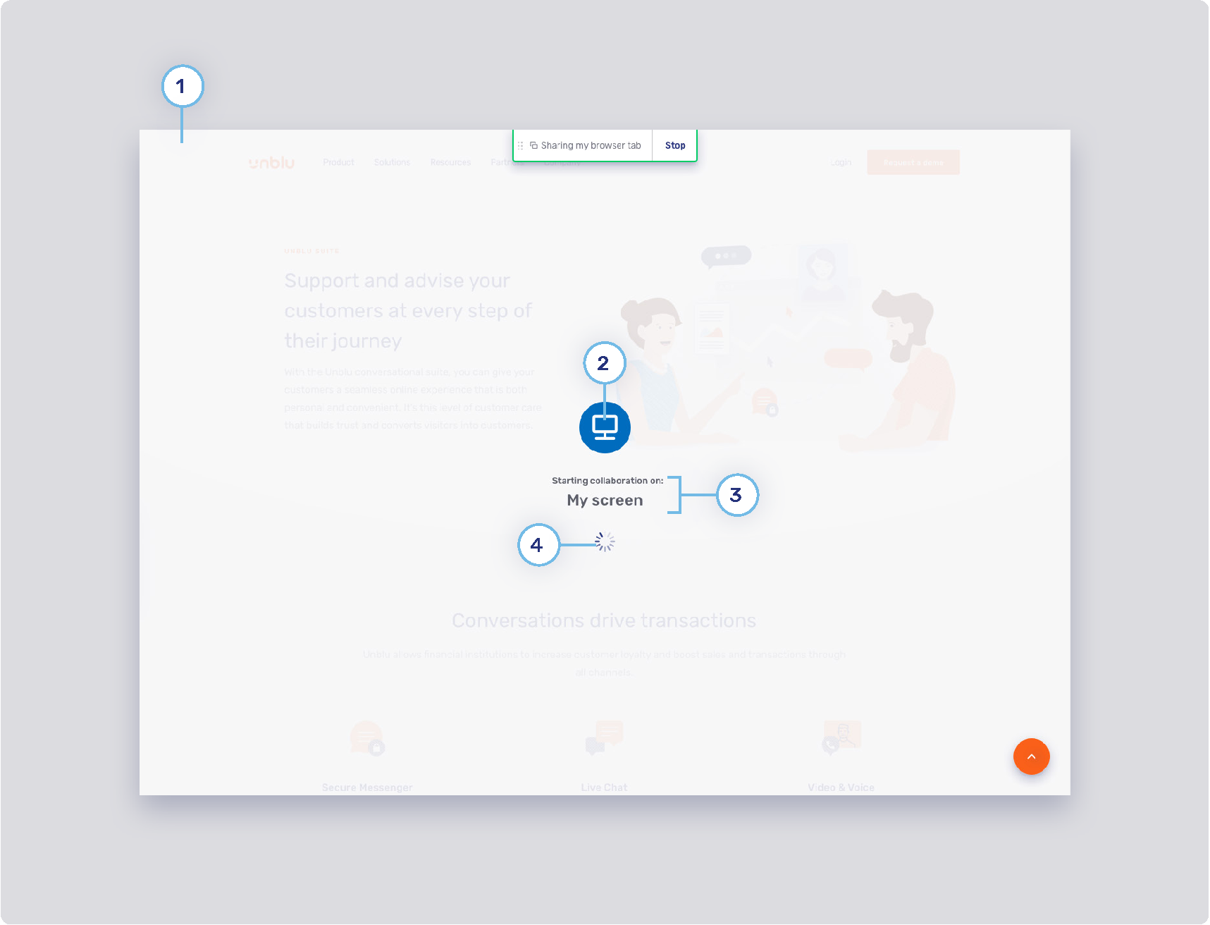
-
1. Loading splash screen
-
2. Loading splash screen icon
-
3. Loading splash screen text color
-
4. Loader color
Visitor collaboration space (2/3)
-
1. Visitor layer menu button
-
Background states
-
com.unblu.visitor.conversation.ui.layercontrols.menubutton.backgroundNormal
-
com.unblu.visitor.conversation.ui.layercontrols.menubutton.backgroundNormalActive
-
com.unblu.visitor.conversation.ui.layercontrols.menubutton.backgroundHover
-
com.unblu.visitor.conversation.ui.layercontrols.menubutton.backgroundHoverActive
-
com.unblu.visitor.conversation.ui.layercontrols.menubutton.backgroundPress
-
com.unblu.visitor.conversation.ui.layercontrols.menubutton.backgroundPressActive
-
-
Border width
-
Border states
-
com.unblu.visitor.conversation.ui.layercontrols.menubutton.borderNormal
-
com.unblu.visitor.conversation.ui.layercontrols.menubutton.borderNormalActive
-
com.unblu.visitor.conversation.ui.layercontrols.menubutton.borderHover
-
com.unblu.visitor.conversation.ui.layercontrols.menubutton.borderHoverActive
-
com.unblu.visitor.conversation.ui.layercontrols.menubutton.borderPress
-
com.unblu.visitor.conversation.ui.layercontrols.menubutton.borderPressActive
-
-
Foreground states
-
com.unblu.visitor.conversation.ui.layercontrols.menubutton.foregroundNormal
-
com.unblu.visitor.conversation.ui.layercontrols.menubutton.foregroundNormalActive
-
com.unblu.visitor.conversation.ui.layercontrols.menubutton.foregroundHover
-
com.unblu.visitor.conversation.ui.layercontrols.menubutton.foregroundHoverActive
-
com.unblu.visitor.conversation.ui.layercontrols.menubutton.foregroundPress
-
com.unblu.visitor.conversation.ui.layercontrols.menubutton.foregroundPressActive
-
-
-
2. Layer action button
-
Refer to Agent Desk collaboration space (4/6)
-
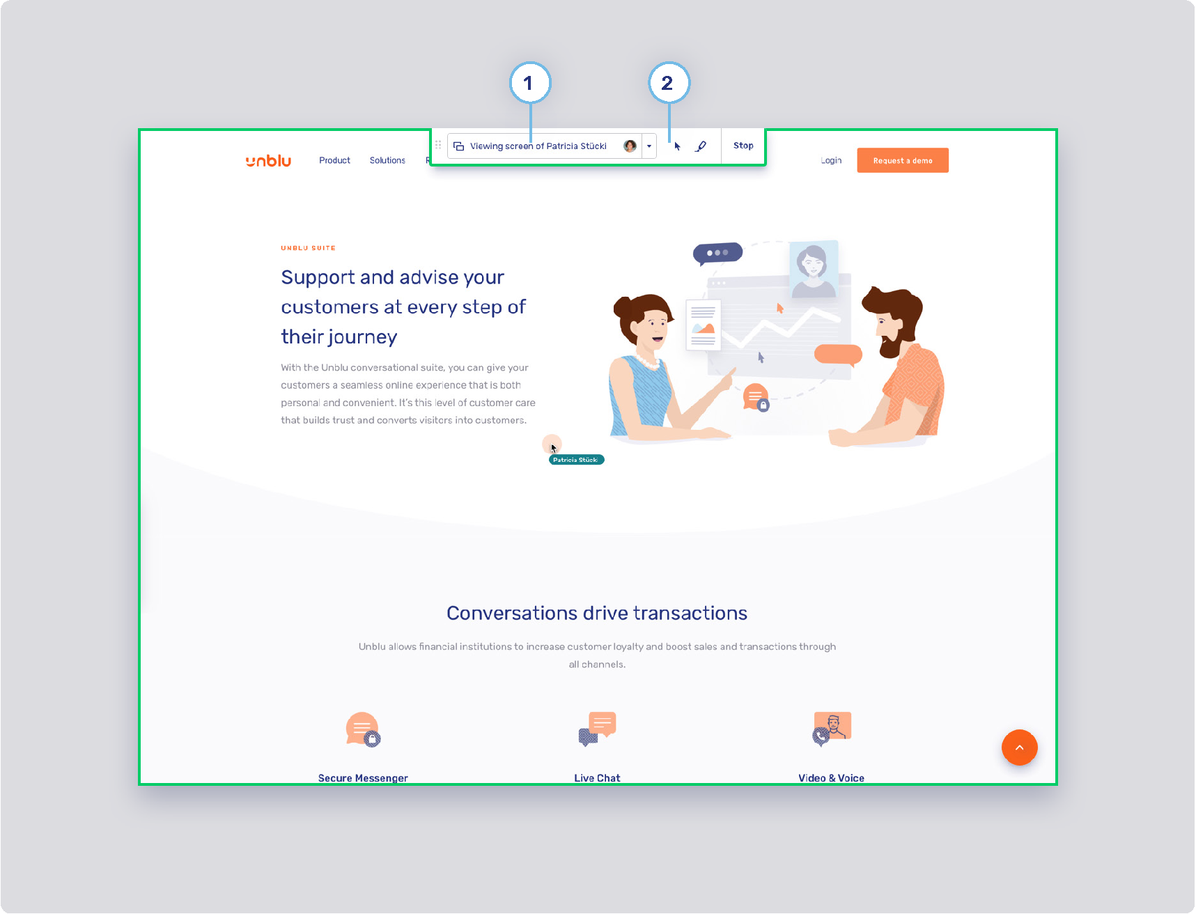
Visitor collaboration space (3/3)
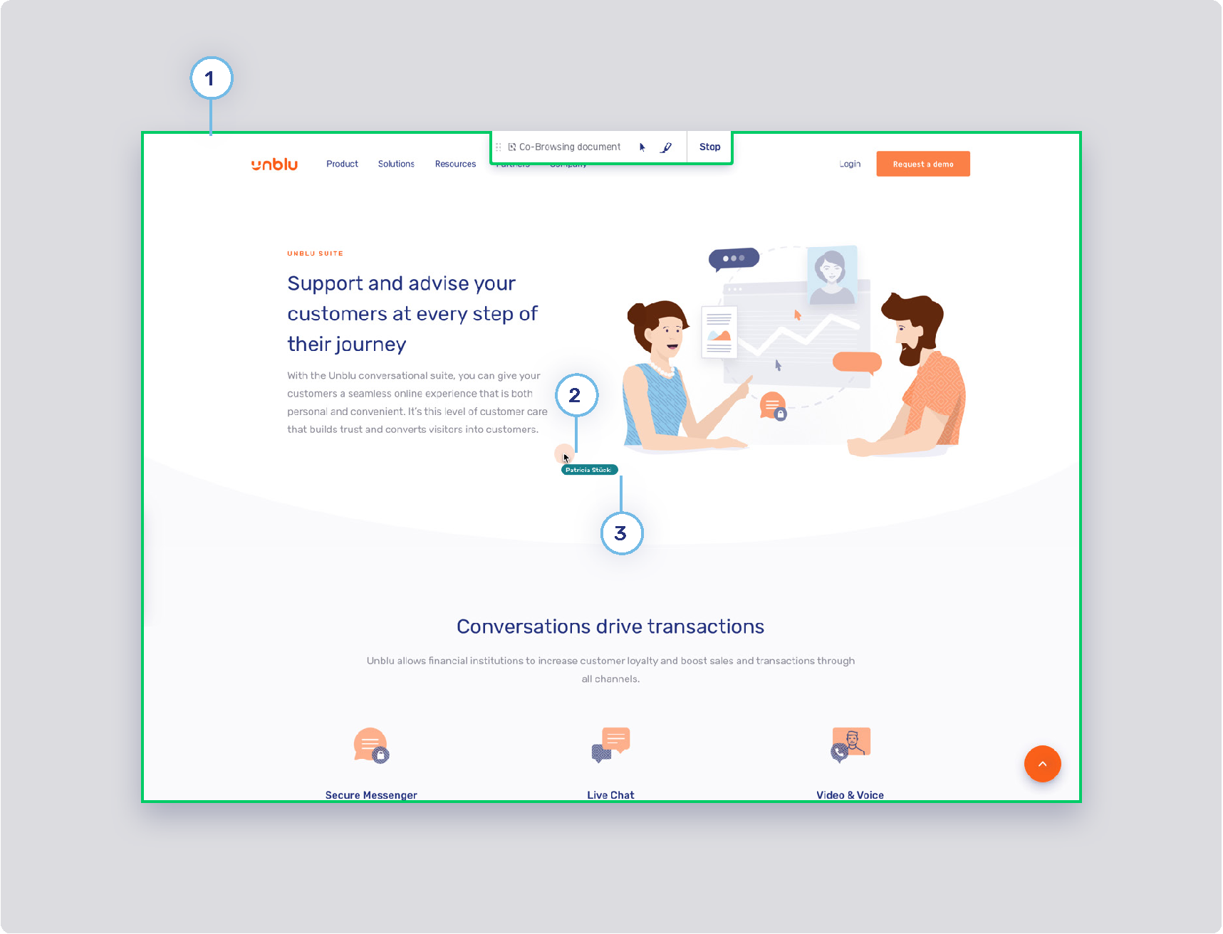
-
1. Capturing frame
-
2. Click feedback animation
-
3. Secondary colormap
-
Colors used for secondary elements such as avatars and virtual mouse cursor labels. These colors are chosen randomly from a set of colors determined in the following configuration key: com.unblu.theme.color.secondaryColorMap
-
Visitor mobile collaboration space
-
1. Visitor layer menu
-
Refer to Visitor collaboration space (2/3)
-
-
2. Layer action button
-
Refer to Agent Desk collaboration space (4/6)
-
-
3. Layer control toggle button
-
Background states
-
Border width
-
Border radius
-
Foreground states
-
Agent UI theme
Agent Desk (1/2)
-
1. Agent side navigation background
-
2. Active highlight
-
3. Agent side navigation button
-
Background states
-
Text states
-
Border width
-
Border states
-
Agent Desk (2/2)
-
1. Top bar button
-
Background states
-
Border states
-
Foreground
-
-
2. Flat primary button style
-
Refer to Flat primary and secondary buttons
-
-
3. Icon background color
-
Audio call: com.unblu.queue.ui.audioCallIconBackground
-
Co-Browsing: com.unblu.queue.ui.cobrowsingIconBackground
-
Video call: com.unblu.queue.ui.videoCallIconBackground
-
4. Icon display
Agent Desk collaboration space (1/6)

-
1. Collaboration layer button
-
Background states
-
com.unblu.conversation.collabspace.layer.button.backgroundNormal
-
com.unblu.conversation.collabspace.layer.button.backgroundNormalActive
-
com.unblu.conversation.collabspace.layer.button.backgroundHover
-
com.unblu.conversation.collabspace.layer.button.backgroundHoverActive
-
com.unblu.conversation.collabspace.layer.button.backgroundPress
-
com.unblu.conversation.collabspace.layer.button.backgroundPressActive
-
-
Border width
-
Border states
-
Foreground states
-
com.unblu.conversation.collabspace.layer.button.foregroundNormal
-
com.unblu.conversation.collabspace.layer.button.foregroundNormalActive
-
com.unblu.conversation.collabspace.layer.button.foregroundHover
-
com.unblu.conversation.collabspace.layer.button.foregroundHoverActive
-
com.unblu.conversation.collabspace.layer.button.foregroundPress
-
com.unblu.conversation.collabspace.layer.button.foregroundPressActive
-
-
Agent Desk collaboration space (2/6)

-
1. Menu button
-
Background states
-
Border width
-
Border states
-
Foreground states
-
Agent Desk collaboration space (3/6)
-
1. Menu item button
-
Be aware that those configuration properties are also used for the user menu and can be used for other menus in the future.
-
Background states
-
Border width
-
Border states
-
Foreground states
-
-
2. Active layer indicator
Agent Desk collaboration space (4/6)
-
1. Layer action button
-
Background
-
com.unblu.conversation.collabspace.layer.action.backgroundNormal
-
com.unblu.conversation.collabspace.layer.action.backgroundNormalActive
-
com.unblu.conversation.collabspace.layer.action.backgroundHover
-
com.unblu.conversation.collabspace.layer.action.backgroundHoverActive
-
com.unblu.conversation.collabspace.layer.action.backgroundPress
-
com.unblu.conversation.collabspace.layer.action.backgroundPressActive
-
-
Border width
-
Border width
-
Foreground
-
com.unblu.conversation.collabspace.layer.action.foregroundNormal
-
com.unblu.conversation.collabspace.layer.action.foregroundNormalActive
-
com.unblu.conversation.collabspace.layer.action.foregroundHover
-
com.unblu.conversation.collabspace.layer.action.foregroundHoverActive
-
com.unblu.conversation.collabspace.layer.action.foregroundPress
-
com.unblu.conversation.collabspace.layer.action.foregroundPressActive
-
-
-
2. Collaboration space background color
Agent Desk collaboration space (5/6)

-
1. Maximize layer button
-
Background states
-
com.unblu.conversation.collabspace.layer.header.maximize.backgroundNormal
-
com.unblu.conversation.collabspace.layer.header.maximize.backgroundNormalActive
-
com.unblu.conversation.collabspace.layer.header.maximize.backgroundHover
-
com.unblu.conversation.collabspace.layer.header.maximize.backgroundHoverActive
-
com.unblu.conversation.collabspace.layer.header.maximize.backgroundPress
-
com.unblu.conversation.collabspace.layer.header.maximize.backgroundPressActive
-
-
Border width
-
Border states
-
com.unblu.conversation.collabspace.layer.header.maximize.borderNormal
-
com.unblu.conversation.collabspace.layer.header.maximize.borderNormalActive
-
com.unblu.conversation.collabspace.layer.header.maximize.borderHover
-
com.unblu.conversation.collabspace.layer.header.maximize.borderHoverActive
-
com.unblu.conversation.collabspace.layer.header.maximize.borderPress
-
com.unblu.conversation.collabspace.layer.header.maximize.borderPressActive
-
-
Foreground states
-
com.unblu.conversation.collabspace.layer.header.maximize.foregroundNormal
-
com.unblu.conversation.collabspace.layer.header.maximize.foregroundNormalActive
-
com.unblu.conversation.collabspace.layer.header.maximize.foregroundHover
-
com.unblu.conversation.collabspace.layer.header.maximize.foregroundHoverActive
-
com.unblu.conversation.collabspace.layer.header.maximize.foregroundPress
-
com.unblu.conversation.collabspace.layer.header.maximize.foregroundPressActive
-
-
Agent Desk collaboration space (6/6)

-
1. Critical action button
-
Background states
-
Border width
-
Border states
-
Foreground
-
-
2. Flat inverse button
-
Refer to Flat inverse button
-
-
3. Marker area color
Agent Desk inbox
-
1. Conversation tab (top bar) style
-
Background states
-
Border width
-
Border states
-
Foreground states
-
Notification badge
-
Modal dialog
-
1. Modal dialog background color
-
2. UI notification service
-
Destination
-
com.unblu.core.client.ui.notification.NotificationService.notificationDestination
-
Alignment
-
Timeout
-
Maximum number
-

Account UI theme
Headless browser theme
The headless browser displays four default pages that consist of an image and some text. These text and configuration properties can be customized.
It is possible to change the colors for all of the pages:
Universal co-browsing about page
This landing page can be used when a new "Websites" collaboration layer is opened. It is possible to change the default page with com.unblu.conversation.headless-browser.defaultNewWindowLocation.
The local URL to display this page is about:unblu.universal-cobrowsing.
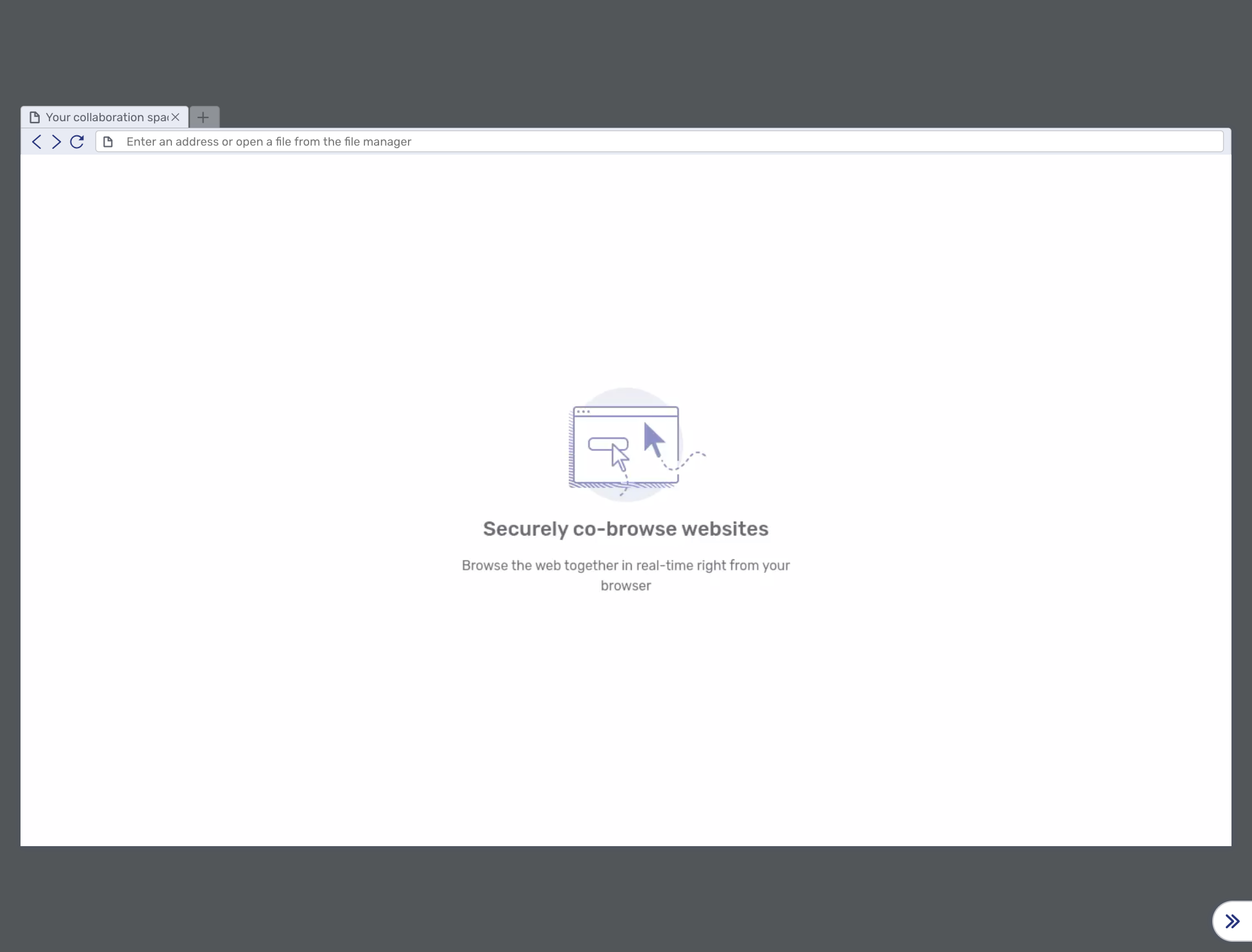
The text items can be changed with:
-
com.unblu.hbworker.aboutpage.pageTitle (shared with the document co-browsing)
Document co-browsing about page
This landing page is used when a new "Documents" collaboration layer is opened.
The local URL to display this page is about:unblu.document-cobrowsing.
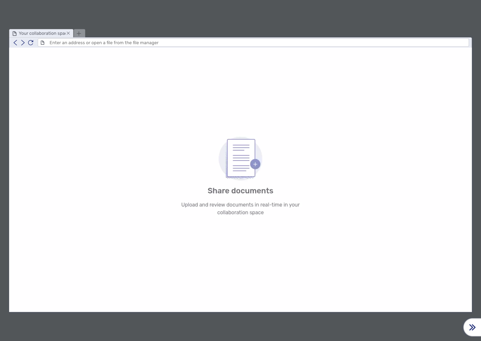
The text can be changed with:
-
com.unblu.hbworker.aboutpage.pageTitle (shared with the universal-cobrowsing)
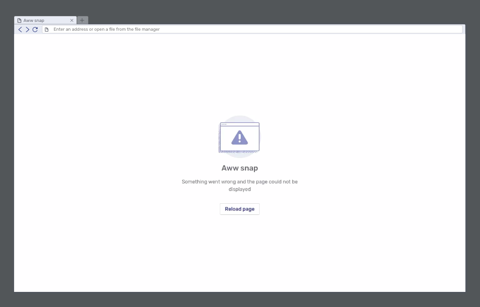
Error page
The error page is displayed when an error occurs:
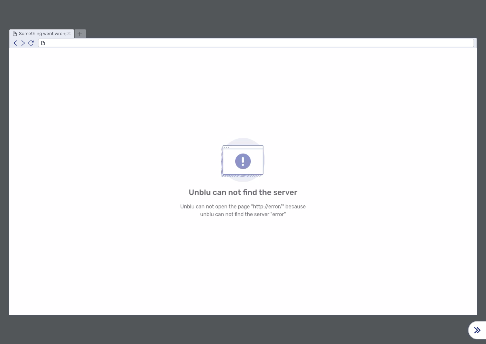
The text items can be changed with:
-
The error message displayed depends on the category of the error:
-
Network errors
-
Name not resolved (NotFound error)
-
Timeout
-
Other
-
-
HTTP error
-
Domain restriction errors
-
Access to local files not permitted
-
SSL is not permitted
-
No JavaScript permitted (URLs starting with
javascript:) -
Protocol (e.g.
ftp:) not permitted -
Request URL not permitted
-
-
SSL errors
-
Other errors
-